Tuesday, June 29, 2021

Fountain Pen Review: BlueDew Pens Flex Strontium Flame

I have used many fountain pens, most of them with medium, broad, and stub nibs and I love writing with them. There's another nib that many fountain pen users love but I am scared of—the flex nib. For me, using a flex nib is almost expecting the nib to break apart. But I love looking at cursive writing, and I admire people whose hands can do Spencerian calligraphy. A few weeks ago, I saw a new pen brand from Singapore that makes beautiful pens with stainless steel full flex nibs. BlueDew Pens, a promising pen brand offers a unique flex pen experience to keep beautiful penmanship alive.

BlueDew Pens Flex in Strontium Flame finish.

I received the Strontium Flame Flex and it's such a beautiful pen. I don't have many red fountain pens to compare it with, but the barrel and cap in deep, rich, strawberry red are very attractive. The gold-plated clip and nib complement the barrel color perfectly. The Flex pen is available in six other colors, including White, Ancient Ice (aqua blue), Emerald (dark green), Mulberry (purple), Tortoise Shell (brown), and Blue.

The Flex is a well-designed pen meant for comfortable flex writing. It's a light pen with the center of gravity at approximately 1/2 to 2/3 from the fingertips to the first knuckle for easier pen control and a comfortable balanced grip. The Flex pen's cap is designed to be fully airtight to ensure that the nib is wet and ready to write even if it was capped for days. The cap takes only one full twist to cap and uncap.

BlueDew Flex Strontium Flame has a deep, rich, strawberry red color complemented by the gold-plated clip and flex nib.
BlueDew Flex can be filled with ink using standard international cartridges, or through a converter supplied with each pen purchase.

BlueDew Flex has the following measurements and specifications:
  • Length, capped: 5.5 in | 14 cm
  • Length, uncapped: 4.9 in | 12.4 cm
  • Length, cap posted: 6.3 in | 16 cm
  • Full pen weight: 30g | 1 oz
  • Body material: Resin
  • Colors: White, Ancient Ice (aqua), Strontium Flame (red), Emerald (green), Mulberry (violet), Tortoise Shell (brown), and Blue
  • Trim: Gold
  • Cap: Screw-on; postable
  • Clip material: Gold-plated steel 
  • Nib: Stainless steel that does not rust
  • Filling mechanism: Standard international cartridge or converter (supplied with purchase)

BlueDew Pens flex nib is the most interesting part of this pen. These flex nibs are designed to be very flexible with excellent line variation from Japanese EF to BB without any discomfort. Unlike dip pen nibs, this stainless steel nib is rust-resistant. It will not rust even with iron gall inks. These nibs were designed from the ground up, taking inspiration from modern No. 6 and dip nibs. They don't have any tipping material to achieve finer lines which are important to flex nib writing.

The creator of this unique flex nib included two design considerations to ensure excellent ink flow, an important requirement for flex pen writing. First, the large, embossed B—which is also the brand's logo—serves as an ink reservoir as extra ink pools underneath. Secondly, the nib wrapping closely around the feed keeps ink in the fins so that ink is supplied to the nib during flexing.

The Flex nib's interesting design is meant to ensure generous amounts of ink towards the tip for flexing.
The barrel is engraved with the brand's name, BLUEDEW.

BlueDew Flex is a full-sized fountain pen with a comfortable grip section. Capped, it has the same size as most regular pens including a Lamy Al-star, Platinum Prefounte, and PenBBS 323. Uncapped, it shares the same size as the Prefounte and Sailor 1911 Profit Junior.

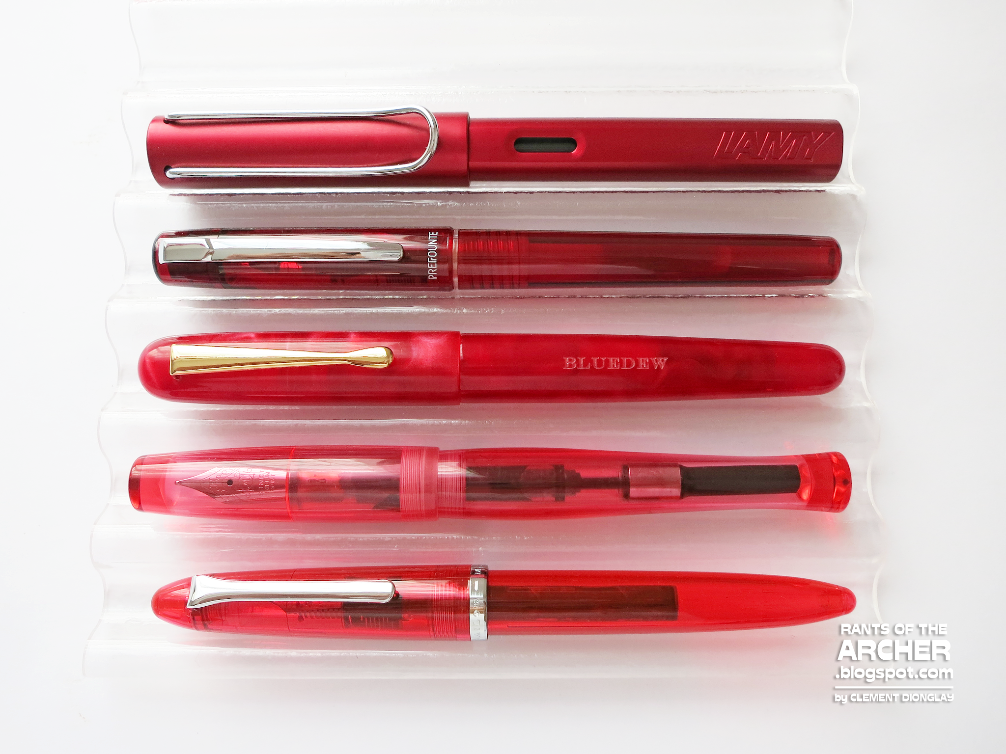
From top: Lamy Al-star Ruby Red, Platinum Prefounte, BlueDew Pens, PenBBS 323, and Sailor 1911 Profit Junior.
Uncapped, the BlueDew Flex is almost the same length as a Prefounte or Sailor Profit Junior.

To test this red pen, I first filled it with Monteverde Valentine Red, a matching red ink. It was too wet for this pen's flex nib and feathered and bled badly. I then switched to a dry ink and used Pelikan 4001 Blue Black. I have tried pens with flex nibs before, and I wasn't too happy with them. I'm amazed at how easy I can write with BlueDew Pens' flex nib. It's nice to use for my thin stick letters and even better for my sore attempt at cursive writing. With this beautiful nib, I may have to take flex writing seriously.

I loved writing with this flex nib. It's very easy to use and I did not have any skipping at railroading, two common problems with flex writing. Also, this quote belongs to the great Abraham Lincoln.
Every BlueDew fountain pen comes in a pen box designed to be a protective case. This sturdy case has a magnetic closure that makes it easier to use.


The BlueDew Pens Flex is a happy and exciting pen surprise! It has a beautiful body, and an even more wonderful nib to try. It is well-designed for flex writing, and I recommend it to anyone who wants to try flex nibs or calligraphy. It's an affordable pen with a modern flex nib for long-term use. If you want to try a new writing experience, BlueDew Pens Flex is for you! Get one for your collection!


Rants of The Archer thanks BlueDew Pens for providing the Strontium Flame for review purposes. The Flex pens are available at BlueDew Pens where they retail for US$88 each. To learn more about BlueDew Pens, visit their website or follow them on social media:

Tuesday, June 22, 2021

Fountain Pen Review: Stanford Wood Studio Impressionists Series Fountain Pen

Last year, I chanced upon Stanford Wood Studio, a new pen maker from Stanford, South Africa. They make fountain pens, solid wood pens, silk pens, and wood and resin pens and pencils. The Studio also makes canoes and kayaks. Since then, Stanford Wood Studio has made many interesting fountain pens, including my beautiful and unique Ghost's Breath.

This year, Stanford Wood Studio launched a crowdfunding campaign at Thundafund to raise funds to pay off a CNC lathe, grow their business, and YES, make more beautiful and magical fountain pens. The rewards of the Thundafund campaign include fountain pens, an exclusive fountain pen ink, and a pen pouch. Stanford Wood Studio offered 6 + 1 pens called the Impressionists Series. The Series has six fountain pens in light color bodies and a black one for those who prefer a more classic, subdued look. Backers can choose from a virtual hug, a handwritten card, or one of the beautifully handcrafted pens in the Impressionists Series plus a bottle of teal ink developed exclusively for Stanford Wood Studio by Frara Road. 

Each pen in the series was created by Stanford Wood Studio's owners, Dave and Di, and gets inspiration from a famous painting by Impressionist painters including Henri de Toulouse-Lautrec (Ball at the Moulin Rouge), Pierre-Auguste Renoir (Dance at La Galette), Jean Béraud (The Gardens of Paris), Édouard Manet (A bar at the Folies-bergere), Eva Gonzalès (Indolence), Claude Monet (Le Dejeuner Sur L'herbe), and Berthe Morisot (Young Woman at the Mirror). 

Stanford Wood Studio Impressionists fountain pen inspired by
Berthe Morisot's Young Woman at the Mirror.

All seven pens in the Impressionist Series have beads in the barrel and cap ends. These beads are tiny Japanese Delicas that are cylinder-shaped glass seed beads. The lighter pens in the series have brightly colored beads but this pen's beads are more subtle and subdued. It has silver, aqua, and ashes-of-roses beads that all look perfect with the black barrel and cap. The seven pens in the series all have different color sections that match the beads in their barrels and caps.

The Impressionists fountain pen Berthe Morisot has a white section with purple accents that match the beads in the barrel and cap.

The Berthe Morisot pen is a well-balanced fountain pen. It has a nice heft that's just right for writing. I also like the diameter of this pen's section and how I can comfortably grip it as I write. This pen's cap doesn't post, but that's okay with me as I do not usually write with my pens posted.

The Berthe Morisot fountain pen has the following measurements:
  • Length, capped: 6 in | 15.24 cm 
  • Length, uncapped: 5.25 in | 13.3 cm
  • Length, barrel only: 3.4 in | 8.6 cm
  • Length, section to nib: 1.85 in | 4.7 cm
  • Length, cap: 2.75 inches | 7 cm
  • Diameter, barrel: 0.6 in | 1.7 cm
  • Nib: No. 6 Bock rose gold plated
  • Filling mechanism: Converter (included in pen) or international standard cartridges

This fountain pen fills with ink using a converter or standard international ink cartridges. A converter is included with a pen purchase from Stanford Wood Studio.

Stanford Wood Studio uses Bock nibs for their fountain pens. My Ghost's Breath came with Broad polished steel No. 6 Bock nib. Di let me have a rose gold nib this time. I love this Broad Bock because it's smooth, wet, and soft. It wrote so smoothly the first time I tried it, and I did not experience any hard starts or skipping. It also looks so pretty! Stanford Wood Studio offers Fine, Medium, or Broad nibs for the Impressionists Series.

The rose gold Bock nib looks pretty and writes smooth, too!
Silver, aqua, and ashes-of-roses Japanese Delica beads adorn the barrel and cap of the fountain pens in the Impressionists Series.

I now have two fountain pens from Stanford Wood Studio. As both pens are clipless, I always needed to check which end I was holding so I don't put it nib down in my pen wrap.  Dave and Di thoughtful provided simple design tweaks to remind the user of the pen's ends, as one has a flat top, and the other has a pointed end. Thoughtful, wise, brilliant design!

Stanford Wood Studio Impressionists and Ghost's Breath fountain pens.

The Impressionists Series Berthe Morisot pen is a full-length fountain pen, half an inch longer than my BENU Tattoo, Lamy Safari, and Lamy 2000. Despite that, it's not a heavy pen and is still comfortable for writing. 

Capped, the Berthe Morisot fountain pen is longer than BENU Tattoo, Lamy Safari, Lamy 2000, and Esterbrook JR.
Uncapped, it's almost the same length as the BENU Tattoo and Lamy Safari pens.

Frara Road, a retail company based in Cape Town, South Africa has made a new fountain pen ink exclusively for Stanford Wood Studio. The Gardens of Paris is a green-teal ink color named from one of the pens in the Impressionists Series. Frara Road uses a 50 ml PET bottle for their ink. It's a saturated ink with excellent flow, shading, and sheen. It's perfect for this pen's Broad nib which wrote smooth and wet.

The Berthe Morisot fountain pen wrote smooth and wet, a perfect match for the saturated ink.
Perfect match: Frara Road's first and only fountain pen ink, The Gardens of Paris is a beautiful green-teal ink. Some reward tiers of Stanford Wood Studio's Thundafund campaign include a 50ml bottle of this ink.

I am very happy and proud to have one of the seven pens in Stanford Wood Studio's Impressionists Series. This pen is well-balanced, built for long-term use, and a stunning and beautiful pen. It's Dave and Di's work of art and one that I am sure will be loved by many. I'm excited to see new pens coming out of the new lathe! 

The Impressionists Series will soon come to Stanford Wood Studio's store. Stay tuned and get one for your collection! If anyone wants to own one of these pens, do visit Stanford Wood Studio's website or send Di and Dave a message at info@stanfordwoodstudio.com. There are also many interesting fountain pens in their shop! Get one for your collection!


Rants of The Archer thanks Stanford Wood Studio for providing the Impressionists Series Berthe Morisot fountain pen for review purposes. To learn more about Stanford Wood Studio, how to buy their kayaks, canoes, and pens, and for other details about their wonderful work, visit their website at https://www.stanfordwoodstudio.com/ or follow them on social media:

Saturday, June 19, 2021

Fountain Pen Ink Review: New Brew Inks

New Brew fountain pen inks in 60ml bottles.

The COVID-19 pandemic has pushed most of us into unwanted corners and places. Some of us are forced to work at our homes, while others needed to change jobs to cope with the pandemic. It's a difficult time, but it's also a period of learning and discovery. Aside from my family and close friends, several things that got me going at this challenging time are this blog, my fountain pen hobby, and the close-knit network of Pinoy fountain pen users. We help and support each other, reach out to one another, and discover many things together. One of the beautiful new things we discovered together during this time is New Brew, an amazing brand new ink series mixed by one of the younger members of Fountain Pen Network Philippines.

New Brew is produced by 18-year old Marcuz Bryant Cortez from the Philippines. Marcuz got the idea of mixing fountain pens inks four years ago when he got into the fountain pen hobby and didn't have enough inks of his own. He started mixing inks using food colorings and dyes. Now, he has more than 10 ink colors for New Brew and his ink bottles are selling faster than he can make them!

Marcuz has more than 10 ink colors for New Brew, and continues to make new ones. He even mixes limited edition ink colors for special orders placed by FPN Philippines members.

As part of my post-Independence Day week features, here are the 11 ink colors from New Brew, a promising ink brand made by a young Filipino entrepreneur for the world. And because most of us in the Philippines spent our Independence Day weekend watching Trese, Rants of The Archer is joining in! We're giving the world New Brew + Trese this weekend!

Space


Space is a dark blue ink that is very similar to the more popular blue blacks of Pilot, Diamine, and Lamy. It is more vibrant, though, and reveals hints of teal undertones. It is moderately saturated with excellent flow. New Brew Space has a good amount of shading even from a Fine nib and dries in less than 15 seconds on Veco 100gsm paper.

New Brew Space is a nice dark blue fountain pen ink with teal undertones.
New Brew Space from a wet Jinhao 992 F nib. This blue ink is so nice!

Blood Stain


Blood Stain is a dark red ink that looks like, yes, blood. It's not as wet as Space, but it still has good flow, and the F nib I used to test it did not experience any skipping or hard starts, two common problems with drier inks. I like Blood Stain when it has already dried because it develops a nice character that's not easy to find in bright red inks. It dries a dark red with hints of orange undertones and closer in color to Diamine Red Dragon or Robert Oster Royal Red.

New Brew Blood Stain is a dark red ink with hints of orange undertones. 
New Brew Blood Stain from a wet Jinhao 992 F nib. I love the character of this dark red ink when it has dried on paper.

Wine


Wine is a dark burgundy colored fountain pen ink that reminds me of J. Herbin Rouge Grenat or Diamine Terracotta. In the Canson paper when I did the swatch, it looks reddish-brown, but in the 100gsm Veco paper, it appears a dark brown color. This dark ink is moderately saturated and has a good flow. I used a glass dip pen to write a sample and it looked darker when it dried but it still showed the beautiful burgundy color.

New Brew Wine is a dark burgundy-colored ink.
I wrote this using a glass dip pen that's why it appears dark and saturated. It still shows the beautiful burgundy color.

Marshland Moss


Marshland Moss is New Brew's take on some classic moss green ink colors such as Sailor Epinard, Rohrer and Klingner Alt Goldgrun, Robert Oster Crocodile Green, and RO Australis Tea. At FPN Philippines, there is a group of moss green ink devotees called "Team Lumot (Moss)" and this ink color is typically up to their selection. Marcuz made Team Lumot so happy with Marshland Moss. It's a wet ink, more like Space, and while I used a glass dip pen to write a sample, I'm sure it has a good amount of shading when used in a fountain pen.

New Brew Marshland Moss, perfect moss-colored fountain pen ink.
I used a glass dip pen to write this sample so no shading here and it looks darker, but the moss green color is still visible.

Morning Brew


Marcus made a coffee-toned ink, too. Morning Brew is for the coffee lovers out there! Think of those halos left by coffee mugs and cups on the table. That's the color of Morning Brew! This ink color is lighter brown with hints of yellow and reminds me of J. Herbin Terre de Feu. It is moderately saturated, has good flow, and dries slower than the other New Brew inks. Again, I used a glass dip pen to write the writing sample so it appears darker than the ink swatch, but nice brown color is still visible. I can't wait to try this ink in a fountain pen to see some shading.

New Brew Morning Brew, a coffee-colored fountain pen ink.
Written with a glass dip pen, this sample looks a darker brown.

Shamrock


Here's New Brew's second green ink, Shamrock. It's a bright, happy green ink that reminds me so much of J. Herbin Lierre Sauvage, my first green fountain pen ink. Unlike Marshland Moss, Shamrock is less saturated and writes wetter. 

New Brew Shamrock, a happy, bright green fountain pen ink.
Shamrock is a wet ink, and though I wrote this using a glass dip pen, it's still a bright green color.

Late Afternoon


This orange ink color is called Late Afternoon to perhaps remember the colorful hues of the setting sun. I love, love, love this orange fountain pen ink! It has more yellow than red and appears very light while wet, but dries a beautiful sunset orange. It reminds me of J. Herbin Orange Indien, Laban's Greek Mythology Apollo Orange, and Lamy Mango. It's a wet ink, one of New Brew's less saturated inks and dries in 15-20 seconds.

New Brew Late Afternoon, a beautiful sunset orange ink.
Did I say I love this orange ink? I love this orange ink! And look at the yellow undertones in that shading! It's so beautiful!

Smoked Lavender


When Marcuz started posting about his ink mixes, Smoked Lavender was the one that caught my attention. This ink reminded me of Diamine Damson and my fondness for J. Herbin Poussiere de Lune, the dusky purple ink that got me started reviewing fountain pen inks. Smoked Lavender is also a dusky purple ink with gray undertones. I tried it on a wet fine nib and though it appears dark, it's still a beautiful ink color. Smoked Lavender would also look good in wider nibs, especially stubs that will show more of its shading. 

New Brew Smoked Lavender is a charming dusky purple fountain pen ink.
Smoked Lavender in a wet Jinhao 992 F nib. This ink would also look good in a stub nib.

Viridian Sky


Viridian Sky is another green ink from New Brew. It has more blue to it, which brings it closer to Edelstein Jade and Robert Oster's Tranquility and Marine. It is moderately saturated and has a good flow. Viridian Sky is a cooler green ink color than Shamrock.

New Brew Viridian Sky, a green ink with blue undertones.
Viridian Sky from a dip pen looks a darker green ink. It's a cooler green than Shamrock with its blue undertones.

Pebble Grey


I have a few favorites among these inks from New Brew and Pebble Grey is one of them. There are many gray inks available, but most of them are lighter in color. Pebble Grey is a gray ink that's dark enough to be readable and to have that "dark ink character". It also wrote so smoothly even from a Chinese F nib.

New Brew Pebble Grey (I misspelled it, sorry.), a dark, readable gray ink.
Pebble Grey from a wet Jinhao 992 F nib. It looks dark in this writing sample, but I like it. 

Nancy Pink


Of all the 11 inks in this review, Nancy Pink is the most amusing ink color to me. I'm a blue and orange ink person and I have maybe three or four pink inks in my collection. Nancy Pink is a bright, almost iridescent/neon pink that jumps off the page. It's also translucent so it could be used as a highlighter ink. It actually reminds me of the pink highlighter I used in High School. Like Late Afternoon, Nancy Pink is a happy and bright ink color.

New Brew Nancy Pink, a bright, translucent pink ink.
Nancy Pink is almost neon pink! I love it!


For the first time ever, I wrote about 11 inks in Rants of The Archer! But I am so pleased, so happy, so proud of these inks made by a young Pinoy entrepreneur. Marcuz is not only making new products, but he is constantly improving all of them through insights he gets from fellow fountain pen users. New Brew is still young, so is the mixologist, and I am so excited about the new products that Marcuz will bring to the fountain pen world! Do you like New Brew inks? Get one (or more) for your pens now!


Rants of the Archer thanks Marcuz Bryant Cortez and New Brew for providing the inks for review purposes. If you want to get New Brew inks, you can contact them through their Facebook page: https://www.facebook.com/MarcuzBryant03

Monday, June 14, 2021

Fountain Pen Ink Review: Vinta Inks Vintage and Neon Capsule Collections

Vinta Inks Vintage and Neon Collections

I have been using fountain pens for thirteen years now, having shifted to full fountain pen use in 2008 after discovering Fountain Pen Network Philippines. Back then, most of us Pinoy fountain pen users had very limited sources of fountain pen products including inks and paper. We considered ourselves lucky if we find fountain pen inks other than Parker Quink, fountain pen friendly paper, or if we come across student pens in Recto.

Luckily for us, a number of stores and sellers have brought in the products we love to the local market, and a few of them made new products for Pinoy fountain pen users to enjoy. One of them is Vinta Inks, a brand of ink proudly produced in the Philippines using locally sourced pigments meant for fountain pens and calligraphy. Since their launch in 2019, Vinta Inks have introduced many fountain pen inks that have become crowd favorites. Last April, Vinta Inks surprised us once again with the launch of the Vintage and Neon Collections, their first Capsule Collection of fountain pen ink colors.

Vintage Capsule Collection includes orange, blue, and rose ink colors.

Vinta Inks' Vintage and Neon Capsule Collections are the most recent addition to their selection of "obsessively designed and meticulously mixed" fountain inks. Both sets contain happy, bright, and vivid fountain pen ink colors. Each set contains three ink colors in 15ml amber glass bottles presented in colorful, well-designed, and collectible boxes.

Neon Capsule Collection includes blue, pink, and teal ink colors.

Vinta Inks Vintage Collection


The Vinta Vintage Capsule Collection gets its inspiration from the 1970s, an interesting chapter in Philippine history. The period is called "Dekada '70," or the Philippines during the 70s. This period saw the convergence of growing political resistance from students as well as the rise of pop culture. At that time, the growing resistance against the Marcos regime was intense, but art and culture were flourishing. Vinta Inks pay homage to this important historical period with the Vintage Capsule Collection.


Vinta's Vintage Capsule Collection includes Blaze 1970 [Silab], Pilgrim’s Blue 1970 [Peregrino], and Pink Rose 1973 [Binibini]. Silab is a happy, bright red-orange, Peregrino is light blue, and Binibini is a muted dusky pink.

Blaze 1970 [Silab]

This bright and happy red-orange ink commemorates the “First Quarter Storm,” one of the earliest collective demonstrations led by students against the leadership and administration of President Marcos. This vibrant orange shade reminds us that we all have the fire within us to fight against injustice and demand accountability.

Silab is a cheery, happy ink color that lifts me up whenever I see it on a page. It's highly saturated but has a good, consistent flow. However, if you're looking for shading, Silab has only very minimal shading. Silab is a bright ink color, and while I cannot use it for highlighting, I can use it to mark important parts of my notes or journal entries. Silab is brighter and has more yellow and red than Terracotta [Damili 1572], a Vinta orange ink from the Heritage Collection. 

Vinta Blaze 1970, also called Silab.

Pilgrim's Blue 1970 [Peregrino]

This charming light blue ink color commemorates a Papal visit to the Philippines. In November 1970, Pope Paul VI visited the Philippines. Known as the “Pilgrim Pope,” this color celebrates the deep and longstanding Catholic faith of Filipinos. This beautiful shade of blue is also reminiscent of the iconic habits of the nuns who held the line against the military during People Power I.

The light blue Peregrino is moderately saturated, has excellent flow, and dries faster than Silab. It has some nice shading but no sheen at all. Peregrino is similar to Deepwater Blue [Lucia 1952] from Vintas' Carnival Collection, but Peregino is darker and more vivid.

Vinta Pilgrim's Blue 1970, also called Peregino

Pink Rose 1973 [Binibini]

This muted dusky pink ink color pays tribute to a beauty queen and very special to me because 1973 is my birth year. In 1973, Margie Moran of the Philippines won the Miss Universe pageant held in Athens, Greece, making her the second out of four winners who hail from the Philippines. Considered a beauty pageant powerhouse, pageantry in the Philippines is a source of deep pride and joy.

I love this muted pink ink from the Vintage Collection because it reminds me of a scented fan of the same pink color that belonged to my grandmother. I remember secretly borrowing it and inhaling its rosé scent. Like Peregrino, Binibini is moderately saturated. It appears lighter while wet and dries a darker, muted pink with beautiful shading. I can use this pink for notetaking and journal entries. Binibini is darker than Pastel Pink [Julia 1991] from Vinta's Carnival Collection.

Vinta Pink Rose 1973, or Binibini.

Vinta Inks Neon Collection


The Vinta Neon Collection is a fun capsule collection that focuses on technology, the future, and contemporary art including film. Vinta Inks thought of technology, in particular, computers and space/time travel. While the Vintage Collection looks back in time, the Neon Collection looks to the future and the possibilities that await all of us.


Vinta's Neon Capsule Collection includes Pop! 1993 [Magnetic Blue], Tagpuan 2046 [Electric Pink], and Astro 1980 [Android Teal]. Pop! is a bright, cheery light blue ink, Electric Pink is bright pink, and Android Teal is beautiful blue-green ink color.

Pop! 1993 [Magnetic Blue]

I love that Vinta Inks included an ink color in the Neon Collection that celebrates Filipino music. Pop! 1993 celebrates Original Pinoy Music (OPM). Some of the most groundbreaking Filipino music came out during this period including songs from the band Eraserheads. Magnetic Blue is a bright shade of blue with shading.

Magnetic Blue reminds me of my first turquoise fountain pen ink, Waterman South Sea Blue. Magnetic Blue is brighter, though. It is less saturated, flows well in the pen I used to test it, and has a good amount of shading. Magnetic Blue is similar to Deepwater Blue [Lucia 1952] from Vintas' Carnival Collection, although Magnetic Blue is a brighter blue.

Vinta Pop! 1993, also called Magnetic Blue.

Tagpuan 2046 [Electric Pink]

This bright pink ink gives me so much feels and thrill because it is an homage to one of my favorite filmmakers. For the first time ever, Vinta used an international reference for one of their ink colors. A Wong Kar Wai film is a study of color and cinematography. 2046 is the epitome of color as language. Tagpuan means meeting place. Lovers, friends, and family, “when shall we three meet again?”

Electric Pink is such a happy pink ink color! It stands out on a page, but in a good way. It's a charming, happy, cheerful pink. Like Magnetic Blue, this pink ink is less saturated, maybe drier than the other ink colors in these two sets, but it has excellent flow. It is lighter while wet, but dries a darker shade with some hits of purple in it. 

Vinta Tagpuan 2046, an Electric Pink ink.

Astro 1980 [Android Teal]

Of all the six inks in these two sets, Android teal is my favorite, and I'm amazed at the inspiration for this one. In 1980, asteroid 6282 was discovered by Carolyn Shoemaker from the Palomar Observatory. Asteroid 6282 is “Edwalda” after two Filipinos Edwin L. Aguirre and Imelda B. Joson who wrote a book on Halley’s comet published in 1985.

Did I say this one is my favorite? It leaked in transit, but that's okay. Android Teal reminds me of another favorite ink, Edelstein Jade. It's another happy color that's between blue and green. It's moderately saturated but has excellent flow and dries quicker than Magnetic Blue. 

Vinta Astro 1980, also called Android Teal
Vinta Inks Vintage and Neon Capsule Collections

I enjoyed doing the swatches and doing the writing samples for these six lovely, happy, bright, and cheery fountain pen inks from Vinta Inks. All six ink colors are beautiful, and truly describe the names they were given, but my two favorites are Silab and Android Teal. I wish that Vinta Inks could sell these in their 30ml amber bottles. 

Do you want to try these inks? Vinta Inks ship their inks internationally through regular mail or courier. You can also get Vinta Inks in selected retailers in the US, Australia, Europe, South Korea, China, Japan, Hong Kong, Taiwan, Malaysia, and Thailand. Here is a list of these retailers.


Rants of the Archer thanks Vinta Inks for providing the Vintage and Neon Capsule Collections for review purposes. To see their ink collections, visit the Vinta Inks website or follow them on social 
media: