Showing posts with label J. Herbin. Show all posts

Monday, September 28, 2020

Fountain Pen Review: Esterbrook Estie Lilac


I'm a fan of modern fountain pens. I like their contemporary designs, and I love that most of these pens are available in a variety of materials, colors, and nibs. I like vintage fountain pens, too, and I love my Esties (our nickname for Esterbrook fountain pens) and their colors and interchangeable nibs. I rarely use them, though, because I don't want to break them, and their filling mechanism intimidates me. However, in 2018, Kenro Industries gave the Esterbrook Pen Company its rebirth, and Esterbrook fans their new Esties. I knew then that I can write with Esties again without the fear of breaking them. 

The Esterbrook Pen Company has now introduced a number of new pen models, and one of them is the Estie, a beloved nickname for Esterbrook and a fitting tribute to the brand and its history. The Estie model is available in stunning vintage-style acrylics. One of the modern Esties, the Lilac was launched in mid-2020, inspired by large lilac blooms that scent the air with trailing waves of lingering fragrance. The Estie Lilac is a well-crafted and fountain pen, and just like my vintage Esties, it's made to last for a long time.

New Esterbrook box. The makers retained the look of the red Esterbrook presentation box from the old design. The new one is bigger, though.

Esterbrook has a long history. At its peak, the company was the largest pen manufacturer in the United States. US presidents signed legislation with their Esterbrook pens. Donald Duck was brought to life with an Esterbrook, and Peanuts creator Charles M. Schulz used an Estie for all his comics. It was one of the most famous pen brands in America for a long time. The brand was revived in 2014, but many Esterbrook fans were unhappy about the pens from this period, and the revival was unsuccessful. In 2018, the Esterbrook Pen Company was given its rebirth led by Joel Blumberg, Kenro's founder and president, and all became well again. Fans love the new pens!

Esterbrook Estie Lilac

The Estie follows the traditional cigar-shaped design. The pens are made from stunning acrylics including the purple Lilac, the most recently launched Maraschino (red), Ebony (black), Tortoise (brown), Honeycomb (orange), Cobalt (blue), and Evergreen (green). The pens are available in either gold or silver trims. Three models, Lilac, Honeycomb, and Ebony are also offered as an oversized pen, but only the Lilac is offered in slim size with silver trim.

The Estie Lilac is made from blended and turned acrylic made with a mix of colors and a highly polished finish. The cracked ice design/pattern is stunning and the gloss is amazing. 

The Esterbrook Estie Lilac fountain pen has the following measurements:
  • Length, capped: 5.9 in | 15 cm
  • Length, uncapped: 5.5 in | 13.9 cm
  • Length, cap posted: 6.7 in | 17 cm
  • Length, barrel only: 3.4 in | 8.6 cm
  • Length, section to nib: 2.2 in | 5.6 cm 
  • Length, cap: 2.75 inches | 6.9 cm
  • Diameter, barrel: 0.5 in | 1.27 cm
  • Diameter, section: 0.4 in | 1 cm
  • Weight, capped: 24 g | 0.85 oz

The Estie is a light pen even with a full converter. It's easy and comfortable to use even for long periods of writing. While some pens need their caps posted for comfortable writing, the Estie can be used without the cap posted. I do not usually post my pens because this practice makes writing uncomfortable—the pens become too long and top-heavy. Thankfully, the Estie can be used comfortably without the need to post the cap. 

The new Esterbrook fountain pens also have the cushion cap closure feature that prevents the nib from drying. The cushion cap closure provides a secondary seal that ensures the nib does not dry while the cap is on. 

The Estie's barrel, section + converter, and cap.
The Estie can be filled with ink using cartridges or converters. A short international cartridge and a converter are included in the box with each pen purchase, and it's a nice touch that Esterbrook's logo is printed on the converter. This prevents any mix-up and helps me use the correct converter for each fountain pen.
The Estie's cap has a cushion cap closure to prevent the nib from drying out when closed. The sleek clip slides easily to a shirt pocket, or pen holder. 
The Esterbrook logo is engraved on the cap and filled with gold. I'm glad that Kenro retained the original Esterbook logo design.
The Estie Lilac's barrel is just stunning. The acrylic's translucence reflects light beautifully and has exceptional gloss and shine.
Metal threads in the section and barrel are another very thoughtful addition to this pen's design. This ensures durability and prevents any loosening and breakage.

The Esterbrook Estie Lilac is fitted with a #6 nib specially manufactured by Jowo in Germany. It is available in various nib sizes: extra fine, fine, medium, and broad. The markings on the nib include the Esterbrook logo, "1858," and "1.1" (nid width). 

Why 1858? Even in its rebirth, the Esterbrook Pen Company holds dear the history and story of how the iconic company started. 1858 was the year that entrepreneur Richard Esterbrook established his pen company under the trademark Esterbrook Pen Company, which became one of the biggest and most beloved pen makers in the world. 


The No. 6 Jowo stub nib on the Estie Lilac wrote smoothly out of the box.

The Estie Lilac is a full-length fountain pen, sharing almost the same length as the Laban 325 Wisteria, though it is lighter. It's also longer than a TWSBI ECO or a Lamy Safari. It's a well-balanced pen that is comfortable to use.

The Estie Lilac shares the same length as the Laban Wisteria, and is longer than a TWSBI ECO and Lamy Safari.
Uncapped, all pens have the same length.

To test how this beautiful purple fountain pen writes, I filled it with an old favorite, J. Herbin Poussiere de Lune, a matching purple ink. The pen wrote smoothly out of the box. The #6 stub nib wrote smoothly, there were no hard starts or writing skips, no inky blobs, and I had no trouble writing at all. I'm so happy that I can use this pen for regular writing, italic calligraphy, and ink art, too! The Estie Lilac is such an enjoyable pen. It's elegant, classy, versatile, and one that can be used for long periods of writing without any discomfort.

The Estie Lilac's wet and smooth stub (1.1) nib is such a joy to write with. I'm glad that I can use it for regular writing and some italic calligraphy.
This pen can do ink art, too!

As I mentioned above, the Esterbrook Pen Company has a long history. At its peak, the company was the largest pen manufacturer in the United States. US presidents signed legislation with their Esterbrook pens. Donald Duck was brought to life with an Esterbrook, and Peanuts creator Charles M. Schulz used an Estie for all his comics. Millions of students grew up learning how to write using Esterbrook pens. Now that the Esterbrook Pen Company is reborn, more people will be able to enjoy the brand and continue the history of one of America's most iconic pen brand.


I am very happy with the Estie Lilac fountain pen, and I recommend it to anyone who wants to explore and know this excellent brand. It's a beautiful pen and well-built for long-term use. Get one for your collection.

Rants of The Archer thanks the Esterbrook Pen Company and Kenro Industries for providing the Estie Lilac for review purposes. The Estie Lilac fountain pen and the entire Esterbrook collection is available at Esterbrookpens.com where it retails for around US$195. Aside from the Estie collection, the following collections are also available: JR Pocket Pen, Camden, Sparkle, Phaeton, and Popeye. 

To learn more about the Esterbrook Pen Company, where to buy their pens, and for other details on purchasing their pens, visit their website at https://www.esterbrookpens.com/ or follow them on social media:

Monday, August 31, 2020

Fountain Pen Review: Laban 325 Wisteria


In 2009, barely a year into full fountain pen use, I witnessed for the first time how fountain pen enthusiasts go crazy when they see notable personalities use fountain pens. On a world tour, then Pope Benedict XVI was seen signing a book using a Laban fountain pen, and many people just raved about it! Since then, I have learned that many personalities I admire use fountain pens: Queen Elizabeth, Angela Merkel, Princess Maha, to name a few. Seeing them using fountain pens helped me learn about these writing tools—brand, origin, material. After seeing Laban with the Pope, I believed Laban is an Italian product for a very long time. Until COVID-19 came along and the brand launched Write to Heal last May. It was only then that I realized Laban is not an Italian brand, but from a neighboring country to the Philippines – Taiwan!

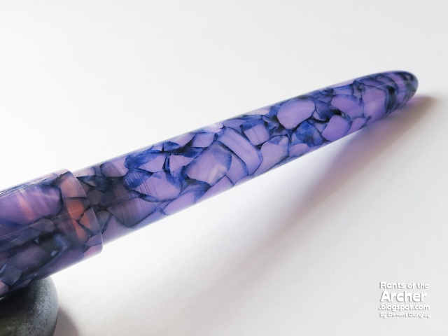
Many of my friends at Fountain Pen Network Philippines joined Laban's Write to Heal, a fountain pen grab bag project to help frontline health workers. I missed joining the two campaigns, so I had to get a Laban pen to know more about its brand and products. I saw that my friends got different pens from the Laban 325 Collection, so I chose the newest pen from the series: Wisteria, an exquisite fountain pen in ivory and purple acrylic resin inspired by the purple Wisteria flower.

Laban 325 Wisteria

Reading about the company, I learned that Taipei-based Laban Pen Corporation is a young pen brand, founded in 1981 by John Hu and his brother Charles. John started the company by exporting paper products, gifts, and writing instruments. The brothers then built their own manufacturing plant intending to produce the highest quality Silver and Rhodium-plated writing instruments. Laban's initial releases were high-end pens such as the 1993 Filigree line of metal overlay pens using a specialized etching process.

Through the years, Laban has successfully established itself as a major pen brand. From 1997 to 1999, the brand was the exclusive manufacturer of the Vatican Museum line of pens and received the Best Writing Instrument of 2004 from the Royal Academy of Arts of the United Kingdom. In 2011, Laban was the Reader’s Choice Award in Pen World Magazine. But the most notable personality to use a Laban pen is probably Pope Benedict XVI when he signed that book in 2009!

The Wisteria comes in a classy blue pull-out box lined with soft white satin. An orange ribbon and two overlapping elastic bands hold the pen in place inside the box. Together with the fountain pen, the box also contains an ink converter, a warranty booklet, and Laban logo and Wisteria stickers.

Inside the box: fountain pen, warranty booklet, bookmark, Laban logo, and Wisteria stickers.

The Laban Wisteria pen is inspired by the elegant purple Wisteria flowers, the noblest color in Japan's  Heian period when the color purple was associated with the ruling class. The Wisteria flower clusters also symbolize "predetermined driving force between people." 

Aside from the purple Wisteria, Laban's 325 Collection offers other beautiful finishes with the signature ivory acrylic and gold trims: Black Cambridge, Burgundy Cambridge, Flame (red), Ocean (blue), Sun (orange), and Forest (green). All of the 325 finishes are also available as rollerball pens.


Laban Wisteria is a beautiful fountain pen. The combination of purple marble, ivory resin, and gold trims is classy. It shows sophistication and elegance. I am glad I chose this finish over the Sun (orange) pen because it has given me a better appreciation of the color purple.


The 325 Wisteria fountain pen has the following measurements:
  • Length, capped: 5.9 in | 15 cm
  • Length, uncapped: 5.15 in | 13 cm
  • Length, cap posted: 6.8 in | 17.2 cm
  • Length, barrel only: 3.6 in | 9.14 cm
  • Length, section to nib: 2.15 in | 5.5 cm 
  • Length, cap: 2.7 inches | 6.9 cm
  • Diameter, barrel: 0.51 in | 1.29 cm
  • Diameter, section: 0.41 in | 1.04 cm
  • Weight, capped: 34 g | 1.2 oz
  • Weight, uncapped: 13.5 g | 0.48 oz
  • Weight, cap only: 22.5 g | 0.78 oz

The Wisteria is a heavy pen especially with the cap on. It's heavier than a Mont Blanc 149 (32 g), Tibaldi N°60 (28 g), or a Lamy 2000 (18 g). It can be used for writing with the cap posted, but it will be top-heavy, affecting one's writing comfort. Usually, posting makes pens uncomfortably long and top-heavy. Thankfully, the Wisteria can be used comfortably without the need to post the cap.

The Wisteria's cap, section + converter, and barrel.

The Laban 325's cap bears all the branding for this pen. The gold-plated clip is firm, sturdy, and holds the pen securely in place. Two slim gold bands sit on top of the clip, and a gold Laban medallion adorns the finial. Laban's logo is etched on the wide gold cap band. There's indeed a lot of gold in this pen's cap, but that's fine with me, I actually love it!

This cap bears most of this pen's branding in gold. 
Laban's logo is etched on the wide cap band.
The Laban 325 Wisteria has a threaded metal section and threaded metal insert in the barrel, which adds to its durability and stability.
The Wisteria fountain pen can be filled with ink using cartridges or converters. A converter is included with each pen purchase, and their logo is printed on the converter.

Laban offers the 325 Wisteria with a size 6 nib made from gold-plated stainless steel manufactured by Jowo in Germany. The nib widths available are the following: EF, F, M, B, 1.5 stub, 14K flex EF, and 14K flex F. The markings on the nib include "3952," Laban, "Germany" (place of nib manufacture), and "B" (nib width).

It took me a long time to figure out the meaning of "3952" on this pen's nib. Laban doesn't provide anything about it on their website, and I know it couldn't be the series name. Then I remembered that Platinum's use of 3776  refers to the elevation of Mount Fuji. So I did some research and looked for mountains in Taiwan that could have an elevation of 3,952 meters. I found it! 3952 comes from the elevation of Mount Yushan, the highest mountain in Taiwan, and the highest point in the western Pacific region outside of the Kamchatka Peninsula.

The No. 6 Broad nib on the Wisteria wrote smoothly out of the box.

The 325 Wisteria is a standard full-length fountain pen, sharing almost the same length as a Bexley Intrepid or Edison Collier, though it is heavier. Its middle section is as thick as the Intrepid and Collier, but it's a well-balanced pen that is comfortable to use.

The Laban 325 Wisteria shares the same length as a Bexley Intrepid or Edison Collier.
Uncapped, the Wisteria is shorter than the Intrepid and shares almost the same length as the Collier, TWSBI ECO, and Lamy Al-Star.
Gold-plated and two-toned gold nibs. From left: Bexley Intrepid (B), Edison Collier (B), Laban Wisteria (B), Dryad Pen (B), Platinum 3776 (B), and Conklin Duragraph™ (M).

To test how this beautiful purple fountain pen writes, I filled it with Lamy Dark Lilac, a matching purple ink. The pen wrote okay out of the box and I did not experience any hard starts, but I was not happy with it. I cleaned the pen and filled it with an old-time favorite purple ink, J. Herbin Poussière de Lune. It was a perfect match! I was in fountain pen writing heaven! With Poussière de Lune, the No. 6 broad nib wrote smoothly, there were no writing skips, no inky blobs, I had no trouble writing at all. I tested the pen and ink combination on several paper brands, and the best writing experience is (still) on Tomoe River paper. The Laban 325 Wisteria is such an enjoyable pen. It's elegant, classy, and one that can be used for long periods of writing without any discomfort.

The stainless steel Jowo Broad nib in Laban Wisteria fountain pen is a joy to write with, especially if it's paired with a wet ink such as J. Herbin Poussière de Lune. The nib just glides on the smooth Tomoe River paper. 

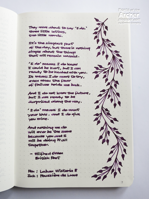
The Wisteria fountain pen can also be used to do ink art and simple shapes. I enjoyed doing the ink art on this page, along with this beautiful wedding poem by the English poet Wilfred Owen. I can't seem to explain it, but the moment I opened the box and saw the Wisteria fountain pen, I thought of a beautiful, romantic wedding. I felt like it's the perfect wedding pen! And for the review, I found the perfect wedding poem! Beautiful pen, lovely purple ink, meaningful love poem — it's a perfect combination!


I am very happy with the Laban 325 Wisteria fountain pen, and I recommend it to anyone who wants to explore and know this excellent brand from Taiwan. It's a beautiful pen and well-built for long-term use. Laban is dedicated to crafting excellent pens using only the best materials. Get one for your collection.


The Laban 325 Wisteria fountain pen is available at Laban.com where it retails for around US$140 (EF to 1.5 stub) to US$280 (14K Flex EF and 14K Flex F). Aside from the 325 Collection, Laban also offers the following collections: Abalone, Antique, Antique'II, Canyon, Flora, Galileo, Mento, Mother of Pearl, Pocket Pen, Rosa, Skeleton, Solar, and Taroko. Laban offers pens in different materials including aluminum, brass, abalone, mother of pearl, resin, and silver.

To learn more about Laban, where to buy their pens, and for other details on purchasing their pens, visit their website at https://www.laban.com/ or follow them on social media:

Monday, June 1, 2020

Pen and Ink Pairings: Lamy Safaris and Herbins


When Food Network was added to my cable TV subscription, one program became an instant favorite — Pairings with Andrea by Master Sommelier Andrea Immer. I was so mesmerized by Andrea's food and wine pairings and I looked forward to each episode. Pairings with Andrea taught me the concept of pairings not only for food and wine but also for writing and design. When I began doing lectures about data visualization and infographics, I taught my students about font pairings, color pairings, even data pairings. When I shifted to full fountain pen use, I created my own lists of ink and paper pairings, and later on, pen and ink pairings. I did these lists to remember which inks are suitable for specific pens and paper types considering ink consistency, flow, saturation; pen nibs and filling mechanisms; and paper thickness, composition, and coatings.

One Sunday afternoon in lockdown, an idea of new pairings came to me and I planned my first Pen and Ink Pairings for Rants of The Archer with two of my favorites: Lamy Safari fountain pens and J. Herbin inks.


Pens: 2019 Lamy Safari Pastel Collection

For the first time in 2019, Lamy launched three pens as the year's Special Edition Safari. The Lamy Safari pastel collection included Powder Rose, Blue Macaron, and Mint Glaze. The pens in the pastel collection looked very pleasing. After Lamy's dark phase for the Safari in the previous three years, the pastel pens looked refreshing and youthful. All three pastel pens have chrome clips and stainless steel nibs and had the classic Lamy Safari glossy finish made from sturdy ABS plastic. The Safaris can be filled using ink cartridges or converters, and the nibs on these pens are interchangeable which is very useful. A timeless and iconic fountain pen, the Lamy Safari is available in a wide variety of colors.

2019 Lamy Safari fountain pens, from top: Powder Rose, Blue Macaron, and Mint Glaze.


Inks: J. Herbin "The Jewel of Inks" Series

My shift to full fountain pen use in 2008 came with other passions in the form of inks and paper. Back then, the only ink available in the country was Parker Quink. I was content with Quink Blue Black for a while, but when I saw a rich, deep, pink-red ink in a blog review, I was smitten. J. Herbin Rouge Opéra, a reminder of Spanish flamenco, became my first ink love and led me to more ink colors and reviews in this blog. 

J. Herbin is the oldest name in pen inks in the world. "The Jewel of Inks" was first created in Paris in 1700, using formulas that the sailor J. Herbin found in his many journeys to India. The inks in this series are safe as they are water-based, non-toxic, and pH neutral. They are available in 35 beautiful colors, manufactured using all-natural dyes. J. Herbin's "The Jewel of Inks" series are available in universal snap-in cartridges and 30ml "D" bottles, and a selection of colors in 10ml and 100ml bottles.

J. Herbin "The Jewel of Inks:" Rouille d'Ancre, Vert Pré, and Diabolo Menthe.
Pastels Pairings.


Pen and Ink Pairings No. 1: Lamy Safari Powder Rose and J. Herbin Rouille d'Ancre

Lamy Safari Powder Rose is one of the three special edition pens for 2019. This pen's soft pastel pink color in a glossy finish is soothing and calming. It has the Safari oversized stainless steel clip and ergonomically-shaped grip. Details of the Safari Powder Rose including the cap button and spacer ring are matched to the body color. Powder Rose is not Lamy's first pink Safari pen, though. Back in 2009, one of Lamy's Limited Edition Safari colors was pink, and the Neon Coral Safari was the 2014 special edition pen.

Lamy Safari Powder Rose, one of three special edition Safari pens for 2019.
Lamy Safari Powder Rose and J. Herbin Rouille d'Ancre

Rouille d'Ancre (Rust of the Anchor or Rusty Anchor Red) is reminiscent of J. Herbin's journey and his sea travels. This color is derived from the rust found on the anchor of the boats when moored in one location for a very long time. I chose this ink for the Powder Rose Safari because of the similarity in their colors. Rouille d'Ancre is a unique ink color. It's very light when wet, but dries as a lovely matte dusky pink that is very close to old rose. This pink ink has a good amount of shading which is best seen in a wet pen. It's a bit dry, though, but the generous flow of the Safari's medium nib made writing with Rouille d'Ancre a wonderful experience.

J. Herbin Rouille d'Ancre


Pen and Ink Pairings No. 2: Lamy Safari Blue Macaron and J. Herbin Diabolo Menthe

Blue Macaron is the second of three special edition Lamy Safari pens for 2019. This pen's light blue color in a glossy finish looks so refreshing. It also has the Safari oversized stainless steel clip and ergonomically-shaped grip. Unlike the Powder Rose Safari, details of the Blue Macaron such as cap button and spacer ring are darker and not matched to the pen's body color. Blue Macaron is not Lamy's first light blue Safari pen, though. In 2011, the first Aquamarine Safari was the limited edition pen color.

Lamy Safari Blue Macaron, one of three special edition Safari pens for 2019.
Lamy Safari Blue Macaron and J. Herbin Diabolo Menthe

Diabolo Menthe's (Lemonade Mint Cordial, or Mint Lemonade) name and color come from a popular non-alcoholic Frech drink made of peppermint syrup and club soda. This cool and refreshing ink color reminds me of summer and the blue and clear waters of the beaches in Boracay, Anilao, and Puerto Galera. I chose Diabolo Menthe for Blue Macaron because they're the perfect color match. It's a cool ink color with excellent flow. It's very light while wet, but dries a beautiful bright cyan with visible green tones with fantastic shading. Because this ink has a light color that remains translucent even after it dries, it's great for highlighting! I used to fill my Rotring Artpen with a 2.3 italic nib with Diabolo Menthe and used it as one of my highlighters. Diabolo Menthe is a beautiful ink color but it has a low tolerance to moisture and is not waterproof.

J. Herbin Diabolo Menthe


Pen and Ink Pairings No. 3: Lamy Safari Mint Glaze and J. Herbin Vert Pré

Mint Glaze is the third of three special edition Lamy Safari pens for 2019. This pen's subdued light green color in the classic glossy Safari finish looks very cool and refreshing. This pen's color is mint, but it looks so much like a creamy avocado shake to me! Similar to the Powder Rose pen, details of the Mint Glaze such as cap button and spacer ring are matched to the pen's body color. Mint Glaze is not the first green Lamy Safari, it joined four other green pens: Savanna Green, Lime (2008), Green (2012), and Neon Lime (2015).

Lamy Safari Mint Glaze, one of three special edition Safari pens for 2019.
Lamy Safari Mint Glaze and J. Herbin Vert Pré

Vert Pré (Green Meadow or Green Prairie) is a fresh green ink that's as fresh as the spring season, the color of the meadow or prairie, and the new grass growing right after the end of winter. Green is a secondary color made from blue and yellow, and Vert Pré's green has more yellow, giving it a fresh and soothing look. Despite its light color, this green ink has fantastic shading that's more noticeable when used in a wide nib. It's wetter than most J. Herbin inks but dries fast. Similar to Diabolo Menthe, Vert Pré remains translucent even after it has dried, so it can also be used for highlighting or underscoring. I chose Vert Pré for Mint Glaze because they're the perfect pen and ink color combination.

J. Herbin Vert Pré

I love doing pen and ink pairings! I had so much fun planning for this review, looking for inks to match the 2019 Lamy Safari fountain pens, and rediscovering some inks that I haven't used in a long time. I hope to do more pen and ink pairings in the future, and perhaps do other pairings, too! Watch out for more pairings here at Rants of the Archer!


Lamy Safari pens are widely available in reputable pen sellers worldwide. For a global search of Lamy sellers worldwide, follow this link. In the Philippines, Lamy pens are available from Times Trading Company, through their increasing number of kiosks at National Bookstore outlets around the country. 

J. Herbin inks are also widely available worldwide through their accredited retailers, listed here. In the Philippines, J. Herbin inks are available from Scribe.ph and Everything Calligraphy.

Friday, March 17, 2017

Fountain Pen Inks Review: J. Herbin 1670 Anniversary Ink Bleu Ocean


In September 2012, two years after the successful launch of the revolutionary ink Rouge Hematite, J. Herbin introduced their second limited edition 1670 Anniversary Ink, Bleu Ocean. This deep blue ink was created to celebrate the adventurous sea voyages of J. Herbin to the Mughal (Mogul) Empire of India, the world's earliest center of production and processing of indigo dye during the time.

After Bleu Ocean, three more inks have been added to the 1670 Anniversary line — Stormy Grey, Emeraude de Chivor, and Caroube de Chypre — all with gold flecks and reminiscent of J. Herbin's experiences during his voyages.

I received a bottle of Bleu Ocean a couple of months after its launch, but I was unable to write a full review for a couple of reasons. The reformulated Bleu Ocean with gold flecks was launched in April 2015, replacing the previous ink without flecks. Now that I have samples of both, it's time for a review!

Two of the same: Bleu Ocean without gold flecks (left), and Bleu Ocean with gold flecks (right).


As a blue ink fanatic, Bleu Ocean has been one of my favorites. It's the only ink I use in my Ocean Blue Lamy AL-star, because their colors (and names) match. I can write with it for legal documents, journaling, calligraphy, and notetaking. When this ink was launched in 2012, J. Herbin followers were not happy with it. Its predecessor, Rouge Hematite, had a successful launch and fans raved about its color and the gold flecks in it. After the announcement for Blue Ocean's release, most people (okay, that included me) expected the ink to have silver flecks — as a follow up to Rouge Hematite, and to match the bottle's silver cord and wax seal as well. When it came out without the flecks, people were disappointed, and branded Bleu Ocean as "just another blue ink."

See the gold flecks in the bottle's opening? Cool! The 1670 bottle has a unique design, but it has a smaller opening than most other ink bottles. Filling big pens requires the help of a pipette or syringe. 


Flecks or no flecks, I love Bleu Ocean. Like its four siblings in the 1670 Anniversary line, it's a collector's item. The box design represents the life of J. Herbin as a French sailor. The 1670 bottle, despite the narrow opening, is lovely. The silver cord, wax seal, and waxed cap are beautiful, making every 1670 box and bottle true collector's items.

Gold flecks at the bottle's bottom.
The 1670 Anniversary inks box represents the life of J. Herbin as a sailor and his voyages to different places.


Although unconfirmed by J. Herbin, the blue color of Bleu Ocean seems to be derived from indigo dye, a natural plant-derived dye with a distinctive blue color. Once considered by the Greeks and the Romans as a luxury product, indigo dye is the color that is often associated with blue jeans.

To test the inks, I wrote on Tomoe River Paper using Lamy Safari and AL-star fountain pens, both with 1.1 nibs. 


Bleu Ocean reminds me of indigo Mediterranean tiles and the blue and white houses in Santorini. This exquisite ink also reminds me of both Van Gogh and Picasso and the depth and poignancy of their work. Van Gogh's Irises and Starry Night; Picasso's The Old Guitarist and The Blue Room.

Bleu Ocean evokes memories from years ago when I used to associate dark blue color with dusk and twilight and their accompanying sounds: crickets chirping, newscast on TV, my mother cooking dinner, our dog snoring, my brothers' banter.

Bleu Ocean has a dark, rich, deep blue color with soft hints of purple. It is a versatile fountain pen ink, and goes from bright purplish blue (Eclat de Saphir) to a dark, almost blue-black shade (Blue Nuit). It is more saturated than most J. Herbin inks, but flows smoothly, and can be cleaned off pen parts very easily. Fortunately, it dries faster than Rouge Hematite, and does not show any of the ugly nib creep in the fountain pens that I have inked with it.
A swab of Bleu Ocean without gold flecks. 
These ink drops took almost an hour to dry. I got this almost blue-black shade in my previous fills of Bleu Ocean in pens with broad, wet nibs.
Dark Bleu Ocean with sheen up close. Do you see this blue in Picasso's The Old Guitarist? I do.


Bleu Ocean with gold flecks was launched in 2015.

These ink drops took longer to dry than the ones without the flecks.

It's a thrill to see the gold flecks up close!


Because Bleu Ocean is a highly saturated ink, it takes longer to dry, around 8-10 seconds more than the regular Herbin inks, depending on the nib and paper. On Rhodia and Tomoe River Paper, it takes a bit longer to dry. It can be prone to smudging and is not water resistant.

It's a big help for fountain pen users to be able to clean their pens easily. Both inks are easy to clean off nibs and feeds of the two pens I used in this review, but I had a hard time taking off the gold flecks in the Lamy Z24 converter that I ended up disassembling it for a full cleanup.

Gold flecks and shading in my writing sample.
Bleu Ocean in Ocean Blue and Blue. Blue on blue.


If you use fountain pens regularly like I do, if you like J. Herbin inks, and if you have any of the 1670 Anniversary inks, I recommend getting a bottle of Bleu Ocean. Make this ink a part of your collection! The one without gold flecks has been out of production already, but the one with gold flecks is a versatile ink with beautiful shading and shimmer. Get one in your ink collection now! 


Both bottles of 1670 J. Herbin Anniversary Ink Bleu Ocean are from Exaclair USA, through the kindness of Karen Doherty, Marketing VP. 

The Tomoe River paper is from Scribe Writing Essentials, the leading distributor of fine writing instruments, specialty paper including Rhodia; fountain pen inks, including J. Herbin; and other fountain pen related accessories in the Philippines. 

J. Herbin products are widely available worldwide. For a list of authorized retailers, visit the J. Herbin website.