Showing posts with label ink review. Show all posts

Monday, February 14, 2022

Fountain Pen Ink Review: Wearingeul Dr. Jekyll to Mr. Hyde


I may have skipped reading Robert Louis Stevenson's Strange Case of Jekyll and Hyde in my high school and college English classes, but they later caught up with me—twice! The first time was in 1998 when I saw Julia Roberts playing Mary Reilly with John Malkovich as Dr. Henry Jekyll/Edward Hyde. I loved that film. John Malcovich was superb, and young Julia Roberts was impeccable. 

The second time Stevenson's story caught up with me was in December 2021 when I came upon Wearingeul, a new brand of fountain pen ink from South Korea. Wearingeul has an impressive selection of standard, sheening, and shimmering fountain pen inks with interesting literary inspiration, including a two-bottle set called Jekyll to Hyde.  Jekyll to Hyde Fountain Pen ink set is an expression of the "good and evil separation experiment" carried out by Dr. Henry Jekyll in Stevenson's story. The Wearingeul set has a DIY setup that allows the user to make Hyde by injecting a conversion solution into one of the two ink bottles.

Wearingeul Jekyll to Hyde fountain pen ink set.

Jekyll to Hyde is an ink set that includes two bottles of ink, a conversion solution, and a syringe. The two inks, Henry Jekyll and Edward Hyde are presented in 30ml bottles. A 6ml conversion solution in deep purple for the ink DIY is also in the box and the instruction card notes that it should not be used with other fountain pen inks. I was hesitant to mix the ink and conversion solution at first, but I realized that it was fairly easy. See how I did it in the photos below.

The Jekyll to Hyde ink set includes two bottles of ink (Henry Jekyll and Edward Hyde), a conversion solution, a syringe, ink swatch cards, and an instruction card.
Two inks, conversion solution, and syringe with blunt end needle.
Mixing the Henry Jekyll ink and the conversion solution using the syringe supplied in the box. I think it's also possible to just pour the conversion solution into the ink bottle.
Once the conversion solution is poured into the ink bottle, give it a gentle shake to fully mix them together.
From Jekyll to Hyde — the ink is now mixed, it's time to reveal Edward Hyde!
The two inks in the set: Henry Jekyll and Edward Hyde.

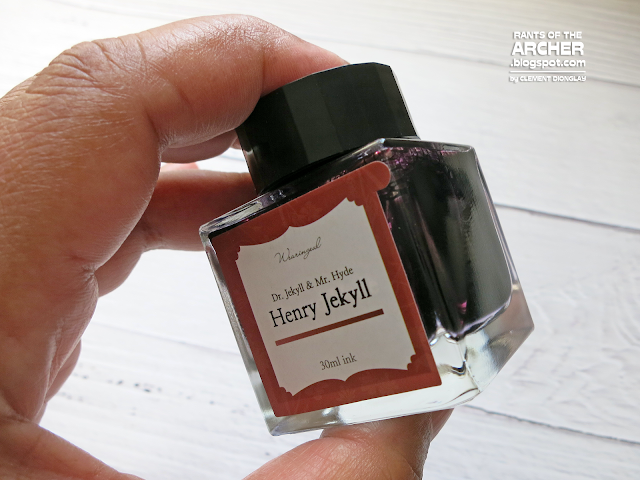
Henry Jekyll

Henry Jekyll is a toned-down deep red ink inspired by the gentle and calm character of its namesake, Dr. Henry Jekyll from Stevenson's story. Wearingeul says that this red ink focuses on the co-existence of good and evil that exist within the gentle and idealistic character of Dr. Henry Jekyll who is not a completely good figure. This blush-red ink looks like a darker version of J. Herbin Rouge Opera or a lighter version of Diamine Syrah, more of a deepened red with a pinkish undertone. It has medium saturation and excellent flow. In wider and wet nibs, Henry Jekyll shows off some nice shading.

Wearingeul Henry Jekyll is a toned-down deep red ink.
Henry Jekyll looks closer in color to J. Herbin Rouge Opera and Diamine Syrah.
I used a Leonardo Momento Magico on Jaquere Reservoir Note to test Henry Jekyll. This red ink has moderate saturation and writes well with excellent flow. 

Edward Hyde

Edward Hyde is the DIY part of this ink set. It starts out as Henry Jekyll and turns into Hyde with the addition of the conversion solution. Edward Hyde is a thick, dark purple ink with a green sheen. Wearingeul says that this ink expresses the evilness of the character as well as the mysterious, dark, and gloomy sentiment. This dark purple ink looks closer to Laban Greek Mythology Zeus Purple and J. Herbin Poussiere de Lune. Similar to Henry Jekyll, this ink has medium saturation and excellent flow. It's also a shading ink, especially when used in wide, wet nibs.

Wearingeul Edward Hyde is a thick, dark purple ink with a green sheen.
Edward Hyde looks like a darker version of two popular purple inks, Laban Zeus Purple and J. Herbin Poussiere de Lune.
I used my Esterbrook Estie Lilac with a Journaler nib on Jaquere Reservoir Note to test Edward Hyde. This purple ink has medium saturation and writes well with excellent flow. 


I enjoyed testing Henry Jekyll and Edward Hyde. They are unique ink colors with fascinating backgrounds and inspiration. They have excellent flow and write well in different nibs. Jekyll to Hyde ink set is a great addition to a fountain pen user's ink collection. Get your set now! 


Rants of The Archer thanks Wearingeul for providing the Jekyll to Hyde fountain pen ink and Jaquere Reservoir notebook in this review. To learn more about Wearingeul and its ink offerings, visit their website or follow them on Instagram (https://www.instagram.com/wearingeul/).

Monday, February 1, 2021

Fountain Pen Ink Review: Scribe x Troublemaker Inks Pawikan


Oh, they did it again! It's the beginning of the year, our favorite pen store has just launched a new limited edition ink, and we are all excited about it. Our "ink inner peace" is officially disturbed. After the successful launch of Butanding ink in October last year, ScribePh has partnered with Cebu-based Troublemaker Inks once again for a new limited edition ink, Pawikan (sea turtle). This collaboration also includes JIM Weaver, a local shop selling scarves and reusable masks. The Scribe x TMKR Inks x JIM Weaver project is inspired by Scribe's "support local businesses" initiative and the set is proudly made in the Philippines.

The Pawikan project, another of Scribe.ph's Support Local initiatives bring us the Scribe x TMKR Inks x JIM Weaver Pawikan Set that includes a limited edition Troublemaker Pawikan fountain ink and JIM Weaver Pawikan reusable face mask.


JIM Weaver is a business in the Philippines led by four women who share the same passion to make art wearable through fashion. Their products range from silk scarves to reusable/reversible masks. The reusable mask in this limited edition set is again very timely as wearing face masks in public is now a mandatory practice in the Philippines. Called "Pawikan," the mask is an original JIM Weaver design by Isabelle Ocier in an exclusive colorway that matches the olive green Pawikan ink.

Limited edition Scribe x Troublemaker Inks Pawikan fountain pen ink.
JIM Weaver's "Pawikan" mask is an original design and exclusive colorway that matches Pawikan ink.

Pawikan is my second Troublemaker ink after Butanding. This shading ink, inspired by the sea turtle, is dark green when wet and dries a charming combination of light olive green, some bluish-green, brown, and orange. Pawikan, like Butanding, is a wet ink with excellent flow and consistency. I'm also happy to report that it does not stain or clog pens.

Pawikan is a charming shading ink with a combination of light olive green, some bluish-green, brown, and orange.
I do not have any similar ink colors, but Vinta Inks Serena is close to Pawikan, while the other ink colors in this sampler are darker.
Pawikan sample from a Lamy Al-star with a 1.1 nib. It took around 25-30 seconds to dry, but ink drying times vary depending on nib wetness, paper quality, and hand stroke. Pawikan could have dried faster if it was written using a fine or medium nib.
In my writing sample, Pawikan's beautiful shading is seen in the Canson 90gsm sketchbook paper. I tried Pawikan on Tomoe River Paper, Traveler's Notebook, and other 160gsm paper sheets, but it was in this Canson sketchpad that the shading is very prominent.
Pawikan's shading is prominent in wider and wet nibs. This writing sample was written using a Lamy Al-star with 1.1 nib.
Pawikan looks good in wider nibs. It only appears as dark green ink in the EF and F nibs, but the shading showed in wider nibs.
Project Pawikan is an excellent example of brands working together to produce something beautiful and meaningful amidst these trying times.

Pawikan is a beautiful fountain pen ink and an excellent product from a collaboration of local brands. It's a unique shading ink and a must-have in one's ink collection. This lovely green ink is available for a short period of time only, so get one for your pens now!


Rants of The Archer thanks Scribe for providing the fountain pen ink in this review. Visit the ScribePh website to learn more about their products, promos, and new brand offerings. ScribePh now offers worldwide shipping. Follow them on social media:

Wednesday, November 28, 2018

Fountain Pen Ink Review: Honest Ink Ultramehrine

Honest Ink Ultramehrine by Straits Pen

Last October, our local fountain pen group, Fountain Pen Network Philippines, organized the first-ever Manila Fountain Pen Show. Members of the group, guests, and local sellers of fountain pens and related products were present during the much anticipated one-day fountain pen show. Straits Pen, a company from Singapore was also at the show with their store-exclusive inks, notebooks, and fountain pens. Straits Pen produced the Manila Fountain Pen Show's special edition exclusive ink, Manila Copper.

I was excited to visit Straits Pen's table at the show because of their blue inks. I wanted to get their store-exclusive Noodler's ink Blue Straits of Malacca and the newly-launched Honest Ink Poorman's Sapphire. I was only able to get Poorman's Sapphire because Blue Straits of Malacca was already sold out. But Ng Lip Sing and the Straits Pen group offered me a bottle of a still-unreleased Honest Ink for review.

I appreciate details such as this one. Most of us throw away the boxes that our ink bottles came with, not knowing that the box helps prevent the ink from fading due to exposure to bright light and heat.

Straits Pen's Honest Ink is a very young ink brand. The ink series is the company's significant move to becoming a manufacturer from being a distributor and reseller of fountain pen inks. Most ink manufacturers are from other parts of the world, and Southeast Asia seemed poorly represented. As a Singapore-based maker, Straits Pen wishes to bring colors and approaches to the market that people from the region would recognize as being from their "neck of the woods." The ink colors' names such as Bougainvillea Purple is a message to the world that Straits Pen is part of a wave of makers that are embracing their own traditions and bringing Southeast Asia to the world.

Not even a year old, the first season of four ink colors was launched in August, during the San Francisco International Pen Show for the US market. The batch includes Poorman's Sapphire, Shitty Sepia, Sad Stormy Swedish Sea, and Happy Accident Lilac. The inks were again launched twice in Japan at the Tokyo International Pen Show and at Itoya's INK.ink.ink! event in September. In October, Honest Ink was launched in the Philippines at the Manila Fountain Pen Show.

Honest Ink is still young, yet the second batch of four new colors is already awaiting their launch. One of the colors in the second batch is Ultramehrine, and the Straits Pen group is thinking of a launch during the Singapore Fountain Pen Lovers Pen Show in 2019. While Honest Ink has been released in different places already, it has not been introduced formally to the local fountain pen community in Singapore. The upcoming pen show in Singapore is the perfect opportunity to launch the inks. The group will also launch the second batch of Honest Ink at the next San Francisco International Pen Show.
Honest Ink comes in a simple no-fuss bottle with a simple no-fuss label.

Ultramehrine is a deep, dark blue fountain pen ink with purple tones. This ink has moderate flow and excellent shading (see writing and calligraphy samples below) which is very visible when used in fountain pen-friendly paper such as our local Victory notebooks. Ultramehrine is not waterproof, however, but it doesn't stain, and I was able to easily clean it off a Lamy Al-star which was used in my writing samples.

The people at Straits Pen named their inks Honest Ink because these inks reflect the reputation that the group has made over the years. They believe in selling honestly, and in telling people the truth about the products they sell. They do not only tell customers about the upsides of a product, but they reveal the bad points as well -- which is evident in the story behind the name Ultramehrine.

According to the group, they wanted an ultramarine ink color, but initial tests were underwhelming --  the color was a subdued dark blue rather than the brilliant ultramarine blue that they want. The resulting color was still a good dark blue, and they decided to use it, even though they felt the ink was 'meh.' And this is how the name UltraMEHrine was created.
Swatches of Honest Ink Ultramehrine.

I love blue inks, and I had so much fun testing this ink (See the tips I used in swabbing inks for this review.). I like using fountain pen inks which surprise me and Ultramehrine did. In the ink swatches above -- details below -- the single layer/single pass swatch is already a nice handsome blue, but note that the double layers swatch is not only significantly darker, it has a distinct poignant character, and I'm thrilled that this same depth is what I see in my writing samples from a 1.1 Lamy nib.

Ultramehrine up close, single layer/single pass. It's a nice, handsome blue ink!
Two layers of Ultramehrine give us a poignant, dramatic dark blue ink.
I'd love to use this ink in my journal entries!
Ultramehrine's drying time. From a Lamy 1.1 nib on Victory paper, it took 12-13 seconds to dry.

I have a wide selection of blue fountain pen inks, including some dark blues which are similar to Ultramehrine. I find Ultramehrine to be very close to Noodler's Midnight Blue, Diamine Sargasso Sea, and Rober Oster Midnight Sapphire. All these inks are beautiful dark blues, but I have stopped using the heavily saturated Sargasso Sea after it stained a converter. Ultramehrine is a dark blue ink but it's not heavily saturated at all and has not stained the two fountain pens I have inked with it.

Honest Ink Ultramehrine is very close to Noodler's Midnight Blue and Diamine Sargasso Sea.
Among the Robert Oster inks that I have, I find Ultramehrine to be closest to Midnight Sapphie.
Here's a (long) writing sample of Honest Ink Ultramehrine. I wrote this using a Lamy Al-star with 1.1 nib on local Victory notebook. 

I love shading inks, and I'll take shading over shimmer or sheen anytime. But, does Ultramehrine fountain pen ink shade? I tried this ink using 1.1 and 1.5 Lamy italic nibs to see its shading, and I was not disappointed. Ultramehrine is a shading ink, and when I tried it using the 1.5 Lamy nib for italic calligraphy, the ink color became more dramatic and meaningful.

It's confirmed. Ultramehrine is a shading ink!
This is Ultramehrine in italic calligraphy using a Lamy 1.5 nib. Excellent shading, beautiful color.

Ultramehrine is a blue ink that every fountain pen user should have. It's a versatile dark blue that is suitable for business or art purposes, or even for daily journaling and notetaking. It doesn't stain so I'm sure it won't clog pens. Overall, it's a joy to write with.

Right now, we don't see the Honest Ink selection in the Straits Pen website. The group said they cannot put it on the website yet because they do not have enough bottles to sell at the moment. Well, I think they should hurry up. These inks are sure to fly off the shelves fast as soon as they become available online.

After my week-long visit in 2011, Singapore became a special place for me. That visit opened my eyes to new horizons, new opportunities, and to more knowledge about the world. Singapore is even more special to me now because of Straits Pen and Honest Ink.


----------
I received the ink in this review for review purposes at no cost from the Straits Pen group during the Manila Fountain Pen Show in October. The Honest Ink selection is available for purchase at Straits Pen in Singapore. Their office is located at Office Block 212 Hougang Street 21 #04-349 Singapore 530212.

Monday, October 29, 2018

Fountain Pen Ink Review: Pelikan Edelstein Olivine


As a regular fountain pen user and collector, I join hundreds of enthusiasts from around the world in our watch not only for new pens but also for new fountain pen ink colors. I eagerly wait for announcements of special edition pens, limited edition inks, new notebooks, and their ETAs to the far east where I live.

This year, Pelikan of Germany has added a new color to their Edelstein ink series. Edelstein Olivine is Pelikan's Ink of the Year for 2018, the seventh ink to be named such. Ink of Year colors includes Turmaline, Amber, Garnet, Amethyst, Aquamarine, and Smoky Quartz. The Edelstein ink collection also includes eight more colors: Onyx, Tanzanite, Sapphire, Topaz, Jade, Aventurine, Mandarin, and Ruby. Olivine, as well as the other Edelstein Ink of the Year colors, are limited and available for the current year only, and I'm so happy that Scribe.ph has kindly sent a bottle for this review.

Pelikan has a wide collection of fountain inks from its three series: 4001 inks, Fount India, and Edelstein. Edelstein is the German and Norwegian word for "gemstones". These higher-end inks from Pelikan correspond to the beautiful colors of gemstones and contain a special ingredient to ensure extra smooth writing.

Edelstein inks are presented in a unique 50 ml high-value glass flacon. The Edelstein flacon is an elegant rectangular glass bottle with a thick base and wide opening for easier ink filling. An eye candy, the flacon's design is one of a kind, and one of the most elegant ink bottles available in the market today.

Edelstein inks are presented in an elegant 50 ml glass flacon.

The Edelstein flacon has an equally elegant cap with the Pelikan logo embossed in silver. 

The flacon's wide opening makes ink filling easier, and it can accommodate bigger pens.

Olivine is a deep, dark green ink that looks more like a forest green color than olive. This color confusion bothered me for a while. Don't be surprised about the color, though. According to The Pelikan's Perch, this ink actually got its name from a gemstone with a typical olive-green color derived from traces of nickel. The mineral also takes on a reddish color, thought to be a result of iron oxidation. There it is. Edelstein Olivine got its name from a gemstone, not from olives.

A single pass/swab of Olivine. This ink is truly versatile. It can be deep and dark, but it can also be light and dramatic.

Double passes/swabs of Olivine shows a dark green ink, but also reveals a faint reddish sheen where the ink pooled before it dried.

I do not have many greens in my ink collection to compare Olivine with, but here is a side-by-side comparison with Diamine POGI, an Olive Green ink specially mixed for the Philippine market.

Pelikan Edelstein ink writing sample from a Pelikan M400 with a broad nib. It took a while to dry at 23 seconds, but ink drying times vary depending on nib wetness, paper quality, and the writer's hand stroke. Olivine could dry faster if written using a fine or medium nib.

Here is Olivine from a Bexley Intrepid with an extremely wet stub nib. It looks like a very dark green-black ink with no shading at all.

Shading is seen in most Edelstein inks but this -- like its drying time -- depends on a combination of factors: nib wetness, paper quality, and the writer's hand stroke. I tested Olivine in pens with wet broad and stub nibs. The writing samples from these nibs looked almost green-black after the ink dried. These are seen in the two photos above. However, when I tried Olivine in a wide 1.5 italic Lamy nib, shading was more obvious, and the ink color became more dramatic and meaningful.


Edelstein Olivine from a 1.5 Lamy nib on Pukka notebook paper. 

Lastly, let me add that Pelikan's packaging for their Eldestein inks is truly impressive, and possibly one of the best. The flacon has inner and outer boxes to ensure that the glass has full protection whether it's in transit or in storage. The flacon and its box both bear the ink's color, making it easy to find an ink you are looking for.

It is helpful that Pelikan includes the ink's name not only on the flacon (see images above) but also on their specific boxes. Locating inks is faster and easier with box labels.

The Edelstein flacon is first encased in an inner box, while the outer box provides additional protection.

Thick pads are added around the cap for reinforced protection. As I said, this packaging is impressive.

Olivine came out of Pelikan's 2016 social media contest which allowed fans to choose the 2018 Edelstein Ink of the Year. An entry for a dark green ink eventually won over 1,200 suggestions sent to Pelikan, which fans all over the world now enjoy. "Created and voted by Pelikan-fans for Pelikan-fans," Edelstein Olivine is a must-have ink color for anyone who loves to write with a fountain pen. This ink has a beautiful dark green color, produces excellent shading, and comes in an impressive and elegant packaging. If I were you, I'd get a bottle of Olivine now, because when it's gone, it's gone!

----------
I received the ink in this review at no cost from Scribe.ph, Pelikan's authorized and exclusive distributor in the Philippines. Pelikan products including Edelstein inks are exclusively available at Scribe.ph, a specialty store in the Philippines selling fountain pens, inks, paper products, and calligraphy supplies. Scribe.ph has stores in Eastwood Mall, Shangrila Plaza Mall, Glorietta 4, SM Aura Premiere, SM Megamall, SM Cebu, and Ayala Mall Cebu. For their complete location/address, contact numbers, and store hours, click here.