Showing posts with label Scribe Writing Essentials. Show all posts

Monday, January 8, 2018

5 Questions with Patrick Ng

Patrick Ng has been my Traveler's Notebook hero for the longest time. In my mind, Traveler’s Notebook is Patrick Ng, and Patrick Ng is Traveler’s Notebook. It’s almost impossible to think of TN without Patrick. It was through Patrick that I discovered the joys and functionality of the TN, and for years, I have followed his TN adventures through his blog Scription, and I have been a fan since 2009. I have followed him in his travels, and read and reread every single TN post, hack, and DIY that he published. I even made a faux TN using board paper as cover, patterned after his "Pozor" passport TN. (TN was not sold in the Philippines until 2011.) For a while, I used the Chronodex, Patrick’s GTD creation that fits a regular TN.

Through the years, I communicated with Patrick a few times though email. We have not met in person, and a visit to Hong Kong was not in my immediate travel plans. Fast forward to August 2017. In a conversation with Sharon Mae Santos of Scribe Writing Essentials, we thought of inviting Patrick to a TN Meet in Manila that was scheduled in September. I then mentioned the invitation to Patrick, and in a few days, his Manila TN journey became a mind-boggling reality!

In September, Patrick visited the country for the first grand Traveler's Notebook Meet in Manila. Patrick delivered his signature TN Talk, and shared his 12 years of TN journey to more than 100 TN users in attendance. At lunch, it was hard to believe but I was fortunate to be seated next to him! I was a little shy, but I asked him a few questions, five of which are published here.


How did your partnership with Traveler's Company start?

Patrick: When I picked up the job as a buyer in city’super/LOG-ON in 2003, I started to learn more about Midori’s products and people, trying to promote their new product ranges one after another. It is one of the most outgoing Japanese companies I’ve ever worked with and I was particularly impressed by their president’s determination to take the company to the next stage, which was to incorporate higher design philosophy into their brands and products, thus the name Designphil was created.

“Pozor,” Patrick’s Midori passport-sized Traveler’s Notebook.

In 2005, during a trade show in Japan, they were exhibiting in their booth dozens of ideas from designers. Each guest had three votes to cast on their favorite. Traveler’s Notebook was one of them, I casted two votes to it and eventually, it won second place in the campaign. The next year they shipped the products. I got one of the earliest samples to use and was being asked to give feedback to the team.

I was a die-hard Moleskine user back then, however as the company grew bigger and being acquired by different venture capitalists, I felt like losing touch with the brand and doubted their authenticity. While Traveler’s Notebook was selling in our stores, one interesting fact was that customers kept asking if they could buy the sample notebook on display, the leather covers were battered and scratched, yet somehow people would love to buy such samples instead of getting a new one. I did personal leather craft projects once in a while so I knew how people fell in love with something personal like TN. I gradually started using TN to replace my Moleskine and because of this, I asked the Japan team a lot of questions. 

Patrick with TN users during the Manila TN Meet in September 2017. 
During the Meet at SM Aura, Manila broke the record for most TNs in a meet with 114 TNs!!!

What was the concept behind it? Who actually proposed the idea? How did they expect customers to use it? Things like that. Sooner or later, I became a person knowing a little bit more here and there, the team also accepted my opinion both as stationery buyer and user. I created campaigns called “Travel Photo Cafe” to mix product categories such as leather craft, photography, biking, vintage decorations, and others for store display. I also created workshops inviting “travelers” who had different experiences from their professions to share with other users. So over the past 10 years, all these little efforts evolved into today’s Facebook user group, gatherings, and special editions.

That’s how I got close to both customers and the design team, the authenticity is impeccable and I enjoy so much being part of the collective minds to influence the next campaigns.


What does it take to be a TN ambassador?

Patrick: There is no such thing, officially. I guess it was because of my outgoing nature on social media, I was giving out tips and creative ideas quite often and that’s how people recognize me as “the” Patrick Ng, who’s somehow related to TN but never quite know who I am. Honestly, as the user community is now pretty global, the TRC team is probably observing if there are other users they can connect to in various countries/cities. Maybe one day the network of ambassadors will come true.

Left: Patrick giving his signature TN journey talk.
Right: Patrick’s luggage that has toured the world with him.

How many TNs do you own and how many do you actually use?

Patrick: I guess I have 16-20 TNs, regular and passport size included. I don’t like to own but not using them, so I use them alternately, my favorites are regular size Camel, Olive, Blue, and the original Brown. I would change the cover every few months and have fun color coordinate my tools around the chosen one. Sometimes by doing so, inspirations come, that’s why you would see me posting new customization ideas once in a while. I don’t use passport size at all. Some of the TNs I own were gifts from artists who did something to the notebooks, while special editions like Tokyo Station I do try to collect but as I say I would use them instead of just for collection. My recent adventure was to paint my unused brown notebook with white silk screen printing ink and let it scratch to reveal the brown beneath as I continue to use. I love the effect and have been pairing it with white pen, white tag, etc. I’m still looking for a lovely white charm and thinking of how to make a white pen loop. See, that’s a lot of fun!

Some of Patrick’s TNs that he brought with him to Manila. Also in the photo are two Manual Factory bears -- a first generation and a more recent one.


Patrick’s brown TN that he painted white.

Why did the Traveler's Company shift from Midori to Traveler's Notebook?

Patrick: Designphil is the mothership, they have corporate services, distribution business and stationery business. Midori name is that stationery business. Traveler’s Notebook was a stationery product range only and it was under Midori. As the brand grew, with their own retail shop, sales channels, and overseas projects, it was decided that they should spin off this brand in order to give it freedom to grow instead of using the existing Midori infrastructure. So this individual company is now called Traveler’s Company. As much as having their own freedom, there are numerous challenges ahead for this spin-off.

Two leather TN covers, the black is from the Midori period while the blue sports the new branding.

What's next (future plans) for Traveler's Notebook?

Patrick: I guess connecting the global community is already challenging enough. I believe they will continue to release interesting editions, through these projects the TRC team gets to know each country/city more in order to determine what can be tailored for those countries/cities.

(Below are Traveler's Company Caravans and limited edition notebooks. Details about these events and notebooks are available in the Traveler's Company website.)

Traveler’s Company Caravan was held in Taiwan’s Eslite Bookstore in April to May 2016.
Details available here.

The Hong Kong caravan was held at LOG-ON Festival Walk on July to August 2016.
Details available here.

In April 2017, the Traveler’s Notebook Olive Edition was launched. It was the second limited edition color after the blue was launched in 2015, and an additional fifth color to black, brown, camel, and blue. 

A collaboration with Hong Kong lifestyle store LOG-ON, a Mister Softee collection was launched in July 2017.

The most recent collaboration with Ace Hotel and Traveler’s Company Caravan was in the US in November to December 2017. Events were held in Ace Hotels in Los Angeles and New York. 

Patrick Ng is a blogger and the world’s top TN ambassador. He is also the Concepts and Merchandising Manager at LOG-ON in city’super, a chain of lifestyle stores in Hong Kong. To see his TN customizations and hacks, visit his blog Scription, or follow him on Instagram (@patrickng) and Facebook (Scription). 

Tuesday, November 8, 2016

Fountain Pen Ink Review: J. Herbin 1670 Anniversary Ink Caroube de Chypre


When I chose to use fountain pens full time, I became enamored with fountain pen inks while most of them were unavailable in the Philippines, including the French brand J. Herbin. I like J. Herbin inks because of the variety of colors they offer. My favorites are Rouge Opera, Orange Indien, and Poussière de Lune. In 2010, J. Herbin introduced the limited edition 1670 Anniversary Rouge Hematite ink to commemorate their 340th founding anniversary. Rouge Hematite became so popular, that J. Herbin added four more inks into the selection.

My favorite J. Herbin 1670 Anniversary ink has always been Rouge Hematite. Even after three more inks were added to the collection, and though I thought that the non-sparkling Bleu Ocean is a beautiful blue, I always go back to Rouge Hematite. Stormy Grey and Emerald of Chivor are equally beautiful inks, only not as charming as Rouge Hematite to my eyes.

Caroube de Chypre, the fifth addition to the Anniversary Ink collection, was introduced this year. I did not get a bottle until last month, and I have to say that I was smitten. The rich, deep, brown color of this ink, with vivid red sheen and green halo, and the shimmering gold effect has bewitched me beyond Rouge Hematite.


Caroube de Chypre, or Cyprus Carob, got its name from the dried carob pods in Cyprus that were said to be a favorite snack food of the sailor J. Herbin during his voyages. In ancient Europe, carob pods were known as the "black gold of Cyprus."

The new Anniversary ink is presented like the four previous 1670 inks. The collector's edition box design represents the life of J. Herbin as a French sailor. The 1670 50ml bottle, despite the narrow opening that makes ink refilling difficult, is lovely. The gold cord, wax seal, and waxed cap are beautiful and make the 1670 bottle a true collector's item.


Caroube de Chypre's deep color takes me back as a young child in my grandmother's backyard, when on hot summer afternoons, my cousins and I would play hide and seek, careful not to rustle the dry leaves and reveal ourselves.

Caroube de Chypre brings me to Christmas breakfasts from the past, where my grandfather serves the family’s specialties: suman (glutinous rice cake) and thick, sweet, frothy dark tsokolate (chocolate) whisked expertly with the family's batidor (molinillo).

Caroube de Chypre reminds me of the big, colorful, shiny beetles that my young brothers and their friends collected in the mango and tamarind trees in our backyard.

Ah, Caroube de Chypre is full of nostalgia and reminiscences. A glimpse of its swatch on paper brings a rush of fleeting and hurried memories: a cup of steaming, hot, strong coffee shared with a friend; freshly baked chocolate chip cookies; aged wood; worn leather. Deep, rich, vibrant, and intense — memories or ink, these I will surely hold on to.

The gold flecks of Caroube de Chypre settles faster than the gold flecks of earlier Anniversary inks.

Caroube de Chypre writing sample on Tomoe River paper.

There are just two things that I do not like about Caroube de Chypre: it takes longer to dry (~8-10 seconds more than the regular Herbin inks, depending on the nib and paper), and it's not water resistant, but, hey, who would want to mess up this beautiful ink on paper? Caroube de Chypre is not as saturated as the original formulation of Rouge Hematite or Bleu Ocean, and the Edison Colier that I filled with it wrote smoothly. (And by the way, I don't care if I need to wait longer for it to dry up.) Despite being a saturated ink, Caroube de Chypre has good flow and does not have clogging issues. Contrary to other reviews, cleaning fountain pens that were inked with Caroube de Chypre was not difficult at all.

Double passes of Caroube de Chypre show this ink's depth, exceptional shimmer, and halo.

I tried some ink swabs to see the beautiful mix of dark red/brown, gold, and green. A single pass (top) shows lovely dark reddish-brown, and a moderate amount of gold flecks. Double and triple passes (middle and bottom) reveal a darker brown color with lots of gold flecks, and that incredible green halo around the swab.


I used three types of paper for this ink: Tomoe river Paper (ivory), Canson sketchpad (white), and a Korean brand sketchpad I received from a friend recently. Shading, shimmer, and halo are all present in both Tomoe River paper and Canson sketchpad. The sketchpad from Korea, however, absorbed all of the ink, and I did not see any shading and halo, but only a bit of the gold flecks and a lot of feathering.

There are a lot of gold flecks in this writing sample of Caroube de Chypre in Tomoe River paper. 
Despite the thick lines, it did not feather or smear at all.

Caroube de Chypre has a green halo!

More of this ink's beautiful shading, green halo, and gold shimmer.

This writing sample is written on white Canson sketchpad. Caroube de Chypre is such
a versatile ink that it goes from reddish brown to dark cocoa brown, to golden brown,
and greenish brown depending on the nib, paper, or light exposure.

The single pass ink swab is beautiful, but the double pass swab is incredible!

Caroube de Chypre feathered in this Korean brand sketchpad. I could still see some gold flecks, though.

The Q-tips I used for the ink swabs show the range of colors of Caroube de Chypre:
deep red, dark brown, gold, and green.

All five J. Herbin 1670 Anniversary inks (from top): Rouge Hematite, Bleu Ocean, Stormy Grey,
Emeraude de Chivor, and Caroube de Chypre
Perfect pairing: Caroube de Chypre and Edison Colier with stub nib.


If you use fountain pens on a daily basis, I recommend getting a bottle of Caroube de Chypre. It's a versatile ink with beautiful shading, shimmer, and halo. Get one in your collection now!


The bottle of 1670 J. Herbin Anniversary ink and Tomoe River paper in this review are from Scribe Writing Essentials, the leading distributor of fine writing instruments and accessories in the Philippines. A bottle of Caroube de Chypre retails for PhP1,195 at Scribe.

To get J. Herbin products, visit any of Scribe's stores in Eastwood Mall, Shangrila Plaza Mall, Glorietta 5, SM Aura, and SM Megamall. Scribe also has stores SM City and Ayala Center in Cebu. For their complete location/address, contact numbers, and store hours, click here.

Wednesday, August 10, 2016

Paper Review: Tomoe River Paper


After putting LIFE Notebooks in their store shelves last year, Scribe Writing Essentials has another Japanese paper product to offer: Tomoe River Paper. Tomoe River paper, or Tomoe River FP, is highly coveted and very popular among artists and fountain pen enthusiasts because of its high tolerance to inks. For a long time, I was a curious fan. My fellow fountain pen enthusiasts raved about it, pen sellers began stocking it, and more people were using notebooks filled with Tomoe River paper.

As a brief backgrounder, Tomoe River paper is manufactured by the Tomoegawa Co., Ltd. in Tokyo, Japan. On their website, Tomoegawa Co. lists their product range from electronic parts, to display components, to functional sheets and specialty papers. Tomoegawa Co. collaborated with Sakae Technical Paper Co., Ltd. to release a number of stationery products including paper pads and loose sheets using Tomoe River paper. According to Tomoegawa Co., products using the Tomoe River paper are specially trademarked with the logo on the cover page.


Scribe offers Tomoe River paper in blank A4 pads and loose leaf sheets, in both white and cream. Tomoe River paper is unlike any paper. It is thin, and nearly transparent at 52gsm, which is almost half the thickness of regular copy paper at 80-110gsm. According to the Nanami Paper Co., Tomoe River paper was developed to be thin to reduce the thickness of bulky notebooks that use a lot of pages, while remaining strong and resistant to ink bleed-through and feathering.

Tomoe River paper is sheer, almost like Bible paper, and will crease or crinkle if one is not careful, but it is very suitable for fountain pen ink. Ink surprisingly dries faster in it, making it highly suitable for fast writing, and also for left-handed writers. It is also smooth, but not glossy. Writing in it is a completely different experience.

 
Tomoe River paper is thin, but holds fountain pen ink very well.
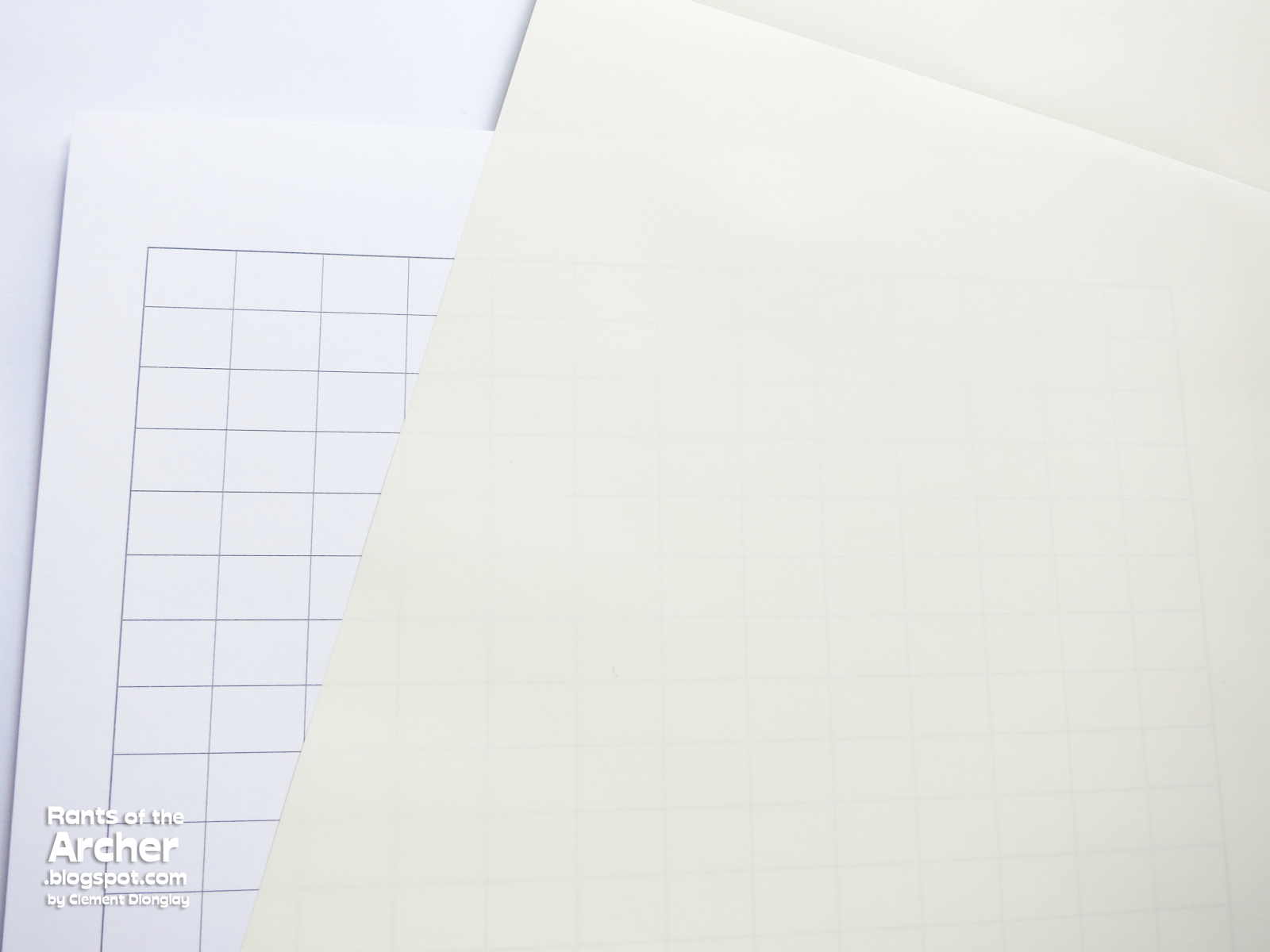
The writing guard provided in the pad is a useful tool to avoid unnecessary writing impressions on the other pages when you write on a page. The writing guard also has grids, although I find it a little too wide.

Now for the writing samples. If I wrote in a regular 52gsm paper, ink would seep through to the next page, considering the nibs on my pens are on the wide side. I used my inked fountain pens to test Tomoe River paper. Writing on it, as I mentioned, is a different experience. Tomoe River paper is simply a joy to write on. The paper is very smooth, and there is no feedback at all. I did not feel any snags and those slick spots I sometimes encounter in notebooks and other paper pads.

Writing samples in Tomoe River paper. No feathering even if most of these lines were written with medium, broad, and stub nibs.

Of all the eight pens I used to test Tomoe River paper, only one has a fine nib, the Kaweco Classic Sport. The rest have medium, broad, and stub (1.1) nibs. Not one of these pens' inks bled or feathered in Tomoe River paper. There is show through, though, and this is the only downside to this paper: I cannot write on the back side because of the show through.

The back side of the paper is clean, as there is no bleed though. There is some ghosting, though.

I recommend Tomoe River paper to anyone who wants to experience writing on excellent quality paper. Tomoe River paper pads and loose sheets are also reasonably priced at P1,550/pad or pack of 100 sheets.

Tomoe River paper is available in the Philippines at Scribe Writing Essentials. To get your own pad, visit any of Scribe's stores in Eastwood Mall, Shangrila Plaza Mall, Glorietta 5, SM Aura, and SM Megamall. Their 6th store has just been opened in SM City Cebu in April. For their complete location/address, contact numbers, and store hours, click here.

Tuesday, May 24, 2016

Notebook Review: Life Pistachio A5


If you use fountain pens on a regular basis, you probably understand the huge challenge of finding suitable, fountain pen ink-friendly paper. When I shifted to full fountain pen use in 2008, the stationery market in the Philippines had a very limited selection of fountain pen-friendly paper brands to offer.

When Scribe Writing Essentials began offering fountain pen-friendly paper products, it was a joy to walk into their stores and see shelves filled with Midoris, Rhodias, TWSBIs, and just recently, LIFE and Tomoe River Paper. Scribe has kindly given me two samples of LIFE products to review, a soft-covered, ruled Noble Report in A4, and a ruled Pistachio notebook in A5, both with excellent, superior paper quality.

The LIFE Stationery Company was established in Tokyo in 1946. The company is dedicated to producing paper products of excellent quality, with all products done by hand. LIFE's stationery line features timeless, simple, and elegant designs, together with superior and excellent paper quality. The Notemaker Journal Blog has a beautiful feature on the story behind LIFE Stationery, if you want to read more about the company.

LIFE Pistachio notebook cover

The Pistachio is a sibling to LIFE's Vermillion notebooks, a simple, yet high quality notebook. Its light green cover has an old-school look, with a patterned border and spaces for information printed in bright green and dark red.

The Pistachio Notebook's pages with 7mm ruling in bright green.

LIFE's Pistachio notebook is available in three sizes: A5 (8.3 x 11.7 inches), B6 (4.9 x 6.9 inches), and A6 (4.1 x 5.8 inches). The A5 Pistachio is available with either ruled or grid inside pages, printed in bright green ink. The ruling is a bit wide for me at 7mm, while the grid is just right at 5mm. Each notebook has 32 sheets (64 pages) of stitched, rather than stapled, superior quality Japanese paper.

Pen and ink tests on Pistachio notebook. No feathering at all, and the green ruling is not bothersome at all.

This simple-looking notebook's most amazing feature is LIFE's high quality paper. It is smooth, and simply a joy to write on. It is also resistant to feathering and bleed through, which means I can write with my fountain pens (or any pens) on it. The paper is also acid-free, to preserve its contents for years to come.

Back of the test page. There is ghosting (show through), but there is absolutely no bleed through! 

See? No bleed through! Even if I wrote with my wettest writers (Pelikan BB and B), iron gall ink (Lamy Blue Black), and the notorious Noodler's Baystate Blue.


I recommend LIFE Pistachio notebooks to anyone who wants to experience writing on excellent quality paper. Aside from their excellent quality, LIFE notebooks are also reasonably priced.

LIFE Stationery products are available in the Philippines exclusively at Scribe Writing Essentials. The Pistachio A5 is sold at P185, and the A6 at P175. To get LIFE's paper products, visit any of Scribe's stores in Eastwood Mall, Shangrila Plaza Mall, Glorietta 5, SM Aura, and SM Megamall. Their 6th store has just been opened in SM City Cebu last month. For their complete location/address, contact numbers, and store hours, click here.

Tuesday, February 24, 2015

Fountain Pen Review: Edison Collier Antique Marble

Edison pens are now in the Philippines! Woohoo! 

A few years ago, when I was still new to this hobby, I liked white fountain pens. I recall a time when I grew so fascinated with a white fountain pen that I saw on the internet. Google later revealed that the pen is a Mina from Edison Pen Co. I didn't take the pen, for a number of reasons, but an Edison fountain pen has always been on my list. When I found out that our beloved pen store Scribe Writing Essentials will be the official reseller of Edison pens in the country, I was more than excited to get one.

When Scribe posted the photos of Edison pens that will be available in their stores (read Edison's announcement here), the Collier in Antique Marble finish caught my eye. Its rounded form is very pleasing to look at, and the color is just irresistible. From the photos, the Collier looked like it's a big pen, and I thought it would be heavy, but the amber resin is simply unforgettable. I can't get it off my mind, and I counted the days before I could get one.

The Collier has been with me for more than a week now, and I am very happy I got it. Here's why.


The Edison Box. Having collected a few fountain pens myself, I have seen a number of pen boxes from different pen brands. I'm happy to see that Edison pens are carefully presented in the same elegant box covered in patterned maroon faux leather. While this well-made and elegant box contains a fountain pen, it could easily be mistaken for a jewelry box.


I like the Edison box because it is not oversized, yet the Collier, a long and fat pen, fits perfectly inside. While the box has no markings outside, opening it shows the Edison Pen Co. logo printed on the inside of the cover. Inside the box is the Collier, a wonderful work of artistry in a medley of warm and happy colors, lying on a bed of padded soft fabric held in place by a satin ribbon.


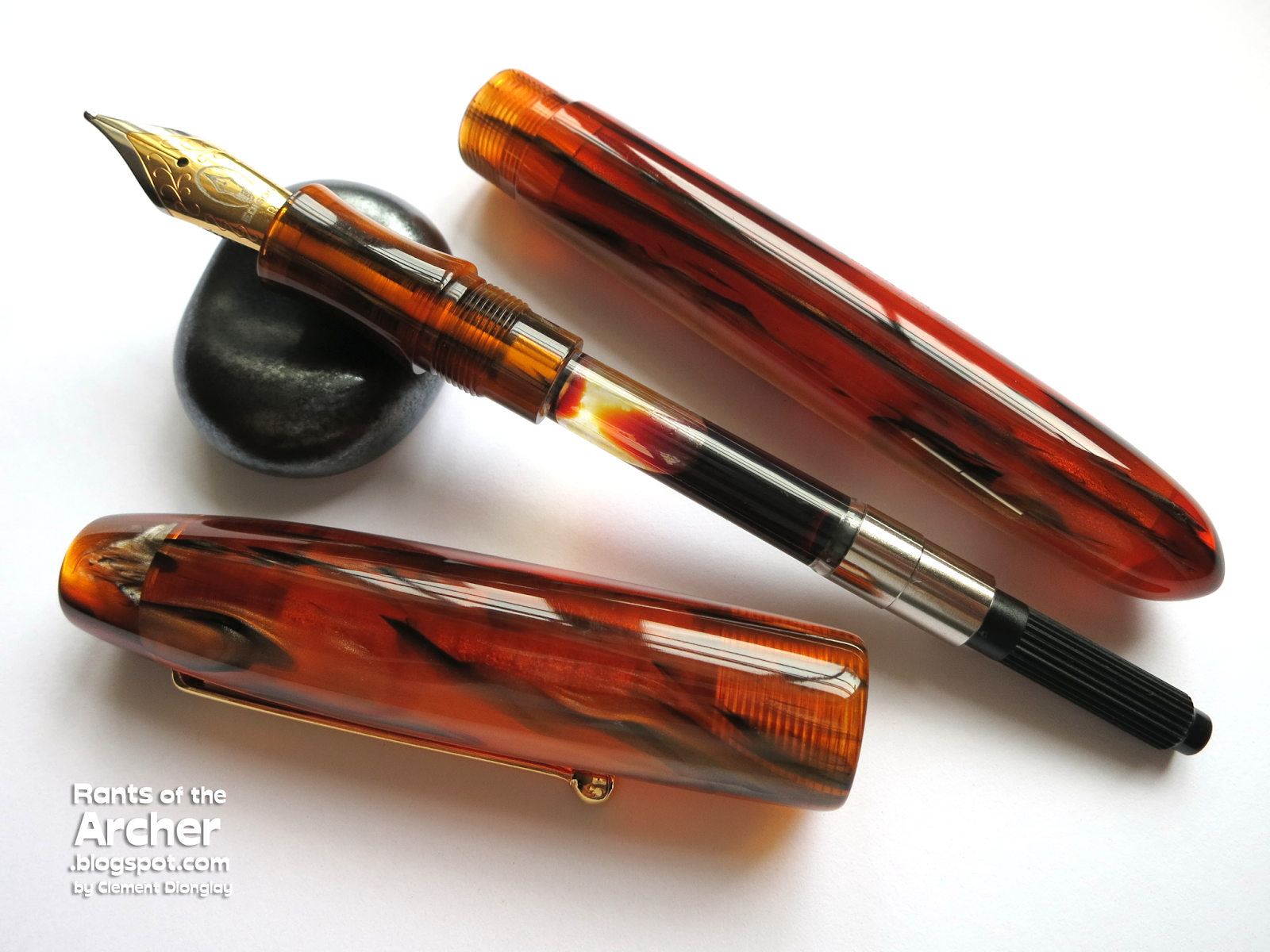
The Edison Collier. The Edison Collier is an award-winning pen. It's Goldspot's Pen of the Year in 2011. The Antique Marble is from Edison's Production Line of fountain pens (available only through resellers). It is made from translucent amber-colored acrylic resin, buffed and polished to a high gloss. At approximately 5.9 inches long (capped), the Collier is my longest (and probably the fattest) fountain pen. 


The Collier's resin is strikingly beautiful with rich swirls of black, brown, and in some parts, silver and pearlescent orange in amber. It's amazing! It's like seeing thin strips of satin suspended in lovely amber. Also notable is that the Collier's parts — barrel, section, and cap — are made from the same translucent resin. It's as if the pen came from a huge blob of real amber!

For such a long pen, the Collier is surprisingly light at 30 grams. Uncapped, the body is only ~5.2 inches long (barrel, section, converter), and lighter at 20 grams, which makes writing comfortable. The pen fits so well in my hand, and the contoured grip keeps my fingers in place as I write.


Like all the pens in Edison's Production Line, the Collier has a cartridge/converter (C/C) filling mechanism. Short and long international cartridges will fit in the Collier, but a standard international converter is included in the box. It can as well be used as an eyedropper pen because there are no metal parts inside the barrel.  


The Collier's screw on cap is ~2.8 inches long and weighs 10 grams. It was not designed to be posted on to the pen's barrel, but I don't usually post my pens, so I don't mind at all. The simple, unobtrusive gold-plated clip of the Collier is the perfect complement to its translucent amber. It feels just right: not too long, but not too short, and flexible enough to easily clip on to a shirt pocket, or to a notebook pen loop.


Here is another photo of the Collier's cap. The glossy rounded top of the cap is just lovely, free from any markings, and the translucent amber just seems to glow and change color according to the intensity of light.

The Collier is a big pen. Its cigar-shaped barrel has a diameter of 0.6 of an inch, almost equivalent to the barrel diameter of a Pelikan M1000! And again, that pattern in amber is just awesome. The other side of the barrel has swirls, while there are black and brown stripes on this side.


The slightly pointed (but still rounded) end of the Collier's barrel is equally beautiful, complementing the rounded top of the cap. 


Brian Gray, President and creator of pens at Edison Pen Co., has designed the branding of his pens carefully. The Collier's branding is so discreet that it took me a while to find it. The laser engraved words "Edison Pen Co. Collier" are so small and hard to see. I had to look very closely at the barrel with a pen light so I can see it. 


The Edison Nib. The Collier has an oversized #6 nib, and I chose a steel, two-toned B (broad, bold, big) nib for my pen, which would probably get a grind soon. It wrote smoothly out of the box, and I am very happy I selected a broad nib. Edison nibs are sourced from Germany, and Brian is known to personally check the nibs on his pens before they are sent.

In an homage to Thomas A. Edison, whom Edison Pen Co. shares birthplace with (Milan, Ohio, USA), Brian designed a logo that shows a light bulb and a fountain pen nib. Clever and ingenious. 


I'm a blue fountain pen ink addict, and I so badly wanted to fill my Collier with Eclat de Saphir, my favorite blue ink. But this pen is begging for a same-color ink, so I filled it Pelikan Edelstein Amber. 


Amber for amber. The Edelstein ink is a perfect match for my Collier's broad nib! 


I thought that a fountain pen size comparison would be useful, especially now that new pen brands are being introduced frequently in the country. I would like to show that the Collier is a large pen. Its length and girth are very prominent and imposing. The other pens are: Bexley Intrepid, TWSBI AL 580, Lamy Safari, Platinum 3776, and Pelikan M400. If you're planning to get an oversized pen any time soon, keep the Collier in mind. You definitely won't regret it. 


The Collier is also available in three other colors: Persimmon Swirl, Silver Marble, and Blue Steel. #6 nibs for the Collier are available in single tone or two tone steel, and in 18k solid gold. Steel nibs are available in EF, F, M, B, 1.1mm italic, and 1.5 italic. The 18k solid gold nibs are available in EF, F, M, and B.

Edison pens are sold by a number of official resellers worldwide. In the Philippines, they are available at Scribe Writing Essentials, a specialty store selling fountain pens, inks, paper products, and calligraphy supplies. Scribe has stores in Eastwood Mall, Shangrila Plaza Mall, Glorietta 5, SM Aura, and SM Megamall. For their complete location/address, contact numbers, and store hours, click here.