Showing posts with label blue. Show all posts

Monday, December 12, 2022

Fountain Pen Review: BlueDew Writer Lapis


I have always loved the color blue. From the light ones — azure, cyan, turquoise — to darker shades — navy, cobalt, midnight — but even more the bright and happy blues of ultramarine, sapphire, and lapis. I always have a blue fountain pen in my daily carry, and my five can't-live-without fountain pen inks are all blue, including the vibrant and intense but notorious Baystate Blue. When I read that BlueDew Pens' latest Writer series has a bright blue pen called Lapis, I knew it will be a must-have for every fountain pen collector. 

To most of us fountain pen users, collectors, and enthusiasts, our pens can be more than just writing tools. Sometimes we use our fountain pens as accessories, just like we pair our clothes with watches, shoes, bags, and jewelry. BlueDew's Writer series are not only excellent fountain pens, but they are also fine accessories with a unique feature — each Writer fountain pen's clip is adorned with a genuine sapphire!

BlueDew Writer Lapis was sent in this functional protective pen case. A BlueDew flex replacement nib for the Writer series is also included in the package.

Last year I had the chance to do a review of one of BlueDew's new Flex pens. It was a unique experience trying the BlueDew flex nib because it's one I'm not scared to use because they are meant for comfortable flex writing. These flex nibs are proprietary stainless steel, rust-resistant, and most of all, they have a line variation of Japanese Extra Fine to western double broad! 

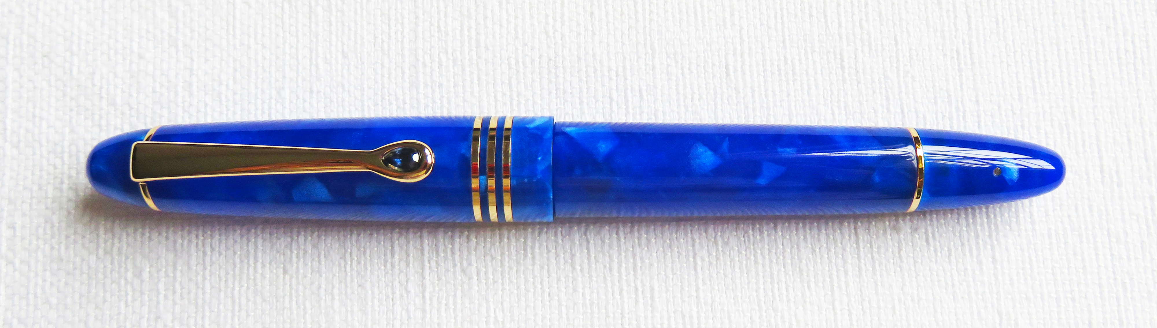
The Writer fountain pens are designed with a vintage feel in mind, but they also have the most classic fountain pen design, the cigar-shaped body. They have straight bodies including caps and barrels, and their ends are rounded. The Writer has gold trims, and it looks perfect with the bright blue Lapis. Classy, stylish, and elegant. The Writer fountain pen has the following measurements:
  • Length, capped: 5.7in
  • Length, uncapped: 4.9in
  • Length, cap posted: 6.4in
  • Full pen weight: 28g
  • Material: Resin
  • Colors: Onyx, Lapis, Rose Quartz, Emerald, and Demonstrator
  • Trims: Gold
  • Clip: Gold-plated metal adorned with a dew-shaped sapphire
  • Cap: Threaded, screw-cap
  • Nib: Stainless steel F nib or BlueDew flex nib (sold separately)
  • Filling mechanism: Vacuum pump filler

The cigar-shaped Writer fountain pen has a vintage feel, and the gold trims look perfect with the bright blue Lapis color of the pen's body.
The Writer's cap is designed to be fully airtight to ensure that the nib does not dry and it is wet and ready to write every time. 
Writer fountain pens have a vacuum filler system. It works well, and the pen fills with ink perfectly.
The cap has three bands, with a dew-shaped sapphire in the clip.
A closer look at the sapphire. BlueDew proudly states that while other brands use plastic as gemstones, those they use in the Writer fountain pens are genuine sapphire stones.
The Lapis has a glossy finish and the barrel is almost translucent. 

I am happy that BlueDew offers a regular, non-flex nib for the Writer series. The new gold-plated stainless steel Fine nib has a heart-shaped breather hole, designed to be slightly soft for a forgiving writing experience. This nib is available in F as of writing, but BlueDew promises that new nibs for the Writer series will be available soon. The Writer fountain pens can also be fitted with replacement BlueDew flex nibs for the Writer series pens. 

BlueDew now offers non-flex nibs. The stainless steel Fine nib (right) has a vintage-inspired heart-shaped breather hole. The BlueDew flex nib (left) for the Writer series is not tipped, so it can write finer lines. Both nibs sport the big "B" which is sometimes mistaken to indicate a B (broad) nib.

The BlueDew Writer Lapis is a full-length fountain pen that shares almost the same length with other cigar-shaped fountain pens — Leonardo Officina Italiana Furore and Esterbrook Estie. It's also about the same length as a TWSBI ECO or Lamy Al-star. Uncapped, though, it's shorter than these four pens.

From top: TWSBI ECO Cerulean Blue, Leonardo Furore Aquapetra Rose Gold, BlueDew Writer Lapis, Esterbrook Estie Gold Rush Frontier Green, and Lamy Al-star Ocean Blue.
Uncapped, the Writer Lapis is shorter than the four pens in this line-up. This does not affect this pen's performance and writing comfort.

The Writer Lapis was sent to me with a replacement BlueDew flex nib. Again, I am not a fan of flex nibs, but I enjoyed using it this time. I was so scared of using it and writing ugly cursive, so I thought I'd do my own style. I love it! I love that I can use this ultra-flex nib to write in my thin stick font style. 

I tested this pen using a wet and matching bright blue ink, J. Herbin Eclat de Saphir. The Lapis wrote nicely, and the flex nib did not disappoint. It did not skip or railroad, and I did not get any feathering or bleeding despite the wet J. Herbin ink. I enjoyed writing with the BlueDew flex nib.

The BlueDew flex nib writes thin like a Japanese Extra Fine and can go wide as a western BB.

I wanted to doodle using the non-flex Fine nib, and I tried it on this 90gsm Canson sketchpad paper. The Fine nib wrote well, even wetter than most of my Fine nibs. I'm so happy with this pen and ink combination, they look so perfect together!

I did a blue doodle! Using the same J. Herbin ink, I swapped the flex nib with the stainless Fine nib. It wrote smooth and not scratchy like other Fine nibs.

This new series from BlueDew is truly a must-have! The Lapis, as well as the Onyx, Rose Quartz, Emerald, and Demonstrator has a beautiful body and wonderful nibs to try. The new non-flex nib gives people the chance to use BlueDew pens using a regular nib. It's smooth and writes well. The BlueDew flex nib is well-designed for flex writing, and I recommend it to anyone who wants to try flex nibs or calligraphy. It's meant for long use and does not wear out quickly. If you want to try a fountain pen with a vintage feel, that fits flex and non-flex nibs, and fills through a vacuum mechanism, then go for a BlueDew Writer! Get one (or two) for your collection!


Rants of The Archer thanks BlueDew Pens for providing the Writer Lapis for review purposes. The Writer fountain pens are available from BlueDew Pens starting at US$145 each. The BlueDew flex replacement nibs specific to the Writer series pens are available for $35.00 a pair. For inquiries, send an email to bluedewpens@gmail.com. To learn more about BlueDew Pens, visit their website or follow them on social media:

Friday, March 17, 2017

Fountain Pen Inks Review: J. Herbin 1670 Anniversary Ink Bleu Ocean


In September 2012, two years after the successful launch of the revolutionary ink Rouge Hematite, J. Herbin introduced their second limited edition 1670 Anniversary Ink, Bleu Ocean. This deep blue ink was created to celebrate the adventurous sea voyages of J. Herbin to the Mughal (Mogul) Empire of India, the world's earliest center of production and processing of indigo dye during the time.

After Bleu Ocean, three more inks have been added to the 1670 Anniversary line — Stormy Grey, Emeraude de Chivor, and Caroube de Chypre — all with gold flecks and reminiscent of J. Herbin's experiences during his voyages.

I received a bottle of Bleu Ocean a couple of months after its launch, but I was unable to write a full review for a couple of reasons. The reformulated Bleu Ocean with gold flecks was launched in April 2015, replacing the previous ink without flecks. Now that I have samples of both, it's time for a review!

Two of the same: Bleu Ocean without gold flecks (left), and Bleu Ocean with gold flecks (right).


As a blue ink fanatic, Bleu Ocean has been one of my favorites. It's the only ink I use in my Ocean Blue Lamy AL-star, because their colors (and names) match. I can write with it for legal documents, journaling, calligraphy, and notetaking. When this ink was launched in 2012, J. Herbin followers were not happy with it. Its predecessor, Rouge Hematite, had a successful launch and fans raved about its color and the gold flecks in it. After the announcement for Blue Ocean's release, most people (okay, that included me) expected the ink to have silver flecks — as a follow up to Rouge Hematite, and to match the bottle's silver cord and wax seal as well. When it came out without the flecks, people were disappointed, and branded Bleu Ocean as "just another blue ink."

See the gold flecks in the bottle's opening? Cool! The 1670 bottle has a unique design, but it has a smaller opening than most other ink bottles. Filling big pens requires the help of a pipette or syringe. 


Flecks or no flecks, I love Bleu Ocean. Like its four siblings in the 1670 Anniversary line, it's a collector's item. The box design represents the life of J. Herbin as a French sailor. The 1670 bottle, despite the narrow opening, is lovely. The silver cord, wax seal, and waxed cap are beautiful, making every 1670 box and bottle true collector's items.

Gold flecks at the bottle's bottom.
The 1670 Anniversary inks box represents the life of J. Herbin as a sailor and his voyages to different places.


Although unconfirmed by J. Herbin, the blue color of Bleu Ocean seems to be derived from indigo dye, a natural plant-derived dye with a distinctive blue color. Once considered by the Greeks and the Romans as a luxury product, indigo dye is the color that is often associated with blue jeans.

To test the inks, I wrote on Tomoe River Paper using Lamy Safari and AL-star fountain pens, both with 1.1 nibs. 


Bleu Ocean reminds me of indigo Mediterranean tiles and the blue and white houses in Santorini. This exquisite ink also reminds me of both Van Gogh and Picasso and the depth and poignancy of their work. Van Gogh's Irises and Starry Night; Picasso's The Old Guitarist and The Blue Room.

Bleu Ocean evokes memories from years ago when I used to associate dark blue color with dusk and twilight and their accompanying sounds: crickets chirping, newscast on TV, my mother cooking dinner, our dog snoring, my brothers' banter.

Bleu Ocean has a dark, rich, deep blue color with soft hints of purple. It is a versatile fountain pen ink, and goes from bright purplish blue (Eclat de Saphir) to a dark, almost blue-black shade (Blue Nuit). It is more saturated than most J. Herbin inks, but flows smoothly, and can be cleaned off pen parts very easily. Fortunately, it dries faster than Rouge Hematite, and does not show any of the ugly nib creep in the fountain pens that I have inked with it.
A swab of Bleu Ocean without gold flecks. 
These ink drops took almost an hour to dry. I got this almost blue-black shade in my previous fills of Bleu Ocean in pens with broad, wet nibs.
Dark Bleu Ocean with sheen up close. Do you see this blue in Picasso's The Old Guitarist? I do.


Bleu Ocean with gold flecks was launched in 2015.

These ink drops took longer to dry than the ones without the flecks.

It's a thrill to see the gold flecks up close!


Because Bleu Ocean is a highly saturated ink, it takes longer to dry, around 8-10 seconds more than the regular Herbin inks, depending on the nib and paper. On Rhodia and Tomoe River Paper, it takes a bit longer to dry. It can be prone to smudging and is not water resistant.

It's a big help for fountain pen users to be able to clean their pens easily. Both inks are easy to clean off nibs and feeds of the two pens I used in this review, but I had a hard time taking off the gold flecks in the Lamy Z24 converter that I ended up disassembling it for a full cleanup.

Gold flecks and shading in my writing sample.
Bleu Ocean in Ocean Blue and Blue. Blue on blue.


If you use fountain pens regularly like I do, if you like J. Herbin inks, and if you have any of the 1670 Anniversary inks, I recommend getting a bottle of Bleu Ocean. Make this ink a part of your collection! The one without gold flecks has been out of production already, but the one with gold flecks is a versatile ink with beautiful shading and shimmer. Get one in your ink collection now! 


Both bottles of 1670 J. Herbin Anniversary Ink Bleu Ocean are from Exaclair USA, through the kindness of Karen Doherty, Marketing VP. 

The Tomoe River paper is from Scribe Writing Essentials, the leading distributor of fine writing instruments, specialty paper including Rhodia; fountain pen inks, including J. Herbin; and other fountain pen related accessories in the Philippines. 

J. Herbin products are widely available worldwide. For a list of authorized retailers, visit the J. Herbin website.

Friday, December 2, 2016

Fountain Pen Inks Review: Robert Oster Signature Ink Bondi Blue and Australian Sky Blue


I came upon Robert Oster Signature Inks one morning, at breakfast. I saw an ink swab of Bondi Blue, and thought it's a beautiful blue ink. I realized Robert Oster has a lot of blue ink, and I fell in love with Bondi Blue and Australian Sky Blue. A lively chat with Robert Oster followed, and a week later, I found myself at the post office, picking up seven (seven!!!) bottles of inky awesomeness from Down Under.

Blue inks overload!

In the past, I have used fountain pen inks from China, India, and Japan, but I have not tried inks from Australia until I saw Robert Oster's Signature line.

Signature Inks are made in Australia, reflecting the country’s natural color palette. Robert Oster is proud that his inks originate from the Coonawarra district of South Australia, one of the most famous wine producing regions of the world. His ink palette has the colors of the sun, sky, sea, earth, vines, and wines.

Blue, blue-green, and green inks from Australia! I got the sky, the sea, and the vine!

Robert is kind to send me Bondi Blue, Australian Sky Blue, School Blue, Torquay, Tranquility, Green Diamond, and Marine. I realized that he sent me the sky, the sea, and the vines of Coonawarra.

Signature inks are sold in tall, leak-proof, Australian-made 50ml plastic bottles that are sturdy enough to survive the sometimes bumpy ride from Australia to the rest of the world. 100ml bottles are also available in selected sellers of Robert Oster Signature Ink worldwide.

Robert Oster Signature Inks come in tall 50ml bottles with gold labels bearing the Signature branding.

Label on the other side of the bottle says that Robert Oster Signature Inks are 'known for their unique colors', and have a 'certain something.'

Each bottle of Signature Inks has a leak-proof cap which also carries the sticker indicating the ink name/color. Just be careful not to mix bottles and caps when you have several ink bottles open.

Signature Ink bottles have wider openings that can accommodate large pens.
I can't fit that TWSBI in a 30ml Diamine bottle, or in the 1670 J. Herbin glass bottles.


I chose two from the seven inks that I received. I tried Bondi Blue and Australian Sky Blue first, and used pens with wide nibs to see the lovely shading and the impressive halo that I saw in Robert Oster's sample ink swabs. Bondi Blue went to my Pelikan M205 with BB nib, and the Australian Sky Blue went into a TWSBI with B nib.

Bondi Blue (top two paragraphs) and Australian Sky Blue (bottom paragraphs) on Tomoe River paper.

Here are my observations, followed by sample photos of the two inks. 

Both inks are wet, and flowed smoothly onto paper. Australian Sky Blue is wetter than Bondi Blue, which explains why it dried longer. Both have excellent shading and halo, but Bondi Blue's is darker, wider, and more visible. Like most fountain pen inks, these two have low water resistance. I have not used them long enough to test their color fastness, but both colors look like they will last, as long as they are not exposed to extreme heat or moisture.

Bondi Blue is dark blue while wet, but turns lighter when it dries. On paper, it looks similar to Waterman South Sea Blue, or Sheaffer Turquoise. Australian Sky Blue doesn't change much when it dries, and it's more similar to J. Herbin Bleu Pervenche and Lamy Turquoise.

Robert Oster Signature Ink Bondi Blue. Bondi is an Aboriginal word which means 'water breaking over rocks,
or noise of water breaking over rocks.'  Perhaps Bondi Beach is the inspiration for this ink color.

I love how Bondi Blue goes light to dark from a single pass to triple passes.

See the shading? And the sheen/halo? This ink has too much sheen! It's visible on the single pass swab (top), which is still very light, but dark and heavy on the swab with three passes (bottom).

Bondi Blue's sheen in my writing sample. This is the reason why I chose to use a pen with BB nib.
The sheen won't be visible in a pen with fine or medium nib. 

Wet ink + BB nib = long drying time.

Robert Oster Signature Ink Australian Sky Blue. Inspired by the bright blue of a cloudless Australian sky.

Australian Sky Blue is a turquoise ink with lovely shading that can go from light to dark, depending on the pen and paper used.

The swabs with double and triple passes show the lovely sheen/halo of Australian Sky Blue.

Shading! Sheen! What's not to like and love about this ink?

Wetter ink + B nib = longer drying time.

I had fun trying and reviewing these Robert Oster Signature Inks. I now have four pens filled with different Robert Oster inks, and I'm looking forward to more fun in my next review.

Writing sample of Bondi Blue on Midori MD Paper.

Are you looking for turquoise inks to add into your collection? Get one from Robert Oster Signature Ink palette. Bondi Blue and Australian Sky Blue are great choices, but there are more turquoise inks there! Torquay and Tranquility are also excellent ink colors, so why not get them, too! Watch out for these two in my future ink reviews.


Robert Oster Signature Inks are available in a number of authorized global resellers. To look for a reseller near you, check Robert Oster's list of global resellers. In the Philippines, these inks are available at EverythingCalligraphy.com.

For more information about the Signature inks, visit the Robert Oster website. For updates and news of new Signature inks, like them on Facebook, or follow them on Instagram and Twitter.

Monday, October 24, 2016

Fountain Pen Review: Nemosine Singularity Blueberry


I came across the brand Nemosine a few years ago through a fellow member of Fountain Pen Network Philippines. His pen, Nemosine Singularity, was a modest demonstrator with chrome trims, but what caught my eye was its #6 nib. More colors were produced since then, but it wasn't available in the Philippines, so the chance of getting one in my collection was slim. Until I got an offer to review one.

Goldspot Pens, seller of brand name luxury and fine writing fountain, rollerball, and ballpoint pens based in New Jersey, USA, has kindly sent me a Nemosine Singularity fountain pen in Blueberry with a 0.6mm stub nib to review here.


Nemosine, a pen company based in Pittsburgh, Pennsylvania, has been around for a couple of years. Their writing instruments, offered only as fountain pens are: Singularity, Neutrino, and Fission. The Singularity, their flagship fountain pen, is available in three finishes: Traditional, Demonstrator, and Acrylic. For a fountain pen in the $20 price range, the Singularity has a wide range of colors and nib widths to choose from. The Blueberry fountain pen in this review is one of the 13 colors of the Traditional Singularity, with seven other colors in the Demonstrator and Acrylic lines.


Nemosine fountain pens are packaged in simple white laminated cardboard boxes that bear the Nemosine logo on one side. The other side has details about the pen such as color, nib width, warranty, and the origins of the pen's parts. Interestingly, every Nemosine Singularity pen box is marked with the Schwarzschild radius equation.

Inside the box are: Singularity fountain pen, converter, six short international ink cartridges, and a fountain pen filling and cleaning instruction leaflet.

The Singularity's parts are manufactured from different places, as the box indicates. The pen bodies (cap, barrel) are from Taiwan, while the nibs come from Germany (either Jowo or Bock). The pens are then inspected and packaged in the USA. Nemosine offers a three-year 'perfection warranty' for their pens.


When I tried the Singularity Blueberry for the first time, I noticed that it's a very light fountain pen, even with a full converter. It's just as light as a Lamy Safari, but the difference in their plastic material is noticeable. While I am confident that the Safari will survive a fall, I cannot say the same for the Singularity. The Singularity, however, has an impressive gloss.

The Singularity weighs ~17 grams (capped), and measures ~5.4 inches long while capped, ~4.9 inches without the cap, and ~5.8 inches when the cap is posted.

Parts of the Singularity: cap, barrel, converter, section, feed, and nib.

The barrel and cap of the Singularity have the same tapered shape, where they are widest at the center of the pen, and narrows slightly towards the ends. The Singularity pen's barrel is shaped from a single piece of plastic which is excellent for eyedropper conversion. The cap is screw-on type, which is a nice feature for an inexpensive pen.


The Singularity's wide cap band is set above the cap lip, giving it a nice look together with the barrel's thin chrome band when the pen is capped. The Nemosine logo is handsomely inscribed into the cap band.


The Singularity clip and clip band are in the same chrome finish as the barrel and cap bands. The folded-metal clip is springy and holds the pen securely in place.


The conical endpoints (top cap, barrel end) of the Nemosine Singularity fountain pen.

The Singularity's #6 nibs have a unique and distinctive design. The design suggests butterfly wings, but I also see flower petals and bird feathers. The imprint includes "Made in Germany" at the base, nib width (0.6) above it, and the letter N (for Nemosine) just below the breather hole.

There are six nib widths available for the Singularity: extra-fine, fine, medium, broad, 0.6mm, and 0.8mm. The 0.6mm nib is untipped and quite sharp, and may not be suited for writers who rotate their pens, but the sharp italic creates impressive line variations.

Traditional Singularity fountain pens have the same black plastic section. It has a nice hourglass shape without any grip guides that is comfortable to hold.

In other pens, the threads used in screwing the cap to the barrel is placed in the barrel. With the Singularity, the threads are placed in the section and not in the barrel, so that at times, my fingers are resting on the threads above the section. It does not bother me at all, nor does it make writing uncomfortable.


The Singularity's (center) nib with other #6 nibs: Jinhao (left) and Edison (right).

I am including the Nemosine Singularity (5.4 inches) in the full size pen category, together with the TWSBI 540 (5.6 inches), Lamy Safari (5.5 inches), and Noodler's Ahab (5.4 inches). Its length is just right for comfortable writing.

I love matching ink colors with my fountain pens. Diamine Sapphire Blue seemed the perfect match for the Blueberry Singularity. The untipped 0.6mm stub nib was not smooth throughout the writing sample I included here, but I am happy and impressed with the line variation it produced.

Perfect together: Diamine Sapphire Blue and Singularity Blueberry
The Nemosine 0.6mm stub nib makes writing very expressive.


While I have a few minor reservations about the Singularity, I would still recommend this $20 fountain pen not only to beginners, but to long-time fountain pen users, as well. Its material may be a downside, but the #6 nib is probably worth $15-$20 on its own. It's a lightweight pen, and comfortable enough to use for longer periods of writing. If you are looking for a beginner fountain pen, or for one to add into your collection, head over to Goldspot Pens and get one (or two)!


The Singularity and other Nemosine fountain pens are widely available in many reputable sellers worldwide. If you want to look at other Singularity pens, visit Goldspot Pens.

I received the Nemosine Singularity fountain pen in this review free of charge from GOldspot Pens. For more details, visit their website.