Showing posts with label Parker. Show all posts

Sunday, January 9, 2011

Ink Review: Diamine Majestic Blue

When I haven't any blue I use red.

- Pablo Picasso


Imagine Picasso running out of blue while painting the Old Guitarist. Or the La Vie. I wonder how his masterpieces would have turned out had he ran out of blue. Interesting, isn't it? But could it be Picasso who inspired the chemists at Diamine to put together blue and red in one ink color they called Majestic Blue? I wonder.


Being a huge fan of blue inks, I have read (and tried) a lot about them and came about Diamine's Majestic Blue long before Phil Davies sent me the box of sample inks for review. I've been curious about Majestic Blue for long and filled a number of pens with it as soon as I received the samples. Since then, I've been a huge, huge fan of this ink!

Diamine Majestic Blue is a deep, dark, saturated blue that is almost blue-black, but it has a reddish undertone that simply amazes me. Before the J. Herbin 1670 Anniversary ink, I have not seen an ink with an undertone such as this one. While wet, Majestic Blue appears to be a deep blue-black -- almost black -- but dries off a beautiful and unique dark blue.


Diamine Majestic Blue reminds me of the blue skirts I wore to school when as a precocious 6 year-old attending Mrs. Avanzado's Grade 1 class, I proudly read stories and poems from books, and wrote and drew on the blackboard using a dusty chalk. My favorite story then was "Henny Penny". Incidentally, the Henny Penny book had laminated dark blue covers like Majestic Blue. Oh, the memories of those days!

Below is a written review of Diamine Majestic Blue. Like the Woodland Green review, I wrote on Kokuyo paper using two pens: a Platignum calligraphy pen (from fellow FPN-P member Eilu) with medium italic nib (blue pen on the left), and a white Parker Jotter with a Pentangeli stub nib.


Diamine released Majestic Blue in late 2009. It is a moderately saturated ink like other Diamine inks, but  flows well on most of the pens I used for this review, especially on the Platignum calligraphy pen. Shading can be seen in the strokes made by the Platignum pen, probably because of its broad calligraphy nib, and the reddish undertone against the blue shade is visible at the beginning or end of a stroke written using my Parker Jotter with a stub nib.


And here's Diamine Majestic Blue up close. Note that it behaves differently when dry on different paper types. 

On Kokuyo paper, written with the Platignum calligraphy pen. Lovely shading, though not as obvious as I would have wanted it to be.

Again, on Kokuyo paper with the Parker Jotter with stub nib. Note that the comma has a different (reddish) tone.
  
This is on Eagle notebook paper. The letters l and u both have the red undertones.

Here's Majestic Blue on Saizen notebook. No red undertones on this one.

On Scribe squared notebook. There is minor feathering, but no bleed. Again, no red undertones.

Lastly, this is on Venzi notebook paper. Look at the letter l. See the red?


I don't have much blue inks to compare Diamine Majestic Blue to, but here it is with Noodlers' Bad Belted Kingfisher and Midnight Blue. It appears more of a dark blue than being a blue-black beside the Noodlers' inks.

Like Woodland Green, Majestic Blue takes a longer period of time to dry, mostly because of its saturation. But still, it dries a beautiful deep blue, so it's worth waiting for a page to dry.


Founded in London, Diamine has been manufacturing inks since 1864. Diamine is one of the largest producers of a large range of fountain pen inks as well as the famous Registrar's Ink for permanent records. Diamine fountain pen inks are available from the Diamine site or from the Writing Desk in the UK. In the US, they are available from the Goulet Pen Company or the Pear Tree Pen Company. (I have no affiliation with any of these companies.)

(The glass boots used in this review are shooters (a type of shotglass) from the UK, gifts from a Lovely friend. I had fun trying to find stuff that will go into my review -- in this case, the English ink is complemented by English shooters and English pens. LOL. The paper and blue cloth are both Asians, though.)

Wednesday, December 1, 2010

Notebook Review: Daycraft's Flower Wow


I'm always happy to receive new products to review, especially ink and paper. When Foreal Lee of Daycraft/Tai Shing Diary Ltd. emailed me to ask if I am interested to review their new notebooks, I replied with a fast-as-lightning yes! A week later, DHL delivered a box to my office with the notebooks that Foreal sent. It felt like Christmas morning in August.

Among the notebooks that Foreal sent to me is one of Daycraft's new products, Flower Wow notebook, the one that Daycraft won't claim (but won't rule out, either) as the world's most beautiful notebook. Available in one size (6 in x 8.5 in) and four cover designs, Flower Wow notebooks have real fabric cover with illustrations of stunning colorful bouquets. My notebook has large, beautiful red and pink blooms on the white fabric cover, which according to Daycraft is a special type of printable cloth from The Netherlands.

Flower Wow notebook. Lovely flowers on the front cover...

 
A closer look at the big red flower on the cover.

A smaller flower is printed on the back cover...

 ... that also bears the Daycraft logo, printed in gold. Elegant.


The gold inside cover of this notebook and the colorful blooms on the inside pocket add more elegance to it. 

The Flower Wow notebook has 176 pages of smooth, cream-colored 116g paper. As with my other Daycraft notebooks, I like that it is ruled, and the 6.5mm line spacing is just right for my large handwriting. Consistent with the notebook's theme, the pages are ruled with faint lines in gold.

The spread of the notebook's inside pages shows printed illustrations of flowers on both the lower right and upper left corners.

Flowers on the notebook's pages. 

The edge of the Flower Wow notebook is gilted in gold - this feature, together with the flower prints on the pages, fabric cover, and gold inside cover, makes me wonder if this notebook came from Victorian times.


I tested quite a number of ink colors and fountain pens on the Flower Wow notebook, and though some ink types feathered and bled, there is definitely a great improvement in Daycraft's paper quality in terms of fountain pen and ink friendliness. This is definitely a lot different than the paper quality of the Signature notebook I reviewed last February.


Some inks bled (see photo below), but I'll have to consider the fact that I used mostly medium wet nibs, so both feathering and bleed are hard to avoid. I'm suprised though, that some pen and ink combinations wrote so well without bleed. These are: Waterman Phileas (M) with Mont Blanc Bordeaux (line 4), Parker 45 (M) with Styl' Honore Rouge Amaryllis (line 5), Schneider Base (M) with De Atramentis Fuschia, (line 6), Sheaffer NoNonsense (M) with Caran d'Ache Saffron (line 8), Sheaffer NoNonsense (fine italic) with Diamine Burnt Sienna (line 9), Schneider iD (M) with J. Herbin Bleu Pervenche (line 17), and Lamy Safari (M) with J. Herbin Diabolo Menthé.

The other side of the test page. Some inks bled. Some are just right. Which means I can use this notebook with my fountain pens. For journalling. Then I'd feel like a lady from the courts of Victoria writing about hard work, perseverance, love and luck.

Below are some macro shots of some of the ink colors on the Flower Wow notebook:

Noodler's Midnight Blue

Noodler's Bad Belted Kingfisher

Diamine Oxblood

J. Herbin Bleu Pervenche

Irozhizuku Kiri-same

Waterman Havana Brown

De Atramentis Fuschia

Caran d'Ache Saffron

Mont Blanc Bordeaux

The Flower Wow notebook is another great addition to the beautiful products of Daycraft. I am glad, as well as other Pinoy pen and paper enthusiasts to know that Mr. Foreal Lee, Retail and Marketing Manager of Tai Shing Diary, makers of Daycraft noteboks, have facilitated the availability of their products here in the Philippines.

Daycraft products such as diaries, notebooks, and sketchbooks are available at Scribe Writing Essentials located at Eastwood Mall, Libis, Quezon City.

Friday, August 7, 2009

The Search is (Almost) Over

... for the (almost) perfect paper for my pen reviews.

I must admit that I'm new to this gel pen review stuff and it's an exciting project. My first three reviews were well-received, but I felt that somehow, something is still missing. Until I saw The Pen Addict's Signo review recently. I noticed that for all his reviews, The Pen Addict used the same paper, where he wrote with the pen being reviewed. And he only used a single photo: the pad (with his review written in longhand) and the pen. After reading that post, and seeing other pen reviews, I knew what I wanted to do with my reviews.

Not that I want to duplicate what The Pen Addict and other pen reviewers do, but I felt I could do something similar so I will have consistency in my reviews. I'll post more photos, of course, but I'd like to use just one pad, notebook, or paper type for my reviews. So during the weekend, I went out looking for a white, ruled pad that I can use to write on for my pen reviews. I had a very specific criteria in mind: 1) paper must be white so it won't interefere with ink colors; 2) paper must be ruled; 3) paper must resist feathering and bleed because I also plan to use it for my fountain pens.

As I browsed the stacks of various paper supplies at NBS, a pad caught my attention because of its blue lines. The 8x10in paper is immaculate white and the lines are printed in light blue. Think about Waterman South Sea Blue. Thickness is not very remarkable, but as an elementary pad paper, I don't think I should expect too much. I'm glad the paper is not shiny, which means it's not coated. After "feeling" the paper for some time, I went ahead and paid for it.

The Cattleya intermediate pad: heaven sent!

A closer look at the Cattleya pad's paper.

At home, I was like my four-year old niece in my excitement to try the new paper on my hands. I tried some of my gel pens first and it went well. No bleed, no feathering. I then took out my pen case and tried my inked daily warriors: medium Schneiders, Parkers, and Lamy Safari, Thein (my Frankenpen, a Sheaffer Thin Model), and Pilot 78G.

A test page showing different pens and inks on a page off the pad.

The ballpoints went okay, and writing is silky smooth, as is the gels and pencils. The Sharpies despite being ultra-fine points feathered and bled too much, but that's okay.

A closer look at the upper part of the test page.

Ballpoints, gels, markers, and pencils.

As I wrote the first line using my Schneider Base, I was super amazed - there wasn't any trace of feathering or bleeding even if the ink dried up fast! It looked (and felt) like I was writing with a ballpoint! (But only because the ink from my Schneider, a wet pen, did not feather or bleed.) I went to try my other pens as well - the very wet medium Lamy Safari, then my Parkers this time, and still, there wasn't any feathering or bleed! The long-awaited but tolerable bleed came when when I tried Thein, a medium Sheaffer. But that is okay, I guess. I've seen worse bleed on paper. :) And I must say that most of the FPs I tried fared better than the gels.

Here are the fountain pens, all with medium nibs: Lamy Safari (it should be M), Schneiders, Parker, Sheaffer and Pilot.

The back of the test page shows some "see-through", but it's not a bother at all. And I think some see-through (exhibited by some of the gels and fountain pens) is way better that the heavy bleed shown here by the Sharpies.

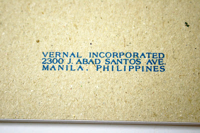
The pad's back board showing Cattleya's logo, its manufacturer and where it was manufactured.


And so the search for the THE (almost perfect) paper ended with with the Cattleya intermediate paper. Sold in pads of 90 leaves in 8x10in book paper, it's selling for PHP28.50, or approximately US$0.60! I will definitely go back to NBS this weekend and get more pads. This pad of paper is not only good for reviews, it's good for oodles and doodles too! Well, as another FPNP member said, the good stuff do not have to always be the expensive ones. *Wink.*

Wednesday, July 22, 2009

A Parker Comes By


Before I got so smitten by white fountain pens, I wished to focus my collection on Parkers, in honor of the maroon Parker Vector which happens to be my first FP. As I read the available literature about Parker pens, I realized the vastness of the sea I was letting myself into. Let me just say that I got very intimidated by the number of pens I must get to legitimize a collection. And so I became enamored with white pens and been like that since I laid my eyes on a white Parker Duofold I saw at my first pen meet.

As pens filled my ice trays (yes, they are ice trays), only 1 Parker made it there: a white Parker Vector. But only because it is white and I feel that my collection will be lacking without it. After that, no more Parkers. Until I saw an ad about a vintage Parker 25 with a 'brushed steel body'. I contacted the seller out of curiosity, and he replied fast. And then we lost communication because I was not interested in the pen by the way it looks on the photos sent to me. It was several days later that he went back to me to offer to sell the pen at a lower price. I wasn't interested still, even if I was told it had a Medium nib. I didn't want a strange-looking pen even at that price and nib (I'm a sucker for medium nibs.). Then the seller informed me that another buyer is eyeing the pen and they are finalizing the sale. Great, I thought. Hours later, he was back to me again.

I felt bad for the pen that I began to pity it. It was like a child that nobody wants to take in and was being passed around. Poor Parker 25! Again, I looked at the photos sent to me, and despite their poor quality, which didn't show the pen any better, I bought it.

UK-made Parker 25, profile of nib.

I got the pen the following day in a pitiful state. It came in its original plastic box with the original paper wrap with the Parker logo, but both plastic box and paper wrap are old, dirty, and about to fall out. Closer inspection of the pen revealed that the nib is gunked with old, dried ink, and though I know that the nib can be removed from the section, it won't even move. It got stuck because of the dried ink. The barrel has tiny brown flecks which scared me because I thought of them as rust. But the worst part is the pen's converter. It came with a squeeze filler, but the metal part that should be squeezed is stuck to the rubber (I'm not sure if it is rubber, though), which is totally unusable.

The underside of the nib.

As soon as I got home, I soaked the nib in soapy water. After an hour, I tugged at the nib and it easily went off. Hurrah! For several hours, I kept changing the water in my soaking tub every hour. I did this until past midnight and I was up so early in the morning to check on the pen. The nib looked a lot better after the overnight soak. While I was airdrying it (using an electric fan), I cleaned the barrel and cap using an all-around metal polish. After two hard scrubbings, the barrel and cap are gleaming. Hurrah!

Parker 25 cap and barrel.

It's obvious that I couldn't wait to test the pen. So I placed a cartridge of Parker Penman Mocha on the pen and tried it. I was very surprised at how easily it wrote after being kept unused and dirty for so long. The Penman looked perfect on it as it wrote smoothly. The pen does not write as wet as I would have wanted it to be, but that's fine. I love its balance now, so there is nothing to worry about. The brushed steel barrel and cap are both very sturdy, I don't need to worry about accidental falls breaking it.

Another shot at the cap and barrel. They definitely look better than in this photo. The pen looks like new!

And here is a writing sample of the pen on a page on my Moleskine. There's feathering and bleed, but that's okay.


There is a lot written about Parker 25 and other Parker pens, but I didn't want to rewrite what has been written. For more reading, ParkerCollector.Com has a lot of valuable information, and there is a long conversation and review of Parker 25 at Fountain Pen Network. Check them out!

Monday, May 18, 2009

Monday Morning Surprise

Imagine my Monday morning joy when I visited The Missive Maven's blog and saw this:

It's the postcard I sent to her last April!!! (Click photo to enlarge.)

Yes, I sent The Missive Maven a postcard in late April after a blog hopping spree brought me to her site. Of course I didn't tell her I'll be sending her a postcard. *Grin.* To my suprise, the postcard arrived in Rhode Island the first week of May. Surprised because it got there a lot faster than the other postcards I've sent to US addresses in the past. The Missive Maven is a blog dedicated to snail-mail and letter-writing. The blog owner calls herself The Missive Maven, from New Port, Rhode Island. She posts photos of the letters she wrote and received, and urges everyone to GO WRITE A LETTER! And so I sent her a postcard.

Here's what she wrote about it:

"A blog reader sent me this postcard of a funky old church from the Philippines. Though I am not much on old churches (or any churches, for that matter), this is a really lovely building. The other side was the rockin' side, though."

The rockin' side she's pointing to is the other side of the postcard where I wrote my short note to her. (Click photo to enlarge.)


Here's what she said:

"I don't know how I hadn't managed to see Parker Quink Ruby fountain pen ink before, but I hadn't. Gorgeous stuff! Wow. I have a couple Parker Vectors -- could it look that fantastic in mine?"

Aw, what a complement. For The Missive Maven to say that about my lowly Parker Vector (but it's white!), I'm truly elated. Now for a bit of info, the ink I called Parker Quink Ruby is part of Parker's Penman ink series, and not Quink -- apologies for the mistake. I got several of these ink cartridges -- Ruby, Emerald, and Mocha -- all from different National Bookstore branches around Manila. The discontinued Penman series have five colors: Ebony, Emerald, Mocha, Ruby, and Sapphire. I'm lucky enough to get hold of three in cartridges only, though. Here in my part of the world, getting hold of non-black, non-blue, and non-blue/black ink is close to impossible so getting the cartridges is just as lucky.

The Penman ink cartridges I got: Mocha, Ruby, and Emerald. (Click photo to enlarge.)

It was only recently that I realized these are not Quink inks, but Penman inks. The Penman logo went by completely unnoticed by my detail-obssessed eyes. *Winks.* Ruby, which I first used on my white Parker Vector and later on my white Schneider Base, is very saturated and I was scared it might cause some serious clogging problems later on. Then again, with a strict rule of cleaning and flushing with every ink/cartridge change, the beauty of this ink, its unique and incomparable redness is just... priceless. As priceless as the review post by The Missive Maven. Thanks, Missive Maven!