Showing posts with label Sheaffer. Show all posts

Wednesday, June 19, 2013

Fountain Pen Review: Sheaffer Taranis

Sheaffer celebrates their Centennial Year - 2013 - with a fleet of writing instruments including super limited edition pens and two new series, Taranis and Sagaris. Here in the Philippines, both pens are sold at National Bookstore, the official seller of Sheaffer products (pens, inks, pen cases, notebooks) in the country.

Robby da Silva, Sheaffer's Brand Manager at National Bookstore has kindly let me borrow a Taranis fountain pen to review and this pen has really caught my interest. Robby sent me the Stormy Night finish with chrome plate trim, and despite my initial impression of the Taranis based on what I have read about it, this is one elegant-looking pen. 


Sheaffer named this pen after Taranis, the Celtic thunder god, to emulate the titan's rule of the heavens, and have a pen that will stand out among other pens. American architect Charles Debbas (inventor of the Ergopen) designed the Taranis, and he successfully combined the classic look and modern details into this pen. The barrel of the Taranis has medium width, with both ends of tapering off neatly to a square. The Sheaffer White Dot® is on the controversial long clip that is similar to the clip design of another Sheaffer pen, the Intensity.


The Taranis is available in two plate trims, chrome and gold, and five different finishes including Stormy Night with Chrome Plate Trim (reviewed here), Icy Gunmetal with Chrome Plate Trim, Sleek Chrome with Chrome Plate Trim, White Lightning with Gold Plate Trim, and Stormy Wine with Gold Plate Trim. It is offered as fountain pen (nibs in fine, medium, or broad), rollerball, and ballpoint.

The Taranis fountain pen is 5.5 inches when capped, and 4.75 inches without the cap. Posted, it is almost 5.8 inches long. Despite the square barrel end, this pen can be posted. It has medium weight at around 35 grams with its cap, and only 26 grams when uncapped, which means that this pen can be used for extended periods of writing.


The section of the Taranis has chrome embedded into it, with SHEAFFER pressed on to the chrome. A lot of fountain pen users do not like this feature of the Taranis, including myself because I find it a little too much, but I realized that the chrome does not make writing uncomfortable at all. It does not get in the way of how my fingers hold on to the section while I write.


Sheaffer offers the Taranis with a semi-hooded stainless steel nib available in fine, medium, or broad. The pen on this review has a medium nib, but I find it too narrow, and I assume that is due to the small and thin nib of the pen. It writes smoothly, but it's not as wet as I want it to be. If I get one for myself in the future, I will definitely have it tweaked to the wetness I am used to with my other modern Sheaffer fountain pens.


The Taranis can be filled with ink using a Sheaffer converter, or cartridges. I filled this pen with Sheaffer Skrip Black, and I like the narrow lines that this medium nib produced. Again, it writes smoothly, but not as wet as my taste demands.


The Sheaffer Taranis is a well-balanced, elegant fountain pen for anyone. It's an eye catcher on any shirt pocket or pen wrap because of its clip, and a conversation starter when uncapped because of its unique grip section. I like the Taranis, but I wish the nib would be a bit wider, bigger, and wetter.

The Taranis pens (fountain pens, rollerball, ballpoint) are available in the Philippines at National Bookstore branches with the following prices:

  • Stormy Night (chrome plate trim): FP PhP 2,700 / RB PhP 2,520 / BP PhP 2,520
  • Icy Gunmetal (chrome plate trim): FP PhP 3,060 / RB PhP 2,700 / BP PhP 2,700
  • Sleek Chrome (chrome plate trim): FP PhP 2,700 / RB PhP 2,520 / BP PhP 2,520
  • White Lightning (gold plate trim): FP/RB/BP PhP 10,800 each
  • Stormy Wine (gold plate trim): FP/RB/BP PhP 11,500 each
Sheaffer Skrip ink in bottles and cartridges are also available at National Bookstore branches.

Size comparison: The Taranis (middle pen) with my other modern Sheaffer fountain pens.
On top: Sheaffer 300 Straight Line Chased Chrome. Bottom: Sheaffer Prelude® Black LaquĆ©.
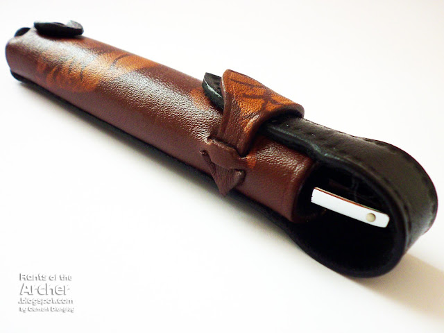
I found that the Taranis fits perfectly into the single leather pen case that my friend Rhona Carantes made for me. For more of her lovely leather creations, check her Facebook page at https://www.facebook.com/rhonacarantes?fref=ts.


Tuesday, April 19, 2011

Review: Quiver Pen Holder


When I saw this newly-released pen holder late last year, I was both curious and excited because of its name. Most people know I named my blog after the centaur with a bow and arrow that is my sign, but only a few knows that I am a former archer. Which is why the pen holder held my attention the moment I saw it. It brought back happy archery memories way, way back. When I was an archer, a leather hip quiver held my arrows, and now that I am a pen collector, a unique pen holder holds two of my favorite pens to a favorite notebook, and it is called the Quiver.

Quiver Global's Bob Koch kindly sent me one of their pen holders to review. I received a double/dual pen holder for large notebooks and I used it as soon I took it out of the envelope. It was love at first sight. Who wouldn't fall for these penholders? They are made from genuine soft leather and hand-stitched by Quiver's skilled leather craftsmen. It's perfect for my pens! I got a brown pen holder, but it is also available in black.


The Quiver pen holder is very easy to use because of its simple design. Just slide the pen holder over the notebook's front cover and move it according to the desired position. The photo below shows the wide elastic band that keeps the pen holder secure on the notebook's cover. This elastic band also offers maximum flexibility to the pen holder so it can be used on a number of large notebooks. Quiver's website has a list of Quiver-compatible notebooks.


The double/dual Quiver pen holder comfortably accommodates two pens. Its soft leather can be stretched a bit, so two large pens can fit in. I tested several pen combinations shown in the photos below, and I paired a big-sized pen with a thin one so they will not scratch each other.

On the Webbie: Haolilai and Esterbrook SJ. 

On the Reecovid notebook: Lamy Safari and Sheaffer thin cartridge pen.

On my red Scribe notebook: Waterman Hemisphere and Lamy Safari.

Lastly, two birds on my 2011 Starbucks planner: Pelikan M200 and the yellow M205 demo from the M205 Duo set. Love, love, love this combo!


The pen and notebook combinations are great! I love seeing two of my favorite pens on the cover of my notebooks and it makes writing very easy for me. I don't need to open a long pen wrap to get a pen to write, I just need to get one from my Quiver.

Quiver pen holders are available for online purchase through Quiver Global site. Other Quiver products include:
  • single pen Quiver for small notebooks;
  • single pen Quiver for large notebooks; and
  • double pen Quiver for small notebooks.

Quiver also offers an adapter for use in softcover notebooks. Also available are a number of Combo Sets that include any Quiver pen holder paired with a Moleskine notebook of choice.

The Quiver pen holder used in this review is courtesy of Quiver Global. Webbie is from Exaclair, Reecovid from Reecovid, and Scribe from Scribe. Pens and Starbucks planner belong to my personal collection.

Wednesday, December 1, 2010

Notebook Review: Daycraft's Flower Wow


I'm always happy to receive new products to review, especially ink and paper. When Foreal Lee of Daycraft/Tai Shing Diary Ltd. emailed me to ask if I am interested to review their new notebooks, I replied with a fast-as-lightning yes! A week later, DHL delivered a box to my office with the notebooks that Foreal sent. It felt like Christmas morning in August.

Among the notebooks that Foreal sent to me is one of Daycraft's new products, Flower Wow notebook, the one that Daycraft won't claim (but won't rule out, either) as the world's most beautiful notebook. Available in one size (6 in x 8.5 in) and four cover designs, Flower Wow notebooks have real fabric cover with illustrations of stunning colorful bouquets. My notebook has large, beautiful red and pink blooms on the white fabric cover, which according to Daycraft is a special type of printable cloth from The Netherlands.

Flower Wow notebook. Lovely flowers on the front cover...

 
A closer look at the big red flower on the cover.

A smaller flower is printed on the back cover...

 ... that also bears the Daycraft logo, printed in gold. Elegant.


The gold inside cover of this notebook and the colorful blooms on the inside pocket add more elegance to it. 

The Flower Wow notebook has 176 pages of smooth, cream-colored 116g paper. As with my other Daycraft notebooks, I like that it is ruled, and the 6.5mm line spacing is just right for my large handwriting. Consistent with the notebook's theme, the pages are ruled with faint lines in gold.

The spread of the notebook's inside pages shows printed illustrations of flowers on both the lower right and upper left corners.

Flowers on the notebook's pages. 

The edge of the Flower Wow notebook is gilted in gold - this feature, together with the flower prints on the pages, fabric cover, and gold inside cover, makes me wonder if this notebook came from Victorian times.


I tested quite a number of ink colors and fountain pens on the Flower Wow notebook, and though some ink types feathered and bled, there is definitely a great improvement in Daycraft's paper quality in terms of fountain pen and ink friendliness. This is definitely a lot different than the paper quality of the Signature notebook I reviewed last February.


Some inks bled (see photo below), but I'll have to consider the fact that I used mostly medium wet nibs, so both feathering and bleed are hard to avoid. I'm suprised though, that some pen and ink combinations wrote so well without bleed. These are: Waterman Phileas (M) with Mont Blanc Bordeaux (line 4), Parker 45 (M) with Styl' Honore Rouge Amaryllis (line 5), Schneider Base (M) with De Atramentis Fuschia, (line 6), Sheaffer NoNonsense (M) with Caran d'Ache Saffron (line 8), Sheaffer NoNonsense (fine italic) with Diamine Burnt Sienna (line 9), Schneider iD (M) with J. Herbin Bleu Pervenche (line 17), and Lamy Safari (M) with J. Herbin Diabolo MenthĆ©.

The other side of the test page. Some inks bled. Some are just right. Which means I can use this notebook with my fountain pens. For journalling. Then I'd feel like a lady from the courts of Victoria writing about hard work, perseverance, love and luck.

Below are some macro shots of some of the ink colors on the Flower Wow notebook:

Noodler's Midnight Blue

Noodler's Bad Belted Kingfisher

Diamine Oxblood

J. Herbin Bleu Pervenche

Irozhizuku Kiri-same

Waterman Havana Brown

De Atramentis Fuschia

Caran d'Ache Saffron

Mont Blanc Bordeaux

The Flower Wow notebook is another great addition to the beautiful products of Daycraft. I am glad, as well as other Pinoy pen and paper enthusiasts to know that Mr. Foreal Lee, Retail and Marketing Manager of Tai Shing Diary, makers of Daycraft noteboks, have facilitated the availability of their products here in the Philippines.

Daycraft products such as diaries, notebooks, and sketchbooks are available at Scribe Writing Essentials located at Eastwood Mall, Libis, Quezon City.

Tuesday, July 27, 2010

Ink Review: J. Herbin Lierre Sauvage

It rained for four years,
eleven months,
and two days.

The sky crumbled into storms and hurricanes
that scattered roofs 
and knocked down walls
and uprooted every last plant of the banana groves.

- Gabriel Garcƭa MƔrquez, 'One Hundred Years of Solitude'


In this part of the world where I live, the dry spell is over, having been banished by the typhoons of the now-officially declared wet season. I like this season of the year - not for the rain and wetness - but because I see green everywhere! What used to be dry, brown spots are now thriving with growth and greens. Now I can walk and run again! Isn't it refreshing to brisk walk after a heavy downpour? It feels so refreshing to be outside when everything has just been washed by the rain.

This may be a surprise because I am known to hate the rain. Well, I do. So I will stop rattling about it and just write about this wonderful J. Herbin green ink from Karen Doherty though Quo Vadis Blog's St. Patrick Day giveaway. And let's hope it doesn't rain for four days, eleven months and two days on this part of the planet. :)  


I received this bottle of J. Herbin Lierre Sauvage in early April, and that gave me enough time to use it before writing this review. I was reluctant to use it at first because green is not an ink color I am usually fond of, but I was so attracted to Lierre Sauvage's hue that I filled my (green) Chelpark Moti pen with it, pronto. And LS did not disappoint. I wrote an entry in my diary with it and I'm happy that it is indeed, a readable green.

I know much has been written about the J. Herbin ink box. I have written as much (read here, here, and here) so I will not do a repeat. But the Herbin bottle, though, is a beauty. Each Herbin bottle has an elegantly designed label and an integrated pen rest as shown in the photo below. I've always complained that the pen rest is too shallow/narrow to fit any regular-sized pen, although my white Unic fits in the groove perfectly, and this slim 1957 Sheaffer cartridge pen fits comfortably; I learned through Brian Goulet (of Goulet Pens Company and Ink Nouveau) that the pen rest is really meant for the Herbin glass dip pens. Now that makes sense. :)


I love playing around with the bottle, so here is another photo with the bottle turned upside down. Doing that shows the embossed print that says "J HERBIN PARIS".


Here's how the ink looks inside the bottle, which is very dark and almost black. But note that the ink on the bottle's neck (below) and walls (see photo above) somehow show the true green color of Lierre Sauvage.


And now the written review. Lierre Sauvage is a moderately saturated ink, that has excellent, consistent, wet flow. Writing is smooth for both round and italic nibs, and shading is seen in both. I enjoyed writing with this ink on my Sheaffer CP and 1.5mm cursive italic Rotring ArtPen. I had no feathering or bleed problems with the Rhodia Reverse notebook paper.


Below are macro shots of several portions of the page above, to further show how Lierre Sauvage behaved on Rhodia paper from two different nibs.

This doodle is written using the Sheaffer CP, which has a medium nib.


Text below was written using the same Sheaffer CP. Notice the evident shading.


Now SKY, taken from the quote was written using the 1.5mm Rotring ArtPen.
I love the clear shading seen here... 


...here...


...and here. In the slanted line of the letter N (and on the lower line of K from the SKY photo), look closely to see that it is subtly divided, made by the separation of the nib tines.


Lierre Sauvage is a green ink with traces of yellow, or orange, which contributes to its brightness. In the photo below, it is clear that this bright (but not neon-bright) readable green ink shows more yellow than blue (like Diamine Woodland Green - that's for the next ink review), black (like Private Reserve Avacado, my first green ink which I use sparingly due to its saturation), or gray (like the vintage, made in the Philippines Parker Super Quink Permanent Green).


Lierre Sauvage dries fast enough. After the 15th second, it has completely dried on paper, including the dots and end points of strokes. I did not do a comparison with the other green inks, though. 


Lierre Sauvage borrows its green hue and icon from the wild ivy, which is its direct translation. I am loving it, and currently has three pens on my pen wrap inked with it.

J. Herbin inks are available in 30 beautiful colors. These water-based inks are non-toxic, have neutral pH and manufactured using natural dyes. Dowload a printable PDF of the J. Herbin fountain pen ink swatches here.

A 30ml bottle of J. Herbin ink sells for P475 at Scribe Writing Essentials, and US$9.50 at The Goulet Pen Company. (I have no affiliation with either companies, though.)

J. Herbin Lierre Sauvage ink used in this review courtesy of Exaclair, Inc. through Karen Doherty and Rhodia Reverse Notebook from fellow fountain pen collector and budding business entrpreneur John Raymond Lim. The two pens used, the Rotring ArtPen and Sheaffer CP both belong to my collection.

Friday, August 7, 2009

The Search is (Almost) Over

... for the (almost) perfect paper for my pen reviews.

I must admit that I'm new to this gel pen review stuff and it's an exciting project. My first three reviews were well-received, but I felt that somehow, something is still missing. Until I saw The Pen Addict's Signo review recently. I noticed that for all his reviews, The Pen Addict used the same paper, where he wrote with the pen being reviewed. And he only used a single photo: the pad (with his review written in longhand) and the pen. After reading that post, and seeing other pen reviews, I knew what I wanted to do with my reviews.

Not that I want to duplicate what The Pen Addict and other pen reviewers do, but I felt I could do something similar so I will have consistency in my reviews. I'll post more photos, of course, but I'd like to use just one pad, notebook, or paper type for my reviews. So during the weekend, I went out looking for a white, ruled pad that I can use to write on for my pen reviews. I had a very specific criteria in mind: 1) paper must be white so it won't interefere with ink colors; 2) paper must be ruled; 3) paper must resist feathering and bleed because I also plan to use it for my fountain pens.

As I browsed the stacks of various paper supplies at NBS, a pad caught my attention because of its blue lines. The 8x10in paper is immaculate white and the lines are printed in light blue. Think about Waterman South Sea Blue. Thickness is not very remarkable, but as an elementary pad paper, I don't think I should expect too much. I'm glad the paper is not shiny, which means it's not coated. After "feeling" the paper for some time, I went ahead and paid for it.

The Cattleya intermediate pad: heaven sent!

A closer look at the Cattleya pad's paper.

At home, I was like my four-year old niece in my excitement to try the new paper on my hands. I tried some of my gel pens first and it went well. No bleed, no feathering. I then took out my pen case and tried my inked daily warriors: medium Schneiders, Parkers, and Lamy Safari, Thein (my Frankenpen, a Sheaffer Thin Model), and Pilot 78G.

A test page showing different pens and inks on a page off the pad.

The ballpoints went okay, and writing is silky smooth, as is the gels and pencils. The Sharpies despite being ultra-fine points feathered and bled too much, but that's okay.

A closer look at the upper part of the test page.

Ballpoints, gels, markers, and pencils.

As I wrote the first line using my Schneider Base, I was super amazed - there wasn't any trace of feathering or bleeding even if the ink dried up fast! It looked (and felt) like I was writing with a ballpoint! (But only because the ink from my Schneider, a wet pen, did not feather or bleed.) I went to try my other pens as well - the very wet medium Lamy Safari, then my Parkers this time, and still, there wasn't any feathering or bleed! The long-awaited but tolerable bleed came when when I tried Thein, a medium Sheaffer. But that is okay, I guess. I've seen worse bleed on paper. :) And I must say that most of the FPs I tried fared better than the gels.

Here are the fountain pens, all with medium nibs: Lamy Safari (it should be M), Schneiders, Parker, Sheaffer and Pilot.

The back of the test page shows some "see-through", but it's not a bother at all. And I think some see-through (exhibited by some of the gels and fountain pens) is way better that the heavy bleed shown here by the Sharpies.

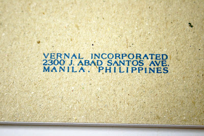
The pad's back board showing Cattleya's logo, its manufacturer and where it was manufactured.


And so the search for the THE (almost perfect) paper ended with with the Cattleya intermediate paper. Sold in pads of 90 leaves in 8x10in book paper, it's selling for PHP28.50, or approximately US$0.60! I will definitely go back to NBS this weekend and get more pads. This pad of paper is not only good for reviews, it's good for oodles and doodles too! Well, as another FPNP member said, the good stuff do not have to always be the expensive ones. *Wink.*