Showing posts with label pens. Show all posts

Saturday, October 31, 2009

Happy Halloween!

I have always wanted to write something for Halloween but didn’t know for sure what to blog about. For an Addams Family fan and an aspiring mortician like I am, it should be a comfortable topic, but I'm still left scrounging for ideas. I don’t have happy childhood trick or treat memories to write, or incredible Halloween parties to rave about. I have never even put on a Halloween costume or carved a pumpkin. But a Halloween post must be written and so here is one.

Before proceeding to read the rest, a warning should be made that this is an incredibly 'orange' post, but definitely has nothing to do with Halloween except that it is filled with a lot of 'orange' stuff. The idea for this post came to me after I received my first Rhodia notepad, and while I was waiting to get my Caran d'Ache Saffron ink from Singapore to ink two of my orange looking pens, a laque copper NOS Parker Rialto with a medium nib, and a copper Esterbrook SJ fitted with a 1551 firm medium nib.

Now let's get the reviews done. :)


Rhodia No. 14

I got this staple-bound Rhodia notepad No. 14 as part of Exaclair's Bastille Day giveaway in July. I was surprised and happy to find other Exaclair products in the package, apart from the two bottles of J. Herbin inks they promised to send. When I took the notepad out of the envelope, it wasn't exactly love at first sight for me. Because of its orange covers. :) I preferred the Clairefontaine spiral-bound notebooks and Quo Vadis Habana that went in the package. I tried the Rhodia when the Saffron ink arrived, and I instantly fell in love with it.


For my Halloween post, I thought I'd draw bats on my Rhodia pad. Seen here
with two of my Tomica toys. I got orange toys, too! :)

The No. 14 notepad measures 4.3 × 6.7 inches, and has 80 sheets of 80gsm high-grade vellum paper. The paper on Rhodia pads is very smooth, and it's a pleasure to write on it. The one I got is the lined version, and it is perfectly resistant to ink feathering and bleed, the two common problems faced by fountain pen users. The pages are microperforated so it's easy to tear a page off as needed. Rhodia notepads' covers have an almost water resistant, shiny, smooth paper/board material. I had difficulty drawing the bats using an ultrafine retractable Sharpie - the ink erases itself! :) I'd like to guess that the ink from my Sharpie pen simply dries up on the paper's surface instead of being absorbed by the paper. The front cover is scored on the exact places where they will be creased due to repeated use. The back cover has a thicker chipboard aside from the orange cover, and this gives excellent support when writing.

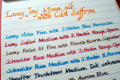
Writing on the Rhodia notepad is an experience. The smoothness of the paper is overwhelming. Below are writing samples of my inked pens, most of which come with medium nibs letting off wet and wide strokes.


It will always be a joy to write on Rhodia notepads. And to claim my full ownership of this little gem of a notebok, I wrote this on its first page, using an orange-colored ink.


Pens: Esterbrook and Parker

Again, this is an orange-themed post, so here are two copper-colored pens from my collection.

Pen No. 1: Esterbrook SJ with a firm medium 1551 nib.


Esterbrook pens are a fascination not only to me, but for a lot of other fountain pen enthusiasts. My Estie (that's their nickname) is a transitional pen and a double jewel demi (SJ). According to the site http://www.esterbrook.net/j3.shtml, the double jewel models came out around 1948 and were produced in vast quantities, with many showing up in the wild with perfectly pliable sacs and in perfect writing condition.


My copper Estie is from fellow Pinoy FP collector Cindy Trinidad. It has a firm medium nib, that I love but which has a remarkable scratch that almost broke my heart until I realized I must align the pen at a certain angle to comfortably write and get rid of the scratch. It writes very well in that angle, and it's among my favorite writers now. :)

Pen No. 2: Laque copper Parker Rialto with a 23k gold plated medium nib.


How do I call this pen? I got it from an office supply store in San Pablo for a price way, way below its current worth. This pen, together with a matte navy Rialto and silver Place Vendome 88 were in the glass shelves of that store since it opened business in the late 90s. I've always seen the pens but never tried them, but once when I was already into FP collecting, I asked the irritated sales clerk if I could try them, and she let me hold the pens for a while. The laque copper Rialto with the 23k gold-plated nib won my heart, but not my purse. Every weekend after that, whenever I have the chance, I'll pass by the store and look at the pens. Until that one Sunday when the store manager asked me if I'd like to buy the pens. She said she's seen me a couple of times looking at the pens, and since they've been sitting there gathering dust for the longest time, the store will give me a discounted price. Oh, boy. That afternoon, I went home with an NOS Parker Rialto.

It took me months to use the pen because I waited for any orange-colored ink to fill it with. When that opportunity came, oh, wow. The pen's medium nib is just so smooth, it's like writing with the softest butter in the world! The barrel's laque finish is excellent, and its 23k gold plated trim doesn't look cheap to me, contrary to what some people say. And though some frown at the Rialto for being a 'spruced up' Vector, I cannot find anything bad to say about this pen, except for its snap-on closure which like the Vector may wear off with time and use.


This pen is a dream come true for me. Not only it is a valuable addition to my collection, it is also a great reminder that, after all, dreams do come true.


Caran d'Ache Saffron Ink


The first time I saw bottles of Caran d'Ache inks was during my second pen meet last March. Leigh Reyes brought a couple of bottles of CdA inks and some of the pens I tried had Caribbean Sea and Saffron in them. I lusted over them since then and when C! Magazine EIC Carl Cunanan went to Aesthetic Bay last month, he kindly bought a bottle of Saffron for me, sent the bottle through our Makati office, in a black Borders bag filled with copies of their swank and hip and cool magazines. :)


Another dream come true for me: Caran d'Ache Saffron. Orange ink!!!


CdA Saffron is a beautiful orange ink. It's a happy orange color, and yet doesn't hurt the eyes when a page written with it is read. The tints of bright yellow, orange and red of the ink really looks like dried saffron stigmas dissolving in hot water. CdA Saffron reminds me of summer sunsets, of flames in my father's furnace at home and of ripe, glossy clementines.

This ink has an excellent flow, and I didn't have any problem with all four pens I tried using it. It dries fast and doesn't stain the converters of my Lamy Joy pens. On the Rhodia notepad, there was no feathering and bleed through at all. CdA Saffron is part of Caran d'Ache's nine-color Colors of the Earth line of products. CdA inks comes only in bottles, no cartridges, and a bottle contains 30ml of ink.

Here is a writing sample of CdA Saffron using all the nib sizes on my Lamy Joy set. Paper is Kokuyo loose leaf, very fountain pen friendly, very sturdy paper. (Click on the image for a larger view.)


And so ends my orange reviews. I didn't like orange before, never liked bright colors. But notebooks and inks and pens changed all that. Thanks to Rhodia, Esterbrook, Parker and Caran d'Ache, I see orange differently now. :)

Friday, October 16, 2009

Inks on Review: J. Herbin Rouge Opera and Bleu Pervenche


When I started using a fountain pen, I only had one ink color in mind: black. After I found a bottle of old washable black Parker Quink at a brick and mortar shop here in Los Banos, it worked fine for me. The fine-nibbed maroon Parker Vector and bottle of Quink worked okay for a long time. Until I found a bottle of Quink Blue-Black in a box of sale items at an NBS branch. It was an important discovery for me, one that opened up to a huge Pandora’s box of endless possibilities in the world of fountain pens.

These endless possibilities include inks, ink colors, and ink brands. I wanted to learn more about them and so I read. And read. And read more. As I read more, I learned more. As I learned more, I began to want to own more pens, and inks, and more ink colors…

While blog hopping last July, I read somewhere that Exaclair, the exclusive distributor of Clairefontaine, Rhodia, Quo Vadis, G. Lalo, Exacompta and J. Herbin products in North America is giving away inks for review in celebration of Bastille Day on July 14. That is how I got these two bottles of wonderful J. Herbin inks. Though it took me longer than Odysseus to get these inks, the wait is worth every second of it. (The story about the Exaclair packages is here.)

When I sent the email to Exaclair, I did as they said. I chose one red ink and one blue ink. I was hoping to get the most coveted J. Herbin orange ink, Orange Indien, but I kept by the rules. I was torn between Rouille D’Ancre and Rouge Opera for my bottle of red; and between Bleu Azure and Bleu Pervenche for my blue ink. I finally settled on Rouge Opera as my red, because it looked so blooming and alive; and Bleu Pervenche for my blue because it’s a turquoise, and yet looked solid and strong.

And now, the reviews.

J. Herbin Rouge Opera


Did I say this ink looked blooming and alive? Well, it is. When I got the first package that Exaclair's VP for Marketing Karen Doherty sent me, Rouge Opera was the first bottle I opened. I'm not one to smell inks, but the scent of Rouge Opera caught me by surprise. It's like taking in the scent of wild flowers and that makes it even better to use. I filled one of my Schneider Base pens with this ink and tried it on my Moleskine. Uh-oh. In my excitement to try the ink, I forgot that Molie paper is the big time ink sucker. I then tried it on my Scribe using my Lamy Joy’s 1.5mm italic nib on my white Safari. It was amazing. It was beautiful. Rouge Opera clearly shows off the beauty of its shading and color when used on pens with broad nibs.

Rouge Opera is my first pink fountain pen ink. It is a lovely pink that leans towards dark fuchsia and burnt red. Though it shows more traces of red, I know that I can use it for everyday writing because it is not as bright and glaring as other red or pink inks. While wet, it has a certain sheen which gives it a glossy, slick appearance. When it has dried, it loses the gloss, but retains the same color intensity. The shading is very evident, especially when used with broader nibs, and I like that with my inks. While I’m more of a blue and black ink user, this pink ink is a keeper on my stash.

J. Herbin Bleu Pervenche


My all-time ink favorite is Waterman South Sea Blue. It’s an attractive turquoise ink that is wet and friendly to all of my pens. Then Bleu Pervenche comes along. I filled another Schneider Base with this ink as soon as I opened the bottle and tried it on the Scribe. Wonderful. The next pen I tried was my new Lamy Vista with my Lamy Joy’s 1.1mm italic nib. It was magnificent. It was beautiful.

Bleu Pervenche is my not my first blue or turquoise ink, but its clarity lends it a unique softness. I like it better on ivory-colored than bright white paper, because it looks softer in the former. While wet, it appears lighter than SS Blue, but looks very soft and readable as soon as it dries. Shading is very evident, as it is with Rouge Opera, and again, that is something I very much like with my inks. I like Bleu Pervenche a lot and right now, I got four pens already filled with it.


And for writing samples, I present my attempts to learn Chancery Italic Script. I wanted to present something worthwhile with my ink tests, and inspired by my Speedball textbook and Ann Finley's instructions at FPN, here are a few samples of my new addiction.


Below is one of my better attempts to Chancery italic script using my Schneider Calligraphy pen with a 1.5mm italic nib.


And finally... a small token of my gratitude to Karen and to Exaclair for being so generous in giving away so many of their products not only for review but also for long-term use. I will forever be grateful to Karen for sending stuff all the way from New York to the Philippines so I can review, use and enjoy these wonderful products I so dearly love!


Thursday, September 10, 2009

The Second Carnival of Pen, Pencil and Paper

The second Carnival of Pen, Pencil and Paper is out! And The Archer is overwhelmed and proud to make it to the Editor's Choice again. :)


In this edition of the Carnival, The Archer's review of the red Scribe notebook is featured as the top Editor's Choice, together with other articles on ink projects, back-to-school crafts and rollerball pens.

Hurry! Run over to the Pen Addict's site to read more on pen, pencil and paper here: http://www.penaddict.com/2009/09/the-second-carnival-of-pen-pencil-and-paper.html

To read about the First Carnival of Pen, Pencil and Paper, head out to Notebook Stories here: http://www.notebookstories.com/2009/08/04/the-first-carnival-of-pen-pencil-and-paper/

More information about the Carnival can be read here: http://www.notebookstories.com/carnival-of-pen-and-paper/

Monday, July 27, 2009

GPW #3: Uni-Ball Signo Gelstick

Here’s GPW#3: Uni-Ball Signo Gelstick 0.7 in Blue and Black


After missing GPW for two weeks, it’s back today with Uni-Ball pens.

I got the Signo Gelstick pens from Office Warehouse, the store that also sells Schneider pens and Eagle notebooks. After buying them, I put them in my plastic pen case together with a lot of other pens and left them there, without even trying any of them.

Weekends ago (yes, it has been that long), while I was looking for pens for GPW, I was settled to get a non-Pilot pen. I thought it was time to try the Signo Gelsticks, so I took the two pens out of the box. As soon I tried to write using the black pen, I regretted not having used it earlier. Oh, why didn’t I?

Both pen are mediums (0.7), but wrote smoothly, evenly, and did not skip. The frosted, semi-transluscent plastic barrel is easy to hold while I write, even without the rubber grip I have so gotten used to in my other pens. And because these pens impressed me, I searched for reviews and comments about them and learned these facts:

  • The ink used is water-based, acid-free pigment gel ink.
  • It is fade and water-resistant, thus lasts long and resists fading due to exposure to light.
  • Helps prevent check washing.
  • The stainless steel tips with tungsten carbide balls have twin-ball action to prevent ink leaks.

The Uni-Ball Signo Gelstick stainless steel tips with the 0.7mm tungsten-carbide balls.

I understand I haven't done a water resistance tests in my previous GPW entries, but because of the fade and water-resistant claims on the Signo Gelsticks, I decided to do one. I ripped off a page from my Eagle notebook and wrote on it. I then placed the page under the tap's running water, and it was simply amazing to see that indeed the ink on these pens remained visibly clear. It did not run, feather, or bleed. Cool.

The Uni-Ball Signo Gelstick now belongs to my top 10 gel pens. It is a simple pen that is highly ideal for everyday use whether at work or in school, and it uses the same ink that Uni-Ball uses in their pricier pens. Great. I'm sure to get more of these pens later, in the same ink colors and hopefully the other available colors: red, green, light blue/turquoise, violet, fluorescent pink, and fluorescent orange.

Monday, June 29, 2009

GPW #1: Pilot G2s

Here's Gel Pen(s) of the Week (GPW) #1: My set of 0.7 Pilot G-2s.


This it it. This is where GPW starts. I mentioned in one of my earlier posts that I will do a GPW project. GPW, or gel pen(s) of the week is a project I thought of while cleaning out my pen boxes. I realized that even if I want to, I cannot fully shift to full fountain pen use due to the following reasons: (a) I got a lot of non-FP pens; (b) i need a GP or a ballpoint to fill out forms, or sign documents; and (c) finding FP-friendly notebooks and paper in this corner of the planet is just way too difficult. But really, the main reason for the GPW project is that I have too many (and still hoarding) GPs and I want to use them.

And so here's GPW #1, and for this week, my featured pens are my Pilot G2 0.7mm retractables.

I met (or bought) Pilot G2s at the same time I got my first Moleskine. Before my Mollie, I've read excellent reviews about these pens from various websites and blogs, and the most interesting articles and posts (even photos) finally convinced me to get these pens for my Molie. To test them, I bought a 0.5mm black and red to use on my new notebook, and true enough, it's an amazing experience to write with these pens. Later on, I got the 0.7mm G2s as I am more fond of thick, wide, dark lines.

Now, a lot has been said about these pens, and as a G2 user, I agree to all the rave about them. These GPs are very smooth and reliable writers, and their ink is very friendly to Moleskine notebooks. I did not experience any skipping or thinning lines ever since I used them not only on the Moleskine, but also on different papers. The rubber grip on the section is just perfect for my discriminating fingers, and the durable plastic clip is excellent to just clip them anywhere-on my bag's tag, my jean's back pocket, etc. Lastly, I am not a person who loves to post their pens. I hate posting my pens, and the fact that the Pilot G2 uses the retractable system makes it a home-run winner!

Through time, I set aside my G2s as I got fascinated with, and of course, used fountain pens. But I also realized it's difficult to move to full FP use. And so I got back to using the G2s. I even found a better use for them in my GTD (getting things done) kit. It helps that I got these GPs in other colors aside from the black/blue/red inks available here. A friend who went to the United States brought me a three-pack of G2s in turquoise, purple, and pink. Now I got six colors out of the 15 available ink colors that Pilot made for G2s.


Here is my GTD kit, opened. The left flap has pen slots, but only for four pens, so the other two pens are clipped to the paper slots on the other flap. This kit, as I call it, is like a wallet, but with more compartments. I got it from NBS for my FPs, but the garterized pen holders are too tight, that I got scared my FPs will be damaged later on. And like the G2 rediscovery, I found a better use for it. *Wink.*

Both the left and right flaps of this pen holder have big slots which can accommodate other stuff, mostly the multi-colored index cards I use for my GTD system.

The back pocket is also roomy enough for bits of paper, and here I got stamps and tea tags.

So here is my GPW #1. I'll dig into my box again and let's see what I'll come up with next Monday. For now, I'm happy with my G2s.

Wednesday, April 15, 2009

Rediscovering Old Inks

After my first pen meet last December, I (surprisingly) started to have a dislike for black and blue-black inks as new ink colors began to interest me. At that time too, I had the luck of owning several bottles of new non-black/non-blue-black inks (Private Reserve Copper Burst and Avocado, and Waterman South Sea Blue and Florida Blue). And so the move to colored inks became a wonderful experience. And because of my exposure to fellow fountain pen collectors, I began to crave for more non-black inks to add into my stash. Who wouldn't be in awe when one sees colorful strokes of sepia-like brown, avocado green, turquiose-like blue, and almost royal blue inks on one's Moleskine's pages? For days, I rotated several pens inked with different colors on my Moleskine, who must have had a heart attack with all those hues after having been used to the monotony of black. But not for long.

Last month, during an international workshop sponsored by my organization, a friend from India brought me four pens: a Camlin Trinity, a Chelpark Moti, and two fancy Montex pens. I postponed inking the pens for a week as I was also very busy at that time. When the time came to ink it though, I took my chances and went back to my previous loves: Parker Quink washable black and permanent blue-black.

I used black on the Camlin Trinity and she was an instant hit with me. "We hit it off right away," is what I'll say if I am to describe my initial impression of the Camlin. I was so smitten by that pen that I temporarily ditched my two Schneider Base pens. She's got a Fine to Medium nib, but she is such a wet writer. She's got some scratch when I write with it though, but I want to think that such flaw adds to her character.

Here's the Camlin Trinity fountain pen with a Fine to Medium nib. Its maroon barrel is made of plastic, and brushed metal for its cap.

Note the unique clip of this pen.

This is the closest I can get to its nib.

And here is a writing sample of this beautiful pen.

For the Chelpark Moti I used the permanent blue-black ink. It wasn't a hit at first, but after some strokes and doodles on paper, she showed me what she's got. Like the Camlin, she's got a Fine to Medium nib, but she's wetter. And so she's smoother as a writer. Which is just wonderful. And while the Camlin fills through a converter, this one gets hers through a piston filling mechanism. Her nib and feed can also be removed so it's easier to clean. And she's got a window to show the ink inside. Cool.

Here's the Chelpark Moti fountain pen with a Fine to Medium nib. Its green barrel is made of plastic, and its brushed metal cap has some signs of brassing.

The cap and nib of the Moti. Her nib is more elaborate than the Camlin's. Note her ink window.

And here is a writing sample of my Chelpark Moti.

Now that I'm into Parker inks, I got myself a box of cartridges of Parker Quink Ruby. It's like burnt red, or red-purple, and I imagine seeing red wine droplets on my Moleskine pages when I write using this ink. I used it on my white Parker Vector as a tiny surprise for anyone who wants to try my white pen. This ink is beautiful, and the photo below cannot do its beauty justice.

Monday, February 9, 2009

A(nother) White Pen

What do you call it when you were searching for something and then you’d find something else that you weren’t actually looking for? Serendipity? Chance? Luck? It could be. But with my pens, I’d like to call it fate. And it was fate that brought me another white pen yesterday afternoon.

It was half past six already, and I was on my way home when I chanced upon an old, familiar school supplies store in San Pablo. I browsed through their selection of pens, notebooks and specialty paper, and even got several postcards for my Postcrossing project. As I paid for the postcards, something interesting caught my attention. Out of an old and battered box inside one of their glass cabinets, the silver clip of a pen is peeking out. I rushed the salesclerk to get the box for me. Lo and behold, the box had two identical pens of different colors: red and white. Yes. White. I prayed that it would be a fountain pen but I was disappointed to find out it was a ballpoint. And it had several dirt specks on its barrel. Then again, because it is a white pen, I asked to try it. It was my second shock that afternoon: it is a Cross ballpoint. And it is white. I tried it and it wrote smoothly. I checked the ink cartridge inside and it says A.T. Cross Medium. And so I went on to pay for it without even asking about its cost. And Holy Mother of Jesus. What a bargain it was. The original price tag says it is selling for 260 pesos, but since it doesn’t have a box anymore, and that it comes as an old stock item, they’re selling it for half the price. So I got a white Cross ballpoint for 130 pesos, or roughly less than $3. Oh, wow.

My white Cross ballpoint, on top of my Moleskine leather wrap. It's a joy to have this pen, never mind that it's a ballpoint.


If anyone is wondering why I got a Cross ballpoint when I have just indicated that I have made the switch to full fountain pen use, well, it comes from something personal. And of course, the pen is white. So I got interested. And it is a Cross pen. Then it gets personal. Because it is a Cross pen. Hm. Way back in college, one classmate had an army of Cross writing instruments: ballpoints, pencils, and rollerballs. He’d even come to class holding his pens instead of putting them in a pen case or pen holder, as if showing them off for all to ogle at. He would proudly display his pens on his writing desk and decline anyone who’d ask to try any of his pens. Hmp. I secretly wanted to have similar pens then. The glitter and shine of all those gold and silver pens with beautiful set cases is indeed difficult to take off my mind.

Through time, I got my hands on several Pilots, Parkers, Rotrings, Staedtlers, and even a Sheaffer 0.7 silver mechanical pencil that my classmates envied, because at that time, those were still hard to come by. (I still have the pencil now, and in very good condition, which should only be the case because being one of Tatay’s few gifs to me, its preciousness is unrivaled.) But I never got to own a Cross. Not one ever. And so this Cross pen is a surprise, a gift from a fateful encounter. My now chance to a past denied opportunity. And it’s a white pen! Aw, shoot. How many times have I already said that?

Here are several more photos of the pen (middle one), together with my other two white pens already, my Schneider Base medium-nibbed fountain pen (left) and my Parker Jotter (right). They are on top of a page off Esopus 8, Spring 2007, page 122. The painting is Gustave Moreau's "Salome Dancing Before Herod". For a better image of the painting, see it here.

Thursday, November 27, 2008

My Missing Pens (Now Found)

I found them!!! Yes, I found my missing Pilot FriXion Ball gelpens. Phew! Remember this post last September? These FriXion pens should have been included in the Pilot pens collection photo, but they were missing the time I was shooting and I could not remember where I placed them no matter how hard I tried to recall. Surprisingly, while organizing my toy truck collection the other night, these pens turned up in one of those small plastic bags holding my Tomy toys. Whew. And all the while I thought I have lost them.


Pilot FriXion Ball pens belong to the large selection of gel pens from Pilot, using the new, clever Metamocolor technology, or what the chemists at Pilot Pens call, thermo-sensitive gel ink formula, which turns transparent when friction is applied to it. A small rubber on its tail serves as an "eraser", and the ink disappears neatly as no eraser dust is produced in the process. Pilot claims that this "erasing" process does not pose any damage to almost all types of paper at all. Because the ink in these pens is easily erased, they cannot be used on legal documents or on any other official papers. The ink on these pens turn colorless when exposed to extreme temperatures (<14°f;>140°F). Their color can be restored, though fading, when placed in freezer to cool.

For practical and obvious reasons, I won't use these FriXions to write on my Moleskine, though. That notebook is reserved for my Pilot G2s. But these FriXions are great, cool pens! Especially when you're around people who get impressed with the idea of erasable gel pen inks. *Wink.*

Yeah, cool. Cool pens, these FriXions are. They're very handy when doing crossword puzzles, or Sudoku. Want more cool stuff about these pens? Watch this promotional video released in the US. Now this is one cool video for one cool pen.

Monday, September 15, 2008

Pens Galore!

I've always loved pens, and I've always wanted pens. Lots of. Through time, I've accumulated so much but held on to the really special ones. Below are the pens on my stash:

Mon Ami Gel Pets

Non-Pilot Gel Pens

Pilot Gel Pens

The lot.

Monday, September 8, 2008

My Favorite Pen


This Rotring Core Rubidium with an XL nib is surprisingly my current favorite pen. It uses cartridges instead of converters, and slurps up ink like a thirsty camel. So I stocked up on Inoxcrom cartridges, which surprisingly (and thankfully) fits this baby. This beauty is the fourth on my budding collection of fancy fountain pens, my first German, and my third red.

I am surprised that it has become my favorite writer because even if I collect them, I rarely use my fountain pens for everyday writing. My everyday, anyday writers are my 3-color Pilot G2 .5 set with some of the other gels (Uni Ball, Dong-A, Faber Castell, etc.) in my pen roll. I had always been faithful to my gels. This one, however, gave me something else: an instant connection the moment I inserted the cartridge with blue ink. And though it guzzles down ink like a leaking faucet, I just love its fat, broad, wet streak when I write with it. And perhaps its ergonomic grip, or the bright red of its barrel?

What is amusing is the fact that when I purchased this pen, I was meaning to buy another Rotring, the 600. But the store has ran out of them, and so I got what fancied my eye: The Rubidium.

And we had since been inseparable. At least for now.

Below are photos of how I wrote using my Rubidium.