Showing posts with label Caran d'Ache Saffron. Show all posts

Wednesday, November 11, 2009

Quo Vadis Habana Notebook: A Review


Here is the Quo Vadis Habana notebook from the kind people at Exaclair, Inc.

Those close to me know how much I love pens and notebooks. I always have a lot of both – in my backpack, on my office table, on my work table at home; even my closet has pens and notebooks inside! I think most of my backpack’s weight is not because of my laptop and its accessories but because it’s always full of pens and notebooks. And like most notebook enthusiasts, I currently have a number of notebooks in use – and four are in my bag. One of them is a black 6”×9” Quo Vadis Habana notebook.


The Quo Vadis Habana notebook.

Karen Doherty of Exaclair, Inc. has kindly sent me a large Quo Vadis Habana notebook in September. I kept my Quo Vadis Habana in its plastic wrap until I was ready to write the review because I was scared of any damage or dirt getting in the notebook. The first thing I did when I took out the plastic wrap was to smell the Habana's paper. Oh, yes I did that! I always do that to my notebooks, especially the newly opened ones. I do that because I love the smell of new paper, and partly because I also want to assess its quality. And yes, nothing beats the sweet smell of clean, new, non-acidic paper!


The Habana's bright white pages stay flat when the notebook is open.

The Quo Vadis Habana’s cover is made of black leatherette that gives it a subtle elegance. Wrapped in this leatherette is a thick but flexible board. I’m sure one can easily bend the covers, but I won’t risk doing that to my notebook. As I ran my fingers on the Habana’s front and back covers, it felt soft and smooth. The pressed QV logo on the front’s lower right corner and at the back signifies quality to me. My work background tells me these logos come from high quality leather pressing/embossing.


Elegant pressed QV logos on the Habana's front and back covers.

Inside the Quo Vadis Habana notebook are 80 sheets of acid- and chlorine-free, bright white, premium 90g Clairefontaine paper. Think of all that paper goodness! I am so amazed with the brilliant white pages and their smoothness. The lines are widely-spaced, and this is good news for me because of my fondness for wide strokes when writing. The notebook’s pages have round corners, and for me, this is a thoughtful gesture from QV for their notebooks’ users because sharp page corners not only tend to curl up, they can also cut into people’s palms.


Round page corners on the Habana's pages.

The Quo Vadis Habana notebook’s binding is another plus for this notebook, because it allows the pages to stay flat on their own while the notebook is open. This is shown in the photo above of the open notebook.


Notebook abuse? Nah. It was only a test that the Habana gracefully passed.


Finally, we come to the best part: the writing samples!

Because all the reviews raved on the Quo Vadis Habana’s ability to hold fountain pen inks, I tried all my wet nibs on it. I wrote with all my italic/calligraphy pens, some o f my medium nibs and two of my wet fines. The results? Amazing!

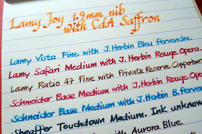
I started write-testing the Quo Vadis Habana notebook using my italic nibs. Then I used three Parkers inked with highly saturated inks: Private Reserve Copper Burst and Avacado. Lastly, I wrote with my other inked pens, starting with my Retro 51, which is a wet medium inked with a wet ink: Waterman South Sea Blue. I tested my other mediums, the Parker Rialto and all three Schneider Base pens, the first filled with CdA Saffron and the others with either J. Herbin Bleu Pervenche or Rouge Opera. I also tried the bold Pilot 78G and two plastic pens I got from Daiso, both with scratchy nibs but gives out very wet ink flow. All writing samples looked beautifully, all ink samples dried fast, and because of the Habana’s white paper, the colors all looked so bright! My momentary surprise was cut short when I remembered I had to check the Habana for two more things: feathering and bleed. There is absolutely no feathering on the Habana from all the pens and ink colors I used. Hurray! Bleed? It’s almost as if I held my breath as I turned the page over so I could check for bleed. And… voila! Absolutely, definitely, certainly no bleed at all! Hurray! This means I can forever use a fountain pen to write on my Habana notebook, right?

Pen and ink combinations


Schneider Creativ 1.5mm italic nib and PR Avacado; Lamy Joy 1.5mm nib and CdA Saffron.


Lamy Vista (1.9mm) with Bleu Pervenche, Lamy Safari (1.1mm) with Rouge Opera and Lamy Joy (1.5mm) with CdA Saffron.


3 Parkers: Parker 25 (M) and Parker Jotter (M) with PR Copper Burst, and Parker Vector (wet F) with PR Avacado.


The rest of all the pens and inks I tested on the Habana.

But, wait! I’m surely happy and excited to use the Quo Vadis Habana notebook for journaling, but there are two things I hope the people behind QV will consider: the elastic closure and the page marker ribbon.

The elastic closure for me seems too narrow for this notebook size. Some users may like thinner bands such as the one on the large Quo Vadis Habana notebook, but I would have liked mine to be a little wider. Perhaps this size is good for smaller notebooks, but for a 6”×9” leather-covered journal, it looks a bit awkward for me.

I feel the same for the Quo Vadis Habana notebook’s page marker ribbon: it is too narrow/thin, and too short for the 9” page size. The ribbon is a bit short for me that I cannot tie its end to prevent fraying or I will shorten it even more. But that’s just me, and that doesn’t mean I love the Habana less. :)


The Habana's page marker ribbon which I feel is too thin and narrow. Again, that's just me! :)

The Quo Vadis Habana is a great notebook, and probably the best I’ve ever tried. It’s already friends with my fountain pens, has excellent paper, looks great, what more could I ask for? (Just a wider elastic band and longer page marker ribbon. LOL!) Perhaps a notebook for each available color? Or one of each size? The Habana is available in four colors: black, which is the one being reviewed here; blue, red, and taupe; and in two sizes: large (6"×9", with 80 sheets of 90g paper), and pocket (4"×6", with 96 sheets of 64g paper). Hmmm... Lots of notebooks to choose from! More information about Quo Vadis Habana notebooks is available at the QV site.

Lastly, I’d like to give Mr. Pythagoras a bit of a show-off here.


Saturday, October 31, 2009

Happy Halloween!

I have always wanted to write something for Halloween but didn’t know for sure what to blog about. For an Addams Family fan and an aspiring mortician like I am, it should be a comfortable topic, but I'm still left scrounging for ideas. I don’t have happy childhood trick or treat memories to write, or incredible Halloween parties to rave about. I have never even put on a Halloween costume or carved a pumpkin. But a Halloween post must be written and so here is one.

Before proceeding to read the rest, a warning should be made that this is an incredibly 'orange' post, but definitely has nothing to do with Halloween except that it is filled with a lot of 'orange' stuff. The idea for this post came to me after I received my first Rhodia notepad, and while I was waiting to get my Caran d'Ache Saffron ink from Singapore to ink two of my orange looking pens, a laque copper NOS Parker Rialto with a medium nib, and a copper Esterbrook SJ fitted with a 1551 firm medium nib.

Now let's get the reviews done. :)


Rhodia No. 14

I got this staple-bound Rhodia notepad No. 14 as part of Exaclair's Bastille Day giveaway in July. I was surprised and happy to find other Exaclair products in the package, apart from the two bottles of J. Herbin inks they promised to send. When I took the notepad out of the envelope, it wasn't exactly love at first sight for me. Because of its orange covers. :) I preferred the Clairefontaine spiral-bound notebooks and Quo Vadis Habana that went in the package. I tried the Rhodia when the Saffron ink arrived, and I instantly fell in love with it.


For my Halloween post, I thought I'd draw bats on my Rhodia pad. Seen here
with two of my Tomica toys. I got orange toys, too! :)

The No. 14 notepad measures 4.3 × 6.7 inches, and has 80 sheets of 80gsm high-grade vellum paper. The paper on Rhodia pads is very smooth, and it's a pleasure to write on it. The one I got is the lined version, and it is perfectly resistant to ink feathering and bleed, the two common problems faced by fountain pen users. The pages are microperforated so it's easy to tear a page off as needed. Rhodia notepads' covers have an almost water resistant, shiny, smooth paper/board material. I had difficulty drawing the bats using an ultrafine retractable Sharpie - the ink erases itself! :) I'd like to guess that the ink from my Sharpie pen simply dries up on the paper's surface instead of being absorbed by the paper. The front cover is scored on the exact places where they will be creased due to repeated use. The back cover has a thicker chipboard aside from the orange cover, and this gives excellent support when writing.

Writing on the Rhodia notepad is an experience. The smoothness of the paper is overwhelming. Below are writing samples of my inked pens, most of which come with medium nibs letting off wet and wide strokes.


It will always be a joy to write on Rhodia notepads. And to claim my full ownership of this little gem of a notebok, I wrote this on its first page, using an orange-colored ink.


Pens: Esterbrook and Parker

Again, this is an orange-themed post, so here are two copper-colored pens from my collection.

Pen No. 1: Esterbrook SJ with a firm medium 1551 nib.


Esterbrook pens are a fascination not only to me, but for a lot of other fountain pen enthusiasts. My Estie (that's their nickname) is a transitional pen and a double jewel demi (SJ). According to the site http://www.esterbrook.net/j3.shtml, the double jewel models came out around 1948 and were produced in vast quantities, with many showing up in the wild with perfectly pliable sacs and in perfect writing condition.


My copper Estie is from fellow Pinoy FP collector Cindy Trinidad. It has a firm medium nib, that I love but which has a remarkable scratch that almost broke my heart until I realized I must align the pen at a certain angle to comfortably write and get rid of the scratch. It writes very well in that angle, and it's among my favorite writers now. :)

Pen No. 2: Laque copper Parker Rialto with a 23k gold plated medium nib.


How do I call this pen? I got it from an office supply store in San Pablo for a price way, way below its current worth. This pen, together with a matte navy Rialto and silver Place Vendome 88 were in the glass shelves of that store since it opened business in the late 90s. I've always seen the pens but never tried them, but once when I was already into FP collecting, I asked the irritated sales clerk if I could try them, and she let me hold the pens for a while. The laque copper Rialto with the 23k gold-plated nib won my heart, but not my purse. Every weekend after that, whenever I have the chance, I'll pass by the store and look at the pens. Until that one Sunday when the store manager asked me if I'd like to buy the pens. She said she's seen me a couple of times looking at the pens, and since they've been sitting there gathering dust for the longest time, the store will give me a discounted price. Oh, boy. That afternoon, I went home with an NOS Parker Rialto.

It took me months to use the pen because I waited for any orange-colored ink to fill it with. When that opportunity came, oh, wow. The pen's medium nib is just so smooth, it's like writing with the softest butter in the world! The barrel's laque finish is excellent, and its 23k gold plated trim doesn't look cheap to me, contrary to what some people say. And though some frown at the Rialto for being a 'spruced up' Vector, I cannot find anything bad to say about this pen, except for its snap-on closure which like the Vector may wear off with time and use.


This pen is a dream come true for me. Not only it is a valuable addition to my collection, it is also a great reminder that, after all, dreams do come true.


Caran d'Ache Saffron Ink


The first time I saw bottles of Caran d'Ache inks was during my second pen meet last March. Leigh Reyes brought a couple of bottles of CdA inks and some of the pens I tried had Caribbean Sea and Saffron in them. I lusted over them since then and when C! Magazine EIC Carl Cunanan went to Aesthetic Bay last month, he kindly bought a bottle of Saffron for me, sent the bottle through our Makati office, in a black Borders bag filled with copies of their swank and hip and cool magazines. :)


Another dream come true for me: Caran d'Ache Saffron. Orange ink!!!


CdA Saffron is a beautiful orange ink. It's a happy orange color, and yet doesn't hurt the eyes when a page written with it is read. The tints of bright yellow, orange and red of the ink really looks like dried saffron stigmas dissolving in hot water. CdA Saffron reminds me of summer sunsets, of flames in my father's furnace at home and of ripe, glossy clementines.

This ink has an excellent flow, and I didn't have any problem with all four pens I tried using it. It dries fast and doesn't stain the converters of my Lamy Joy pens. On the Rhodia notepad, there was no feathering and bleed through at all. CdA Saffron is part of Caran d'Ache's nine-color Colors of the Earth line of products. CdA inks comes only in bottles, no cartridges, and a bottle contains 30ml of ink.

Here is a writing sample of CdA Saffron using all the nib sizes on my Lamy Joy set. Paper is Kokuyo loose leaf, very fountain pen friendly, very sturdy paper. (Click on the image for a larger view.)


And so ends my orange reviews. I didn't like orange before, never liked bright colors. But notebooks and inks and pens changed all that. Thanks to Rhodia, Esterbrook, Parker and Caran d'Ache, I see orange differently now. :)