Showing posts with label Private Reserve. Show all posts

Wednesday, December 2, 2015

A Comparison of Blue Fountain Pen Inks

Black and blue are the two ink colors that are commonly used in fountain pens for everyday writing, and most people use blue inks for business and professional purposes. Blue is my 'go to' ink, and I have more than 30 bottles of blue fountain pen inks, but not all blue inks are the same. I have a few favorites, and I categorized them into three categories: Regular/Standard Blue, Dark Blue/Blue-Black, and Turquoise.


REGULAR/STANDARD BLUE INKS

This category has the widest selection of blue inks, including the basic and true blue inks. Some blue inks in this category have green and red undertones, but the ones I included here are the true, vivid blues. These ink colors can be used everyday in business and and legal documents, in note taking, and even journaling.


J. Herbin Éclat de Saphir is a vivid, bright blue ink with excellent flow and lubrication. It's a wet ink, and shades well, especially in broad or stub nibs. Éclat de Saphir is a beautiful, bright blue even after it dries on paper. It doesn't stain the pens I've filled with it, and is easy to wash off.
J. Herbin Éclat de Saphir

American Blue is my favorite Private Reserve blue ink. It is bright, saturated, and has excellent flow. Shading is best in broad and stub nibs, where I occasionally see a distinct red sheen. American Blue is a well behaved saturated ink, and does not stain or clog my pens. My PR bottle is a fast dry ink, and it dries really fast!
Private Reserve American Blue (Fast Dry)

I have Noodler's Baystate Blue, and I love its bright color, but I am more drawn to the depth and richness of Noodler's Blue. It's a saturated blue ink, and takes longer than most inks to dry. I usually use it on my broad-nibbed pens.
Noodler's Blue


DARK BLUE/BLUE-BLACK INKS

Whenever I want to try a different ink color that's still blue, I go through my box of blue-black inks. They are still blue, but darker, and yet lighter than black. I use blue-black inks to sign documents, and in note taking at the office.


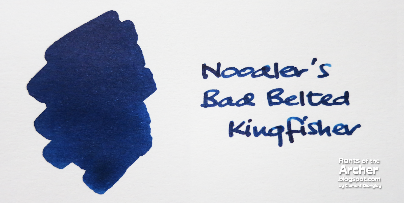
Noodler's Midnight Blue and Bad Belted Kingfisher (BBK) were my first blue-black inks. I prefer BBK because of its depth, shading, and lubrication. It's a saturated ink, smooth, and a true blue-black ink that doesn't become teal after it dries. The only downside to this ink is its drying time. It takes a while to dry, around 20-25 seconds, especially when it's used on a wide nib. It also takes a while to wash off.
Noodler's Bad Belted Kingfisher

Pelikan Blue-Black is my favorite blue-black. It's from Pelikan's 4001 ink series, and a dry ink, so I use it mostly in broad and stub nibs. It's very expressive, turning grayish blue from dark blue, and the shading is simply awesome. It doesn't feather or bleed on thin paper, and dries fast.
Pelikan 4001 Blue Black

My bottle of 1670 Bleu Ocean came from this ink's first batch. It doesn't have the additional gold flecks, and I like it that way. Most people avoid this ink because it is heavily saturated, but I love its deep, dark blue color, and my Lamy Al Star Ocean Blue is always inked with it. The pens I filled with this ink wrote smoothly, and Bleu Ocean dries faster than its older sibling Rouge Hematite, which is a notoriously slow drying ink.
J. Herbin 1670 Bleu Ocean

TURQUOISE INKS

When I was a fountain pen newbie, my first ink love was Waterman South Sea Blue, a turquoise ink. It has been discontinued several years ago, and I have found a few turquoise inks in place of South Sea Blue. While turquoise inks are lovely, I use them more for journaling.


Bleu Pervenche is my introduction to J. Herbin inks. It is a lovely turquoise ink, with subtle hints of green. Bleu Pervenche has excellent flow and lubrication, shades well, dries fast, and easy to wash off.
J. Herbin Bleu Pervenche
Pelikan 4001 Turquoise is a bit darker than J. Herbin Bleu Pervenche, but has the same hints of green. It has nice shading, excellent flow, and dries fast (around 10 seconds). Although it's a light blue ink, it becomes a bit darker when it has dried.
Pelikan 4001 Turquoise

Below is a photo of the ink swatches on a page.

These inks are my favorite blue inks. They are the most behaved, easy-to-maintain-in-pens inks, they do not clog nor stain my pens. The pens in my EDC are always filled with one or two of them.

I got these inks from different stores at different times, but in Manila, they are available at Scribe Writing Essentials. For availability and prices, contact Scribe through their website, or visit their stores in Eastwood Mall, Shangri La Plaza Mall, Glorietta 5, SM Aura, and SM Megamall.

Sunday, November 20, 2011

Notebook Review: Quo Vadis Keith Haring Artist Series


I have a lot of notebooks. I actually have an insane number of them inside my 'notebook cabinet'. While some are from my impulse buys, most of them came from my silent sponsors, as samples for review. I'm fascinated by colorful things, but I have always been fond of plain-covered notebooks. I like using any black-covered ones for journal writing and note taking. I also use a small black notebook for the 'ink diary' that I keep (more on that on the next notebook review). 

When I received the Keith Haring Quo Vadis Habana notebooks that Karen Doherty (Exaclair's USA VP for   Marketing) sent to me a few months ago, it wasn't exactly love at first sight. Late last month, while I was sick and recovering at home, I saw the notebooks again and decided to try them out. That time, though, it was definitely love at first write.

Keith Haring Habana notebooks are the most recent addition to the Quo Vadis limited edition Artist Series that include the art of Pablo Picasso and Henry Matisse. Picasso's "Portrait of Dora Maar" and Matisse's "Icarus" and "The Creole Dancer" are the selected cover designs of their respective series.

Keith Haring's "Earth Day" and "Baby" on small Quo Vadis Habana notebooks.


These Keith Haring Habana notebooks, as with the other notebooks in the Quo Vadis' Artist Series, are made in France, with leather-like cover material which I love because they are soft, not very smooth, and not shiny either. This leather-like material is wrapped on what I assume is thick board, making the cover solid. The firm, solid covers of Quo Vadis Habana notebooks are made to provide writing support. Photo below shows the notebooks' back covers, printed with Keith Haring icons in the middle, while the Quo Vadis logo is etched in the bottom.


Quo Vadis made Keith Haring Habana notebooks in four designs and two sizes. The four designs are: 'Baby', 'Heart', 'Earth Day', and 'La Ronde'. They are available as either small (4" x 6") or large (6¼" x 9½") notebooks. Both Haring Habanas used in this review are small notebooks.

"Earth Day" is only available in small (4" x 6") size.

"Heart", though, comes in small (4" x 6") and large (6¼" x 9½") sizes.


The Keith Haring Habana notebooks have the same features as their regular counterparts: they have the elegant page ribbons/markers and elastic closures in matching colors. Soon I'll be tying the end of the page ribbons into knots to prevent ugly fraying.

Keith Haring's signature is printed in white on the notebooks' front covers. How elegant.


The small Haring Habana notebooks have 96 sheets of very smoooooth satin ivory paper. The pages have 5.5mm ruling, a welcome change from the wide 8mm ruling previously used on both large and small Habana notebooks. The pages have round corners too, which is great. I prefer notebooks with round corners because sharp page corners can sometimes cut into my fingers and palms when I'm writing. Round corners also look more elegant and stylish.

Round page corners of the Haring Habana notebooks.


Another wonderful feature of Quo Vadis Habana notebooks, including the Haring Habanas, is their sewn binding. This ensures more page security and flexibility, and also (again) adds to the notebooks' elegance. Sewn binding is so much better than most punch and bind methods because the pages are more secure and also tidy.

Sewn pages of the small Haring Habana notebooks.


These special Habana notebooks have lovely spines printed with Keith Haring's signature and icon. Definitely a welcome change from the old, plain spines of my previous notebooks.

The Haring Habana notebooks have printed spines.


The Habana's "small" is not the same in size as the "pocket" of other notebook brands, which is always misunderstood by many users who think that the two sizes are interchangeable. "Small" and "pocket" sizes are not the same. Several brands share the same "pocket" size, such as Moleskine and Rhodia, and Scribe here in the Philippines, while Quo Vadis uses the "small" size alone.

Size comparison: Two pocket notebooks on top, Moleskine and Rhodia. 
The two notebooks below are regular Rhodia and Keith Haring Habana.


I mentioned earlier that the Haring Habanas have smooth satin ivory paper. It is really very, very smoooooth but I did not have any difficulty writing on it. In fact, the smoothness made writing very easy and comfortable, compared to other overly smooth paper types that make writing uncomfortable. I also noticed that while the ruling in the old Habana notebook pages went all the way to the binding, it has a certain margin in the new notebooks.

If paper can make people happy, the Haring Habanas' paper will. 
I know because the smooth satin ivory paper made me happy.


Unlike the previous Habana notebooks with continuous lines, the Haring Habanas have dotted lines. But that's fine. The dotted lines didn't get in the way of my writing, or with the readability of what I've written. I actually think this is cool.

Haring Habana page up close. See the dotted lines?


Below is a page devoted to pen and ink tests, and I included gelpens, felt markers, and a permanent marker in the list to fully test the paper. All the fountain pen inks I tested on the Haring Habana fared very well. I did not see any serious feathering or bleed, even with the notorious bleeder, Noodler's Midnight Blue. I also used a couple of pens with broad Esterbrook nibs such as the Transitional J with Private Reserve Black Magic Blue and J pen with J. Herbin Lierre Sauvage. This is good news, and it made me very happy.

The "non-fountain pen" pens I used in the pen and ink test include Pilot G2s, Stabilo felt markers, Zebra Sarasas, and a Sharpie Ultra Fine Permanent Marker. All the other pens wrote well without feathering or bleed, except for the Sharpie which feathered and bled like an open faucet. But that's just okay. Sharpies bleed bad on most papers.

Inks on the Haring Habana up close: Waterman South Sea Blue, Pelikan Blue Black, 
Private Reserve Black Magic Blue, and Pelikan Edelstein Jade.

The "non-fountain pen" pens: Pilot G2, Stabilo, Zebra Sarasa, 
and Sharpie Ultra Fine Permanent Marker.


Shown here below is the back of the pen and ink test page. It's almost clean, without any ink bleed, except for the one on the bottom part of the page. which is the Sharpie pen.

Sharpie pen bleeds at the bottom of the page.


Overall, I am a very happy recipient of these notebooks and I am beginning to think of how to use them soon. A small journal? A notebook for my daily notes? Who knows? Being the fanatic that I am, I'm sure I'll find a way to use them sooner than I thought I would. Now you know where to get yours, right? All information about these lovely Keith Haring Habana notebooks are posted Quo Vadis' site here: http://quovadisplanners.com/notebooks, and also at the Quo Vadis blog here: http://quovadisblog.com/

The Quo Vadis Keith Haring Habana notebooks used in this review are from Exaclair, Inc. through Karen DohertyThe pens and inks used in this review all belong to my personal collection.

Wednesday, April 22, 2009

I Got Green Pens Too!

I was rummaging through my pen wraps last night looking for a Hero when I realized something: several green pens are peeking out of their slots. Whoa. With six fountain pens and two gel pens, I seem to be getting them faster than those white pens I'm trying hard to build on to a collection. But I'm not complaining. Who knows I may just move on to green pens later when I get my fill of those whities. And these green pens remind me of the green Conway Stewart Dinkie pair I saw at Leigh Reyes' blog yesterday. My pens, are of course worlds different from Leigh's and from those in her collection. *Wink.*

100_1103A

Green pens abound.

From left: Chelpark Moti (Fine, inked with Parker Quink Blue-Black); Inoxcrom Agatha Ruiz de la Prada (Extra Fine, uninked); Hero 332 (Fine to Medium, inked with Private Reserve Copper Burst); Youth 208 (Fine, just cleaned, I also got this in teal); MonAmi Gel Love Pets; Schneider 0.5 XTRA 892; M&G Joy Box (Fine, inked with Waterman South Sea Blue); and Schneider Zippi (Fine, inked with Schneider Black).

Wednesday, April 15, 2009

Rediscovering Old Inks

After my first pen meet last December, I (surprisingly) started to have a dislike for black and blue-black inks as new ink colors began to interest me. At that time too, I had the luck of owning several bottles of new non-black/non-blue-black inks (Private Reserve Copper Burst and Avocado, and Waterman South Sea Blue and Florida Blue). And so the move to colored inks became a wonderful experience. And because of my exposure to fellow fountain pen collectors, I began to crave for more non-black inks to add into my stash. Who wouldn't be in awe when one sees colorful strokes of sepia-like brown, avocado green, turquiose-like blue, and almost royal blue inks on one's Moleskine's pages? For days, I rotated several pens inked with different colors on my Moleskine, who must have had a heart attack with all those hues after having been used to the monotony of black. But not for long.

Last month, during an international workshop sponsored by my organization, a friend from India brought me four pens: a Camlin Trinity, a Chelpark Moti, and two fancy Montex pens. I postponed inking the pens for a week as I was also very busy at that time. When the time came to ink it though, I took my chances and went back to my previous loves: Parker Quink washable black and permanent blue-black.

I used black on the Camlin Trinity and she was an instant hit with me. "We hit it off right away," is what I'll say if I am to describe my initial impression of the Camlin. I was so smitten by that pen that I temporarily ditched my two Schneider Base pens. She's got a Fine to Medium nib, but she is such a wet writer. She's got some scratch when I write with it though, but I want to think that such flaw adds to her character.

Here's the Camlin Trinity fountain pen with a Fine to Medium nib. Its maroon barrel is made of plastic, and brushed metal for its cap.

Note the unique clip of this pen.

This is the closest I can get to its nib.

And here is a writing sample of this beautiful pen.

For the Chelpark Moti I used the permanent blue-black ink. It wasn't a hit at first, but after some strokes and doodles on paper, she showed me what she's got. Like the Camlin, she's got a Fine to Medium nib, but she's wetter. And so she's smoother as a writer. Which is just wonderful. And while the Camlin fills through a converter, this one gets hers through a piston filling mechanism. Her nib and feed can also be removed so it's easier to clean. And she's got a window to show the ink inside. Cool.

Here's the Chelpark Moti fountain pen with a Fine to Medium nib. Its green barrel is made of plastic, and its brushed metal cap has some signs of brassing.

The cap and nib of the Moti. Her nib is more elaborate than the Camlin's. Note her ink window.

And here is a writing sample of my Chelpark Moti.

Now that I'm into Parker inks, I got myself a box of cartridges of Parker Quink Ruby. It's like burnt red, or red-purple, and I imagine seeing red wine droplets on my Moleskine pages when I write using this ink. I used it on my white Parker Vector as a tiny surprise for anyone who wants to try my white pen. This ink is beautiful, and the photo below cannot do its beauty justice.

Thursday, February 5, 2009

(Ice) Tray for my Pens

Everyone has his or her own way of organizing writing instruments. And everyone has their own pen holders to do this. I've always had pen holders on my work/writing tables at home and in my office. Some are gifts, like the Ikea pen holder set I got from someone's Singapore trip, or the wooden set I inherited from someone else; but most are modified pen holders, like mugs of all shapes and sizes, or large peanut butter jelly glasses. For long, this worked as long as my pens are organized. However, when I started collecting fountain pens, I realized that the previous pen holders could damage the barrels of my pens. I found relief when I got my flannel pen wrap. (More about it here and here.)

My pen wrap. I'm still using it to keep (and protect) my pens inside my backpack. Nowadays, its permanent residents are my precious fountain pens, some are pictured below, some I keep uninked for the time being.

Then again, untying and retying a pen wrap and spreading it on my table didn't look very pretty at all. And so the quest for a better pen organizer went on... Until I went to a pen meet last December and saw fellow fountain pen collector Cindy Trinidad's pen trays. At first I didn't think it would work for me, these trays. Then again, when I saw them at a mall's kitchen supplies section, I got hooked on these beautiful ice trays made of soft rubber. Each tray has seven slots and each slot is long (and wide) enough to accommodate a pen. And what's best about these pen trays is that they're available in blue! Now, my pen tray looks like this:

(It's my Moleskine on the foreground, yes. That brown ink is Private Reserve Copperburst on my black Schneider Base.)

Up close, this is how my pen tray looks like on an ordinary day. *Wink.* My pens, from left are: white Schneider Base (Medium, inked with Waterman Florida Blue), black Schneider Base (Medium, with Private Reserve Copperburst), Rotring 600 (Broad, with Private Reserve Avocado), black Hero 616 (Fine with Waterman South Sea Blue), Inoxcrom P-200 (Medium with PR Avocado), green Schneider Zippi (Medium with Inoxcrom blue), and a white Parker Jotter with Medium Black ink.

And yes, I've completely shifted to full fountain pen use. I only got the Jotter there for signing documents that need ballpoint ink, or when I'm filling out forms. Otherwise, I'm enjoying full use of my fountain pens and enjoying their ink colors even more!

Tuesday, January 27, 2009

January's New Pens and Ink

New Year spells new beginnings, new hopes, new wishes. I say New Year brought me new pens. *Wink.* Some people welcome New Year with fireworks, 12 fruits, or money in their pockets. I welcomed 2009 with three new pens! While my brothers were busy setting up fireworks, I was busy inking my Schneiders with my new Waterman South Sea Blue and polishing the Hero616 that Sir Butch D. gave me during last December's pen meet.

The Waterman ink is a delight. After using Inoxcrom's blue and Quink's blue-black, this turquoise from Waterman is a new experience to write with that the moment I inked my black Schneider Base, I wrote endlessly on my Moleskine and completed three pages in a flash! (Photos to follow later, including pages of my Molie where I wrote with my PR Copperburst.) But what's also exciting is my Shchneider Base fountain pen. This German pen, inexpensive and so elegant in its design is a joy to write with. Its medium nib writes smoothly sometimes I forget I'm writing with a fountain pen! Here are some photos of the New Year's stash:

Delight, joy, ecstasy. That spells ink, fountain pens and notebooks for me. The bottled ink is Waterman South Sea Blue, and the pens are: Hero616, Schneider Base Medium in white and black barrels.

Ink and pens on the notebook my friend Sonny sent me all the way from Singapore as Christmas gift.

Ink and pen pageantry. My ink stash: Quink black and blue-black, Waterman South Sea Blue, and Private Reserve Avocado and Copperburst. Coming early next week: Noodler's Concord Bream!

Monday, November 24, 2008

Lovely November (and My Birthday Loot)

So I wasn’t able to NaNo. Again. Sadly. Well, there are excuses, and there are reasons, and I have several of both. But to protect the sanctity of my sanity, I choose not to elaborate on these things. There’s another NaNo next year, and I’d like to look at it as my chance to make-up for all the years I missed NaNoWriMo. But so much for NaNo.

A lot of beautiful things happened in November. Tatay’s birthday came around during the first week, and we had a different kind of celebration this year. Nothing grand, nothing fancy, just a simple dinner at home for the family, yet it felt special.

And then last weekend, it was my turn to celebrate as I turned 35. Yee-ha! We feasted on traditional birthday foods: spaghetti, pancit, puto Biñan, and sweet chocolate cake from Mer-Nels. Yes, I got to have my own cake!!! What a treat. It was an adult children’s birthday party, as someone aptly called it. And with my three nieces around, it was indeed a riot!

My birthday cake's candles...

For my birthday loot, here in pictures are some lovely stuff from someone even Lovelier. Wink.*

Books. I got two Murakami books! Yay!


Pens. I got two Schneiders, a green XTRA and another blue Zippi, a black 0.7 Uni-Ball Signo Gelstick, and two blue Inoxcroms: a Kukuxumusu and an Agatha Ruiz de la Prada.


And before these, during early November, I got the two bottles of Private Reserve inks that Sir Butch Dalisay bought for me during his US trip, a green Avocado and a brown/sepia Copper Burst.